Doratec AG
I began by understanding Doratec’s brand, customers, and how people search for PVC doors and windows. This guided a human-centric UX approach focused on clarity and ease of use. In Figma, I designed the full interface system—clean layouts, balanced spacing, and a readable hierarchy built with the Montserrat font.
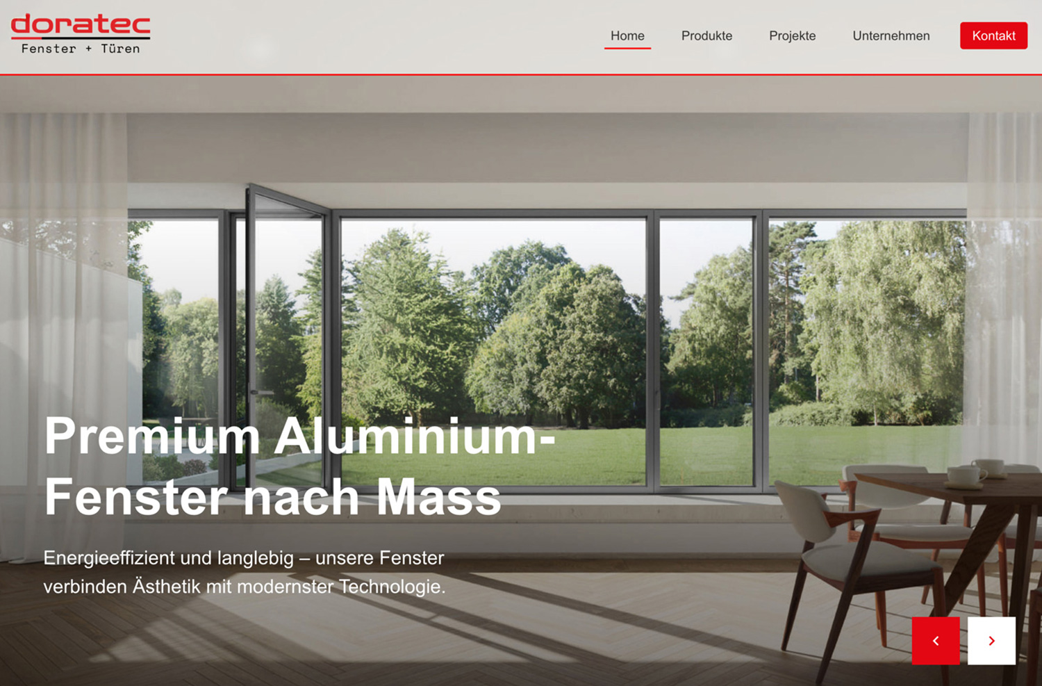
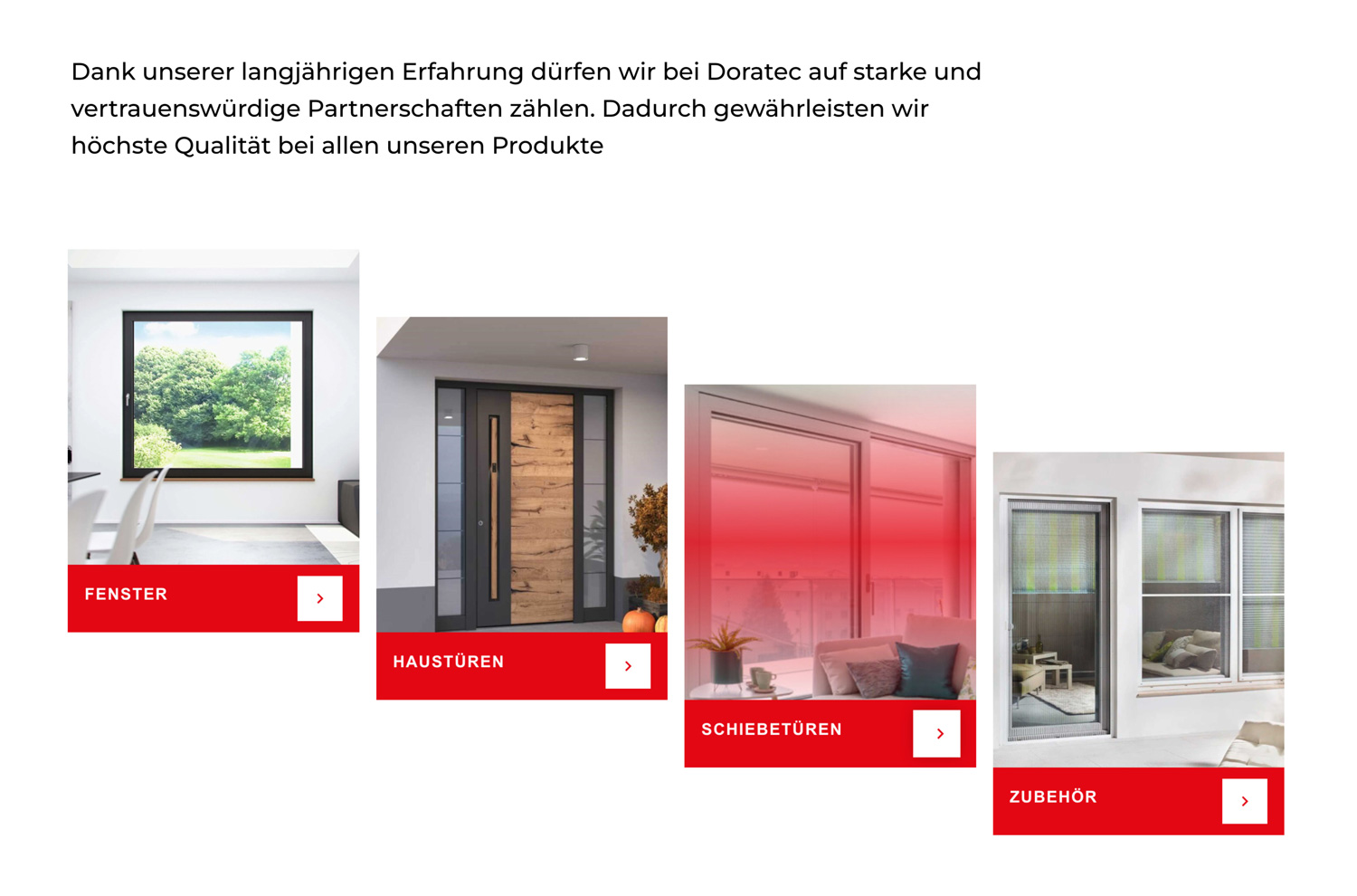
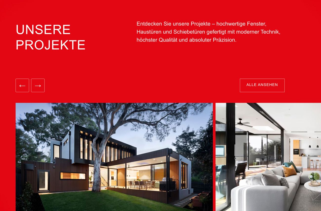
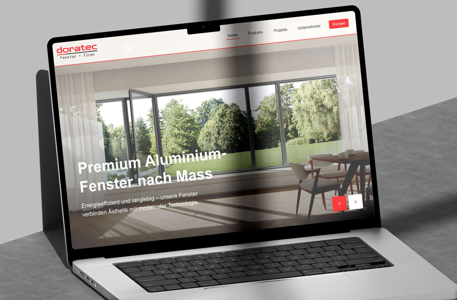
The final site was developed as a lightweight, responsive platform using Doratec’s red, black, and white color palette. A modern glassy header adds visual depth, while interactive product views, technical specs, and a simple contact flow help users quickly find what they need.
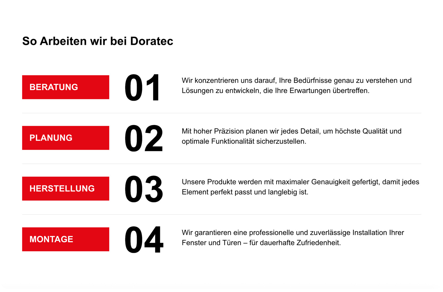
Throughout the project, the goal was to create a human-centric experience: a website that doesn’t overwhelm, speaks in a friendly tone, and guides users step by step toward the information they need.
Less, but intentional.
This project follows a single rule: every element must earn its place.
Space, typography, and motion are used as functional tools—not decoration.