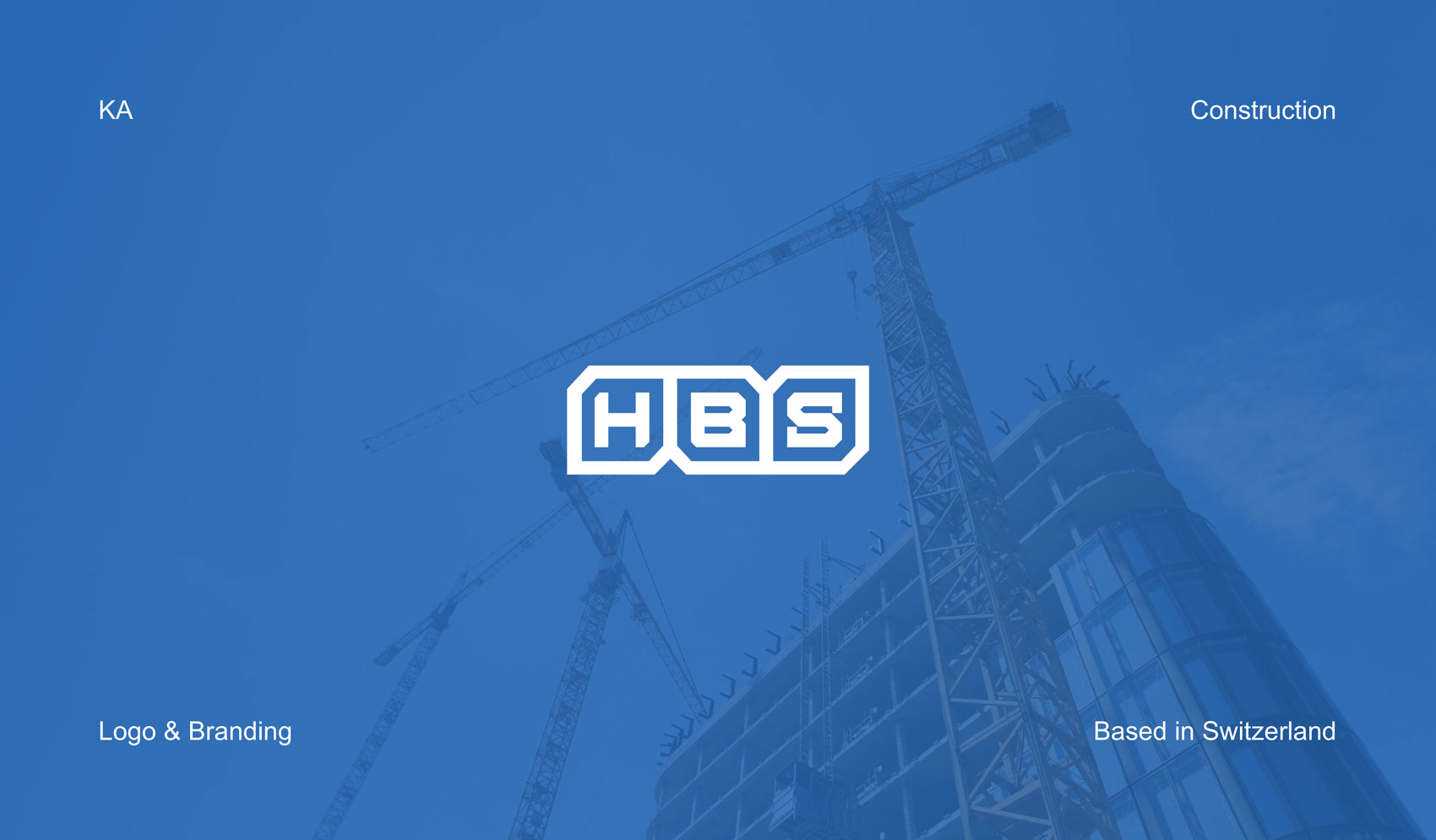
HBS
This project was commissioned by MONUN AG from HBS, a construction company that had relied on the same logo for nearly 25 years and was seeking a renewed identity aligned with its current standards and future direction. As an employee at monun, I was responsible for leading the logo redevelopment and was given full creative freedom to rethink the identity from the ground up. This allowed the new logo to be developed through clear strategic reasoning and design logic, rather than incremental visual changes.
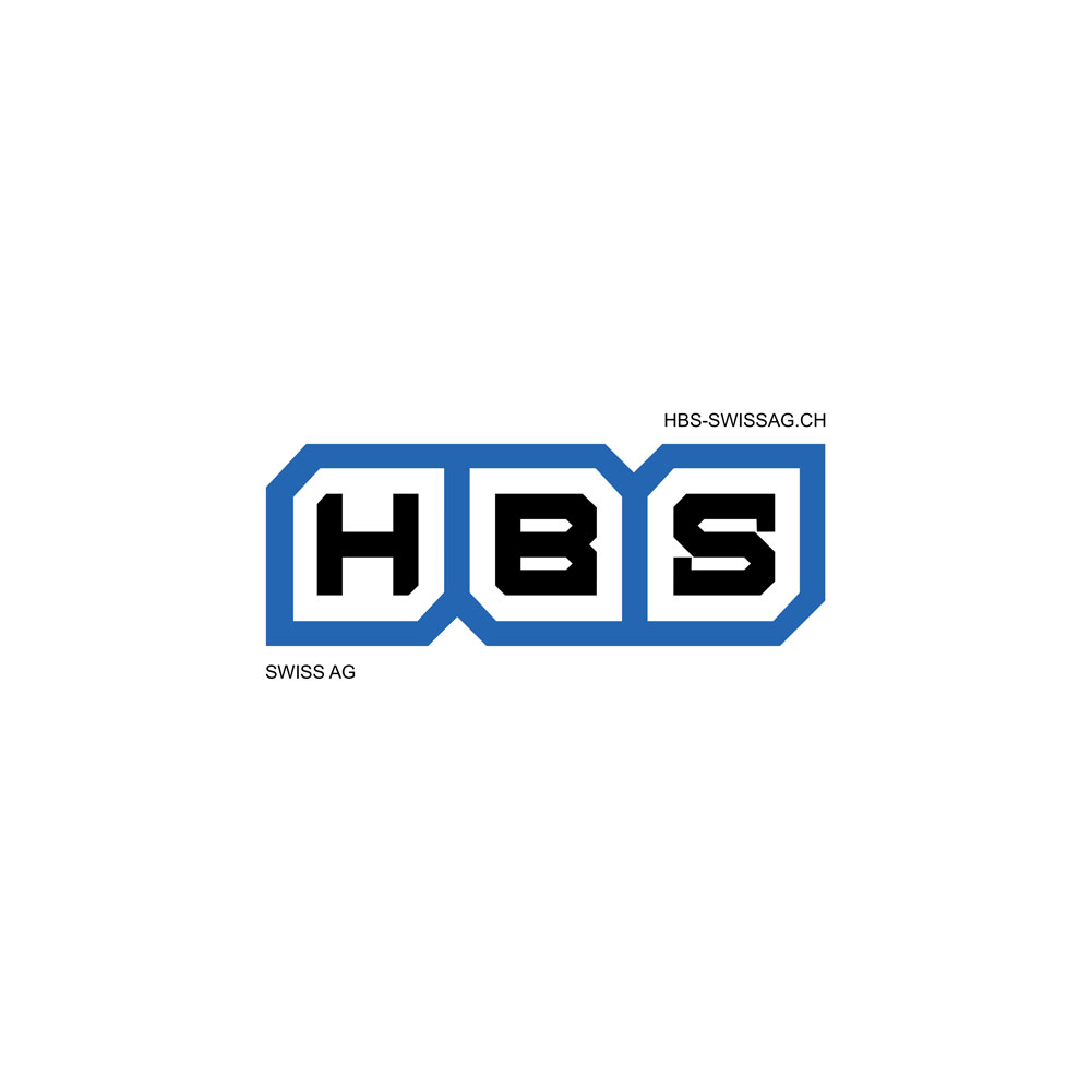
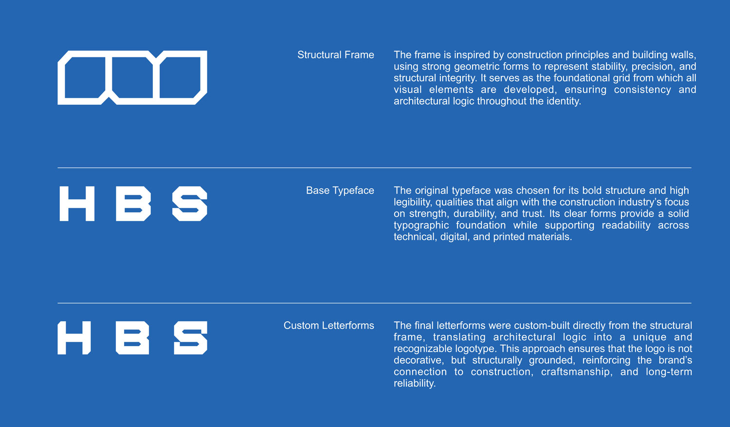
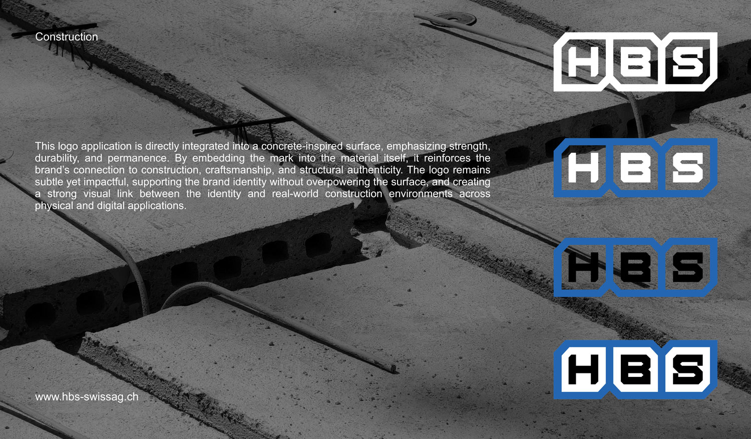
The logo is built on a structural frame inspired by construction principles and building walls. Strong geometric forms express stability, precision, and structural integrity, forming an architectural grid that underpins the entire identity system. This framework ensures consistency and logical construction across all brand elements, directly reflecting the nature of the construction industry.
A bold, highly legible base typeface was selected to convey strength, durability, and trust. From this foundation, custom letterforms were developed directly from the structural frame, translating architectural logic into a distinctive and cohesive logotype. The result is a logo that is structurally grounded rather than decorative, reinforcing a clear connection to construction, craftsmanship, and long-term reliability while remaining adaptable across physical and digital applications.