Jetonikeramika
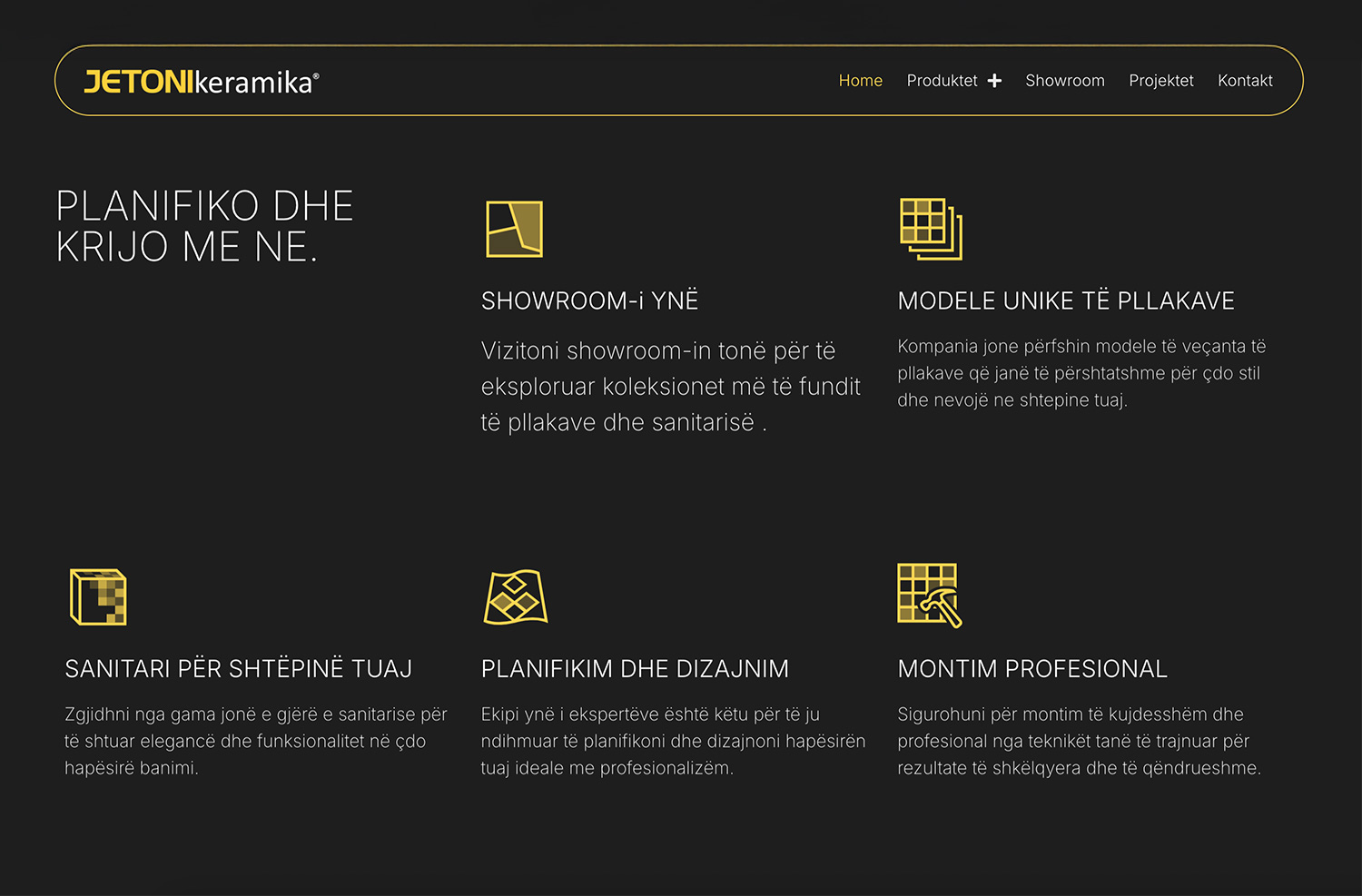
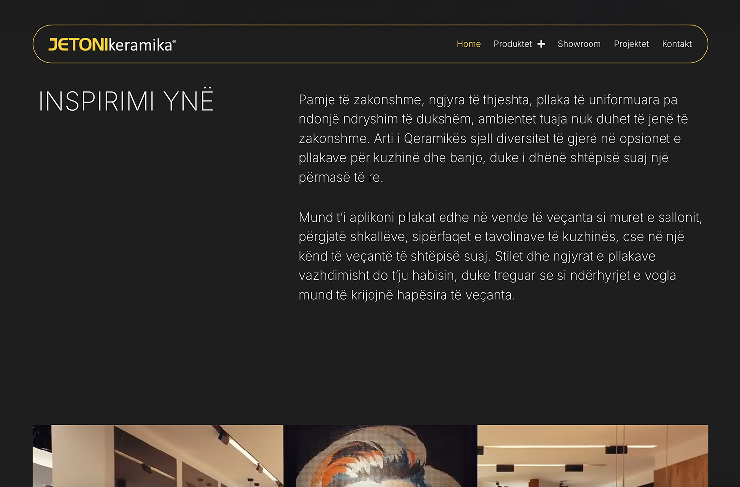
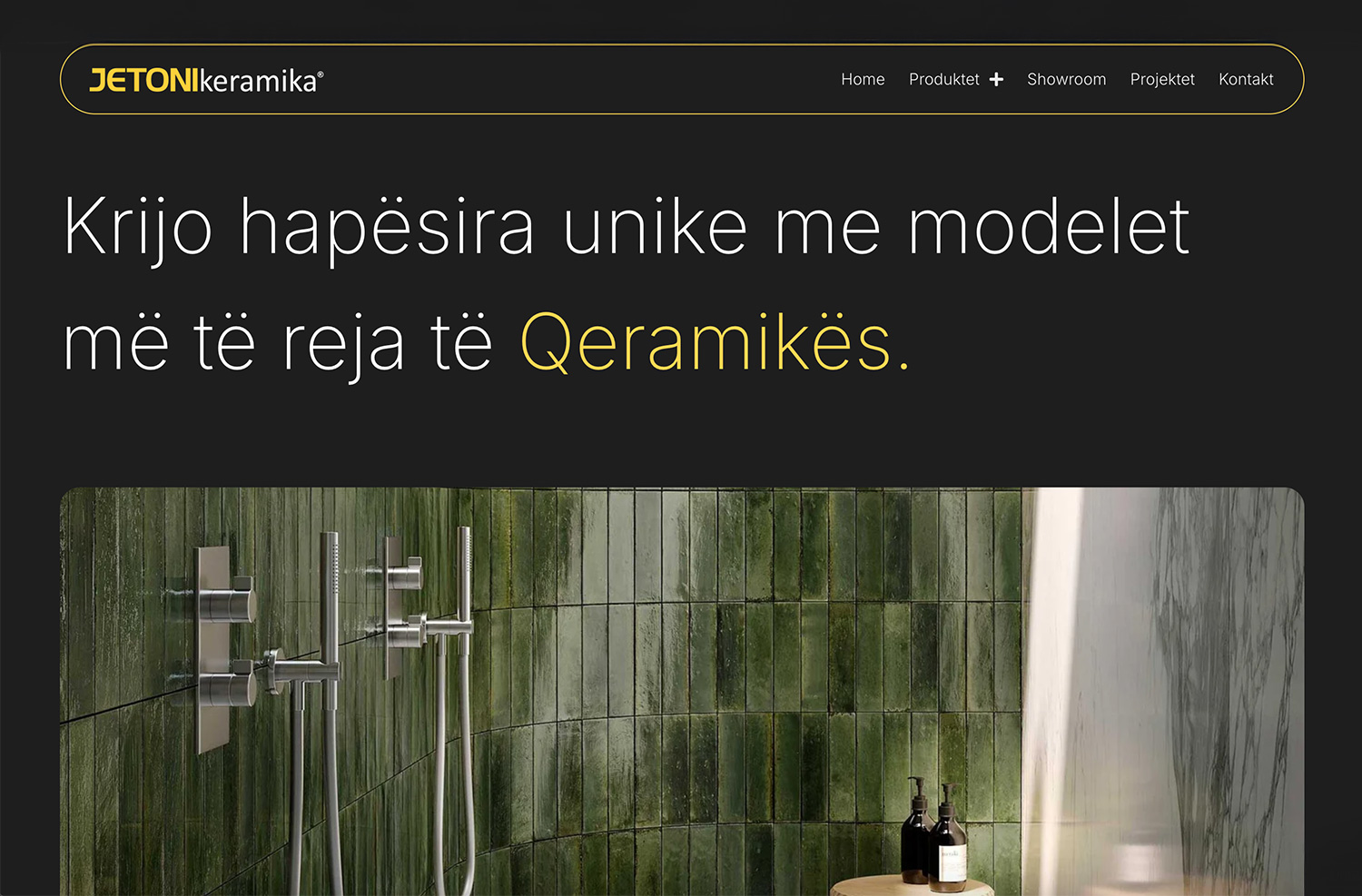
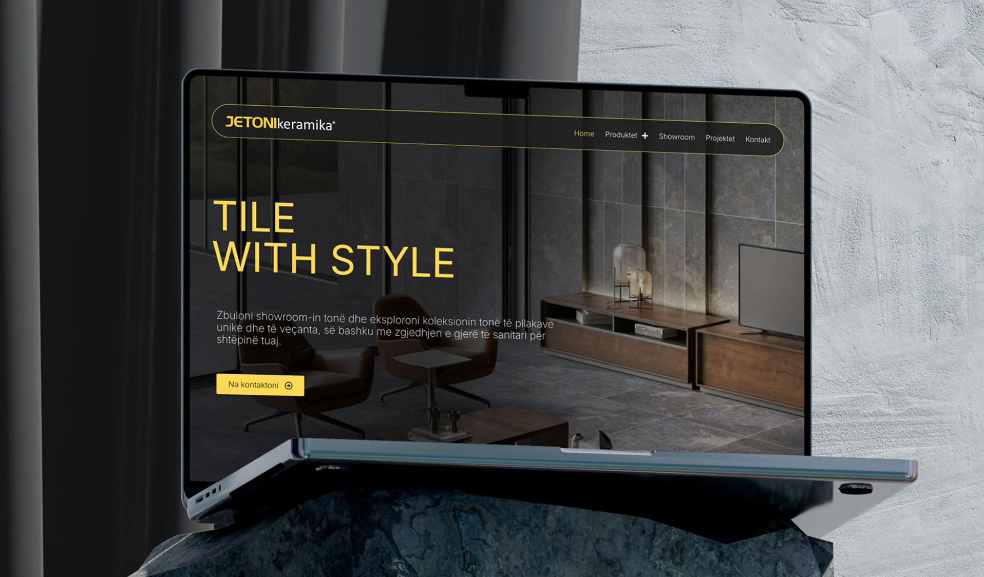
This project was approached with a focus on minimalism and functionality, using a dark visual foundation with white typography and subtle yellow accents derived from the brand identity.
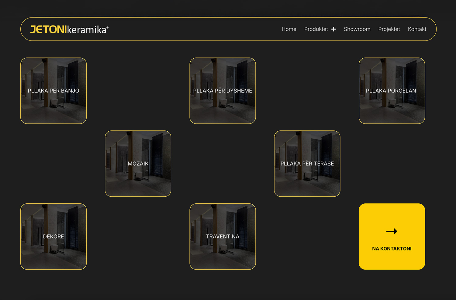
The interface was designed in Figma using a human-centered approach, prioritizing clarity, hierarchy, and ease of use. After client approval, the design was implemented as a custom WordPress build, utilizing HTML, CSS, and JavaScript to support tailored interactions and refined motion.
A key element of the experience is the use of smooth, scroll-triggered animations that introduce content progressively, enhancing visual rhythm while maintaining clarity and usability.
Less, but intentional.
This project follows a single rule: every element must earn its place.
Space, typography, and motion are used as functional tools—not decoration.