Spitex GmbH
I began by researching how patients and healthcare staff interact with Spitex services, focusing on moments where users feel uncertain or rushed. This informed a calm, human-centric UX direction in Figma, with clean layouts, generous spacing, and typography that supports clarity and ease of use.
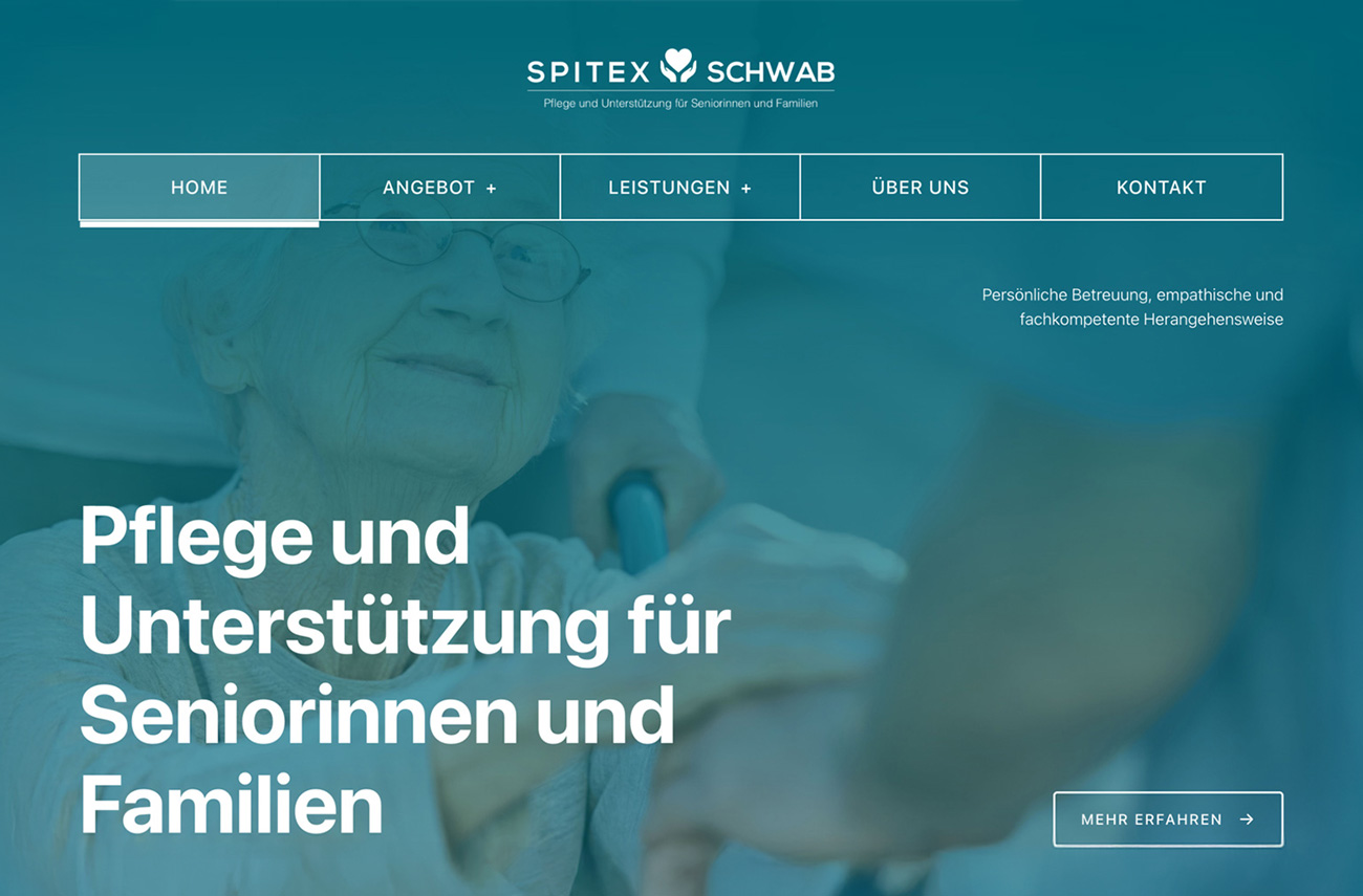
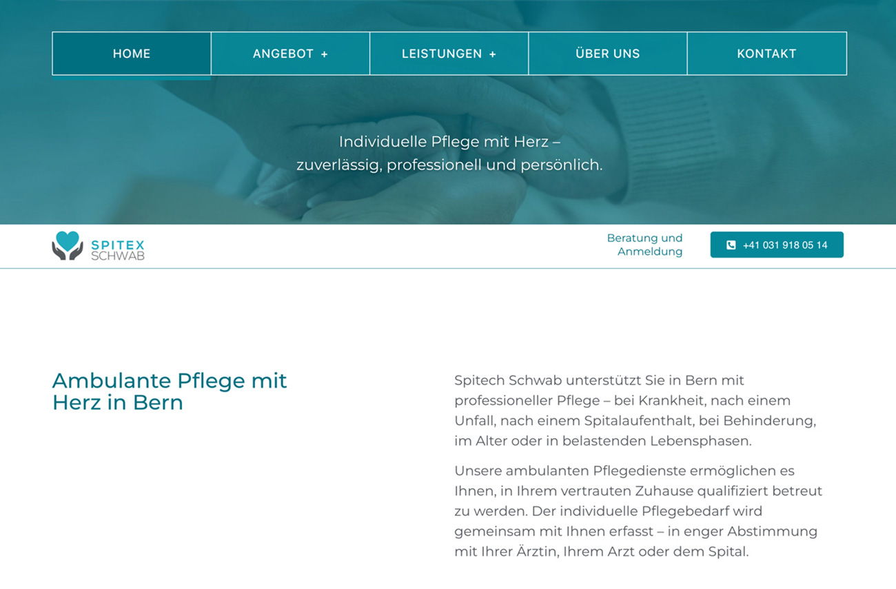
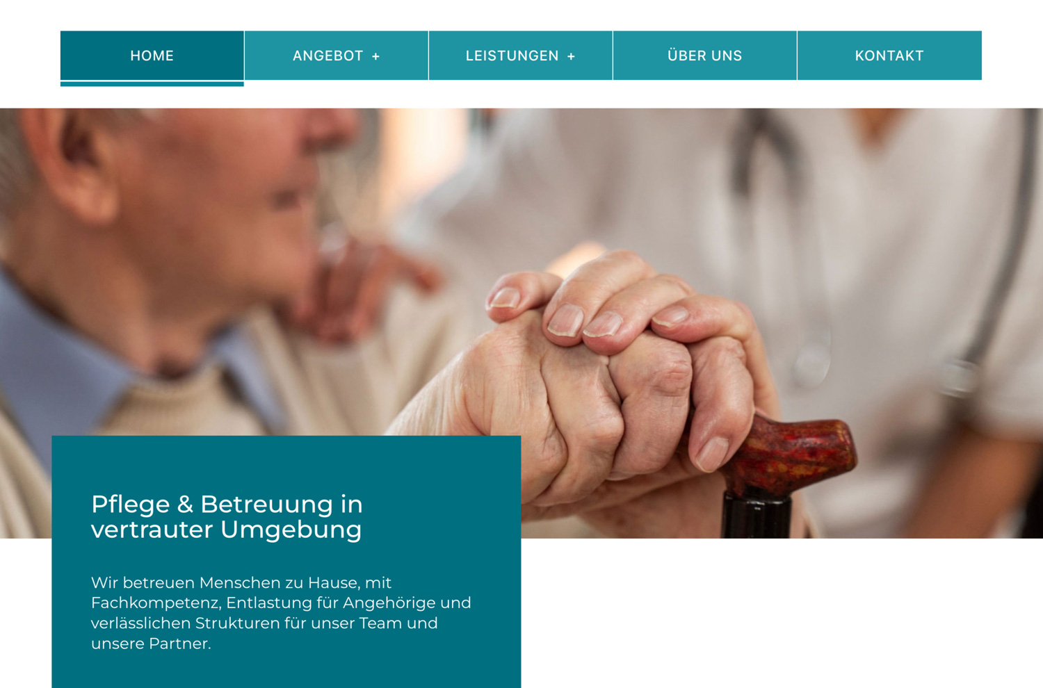
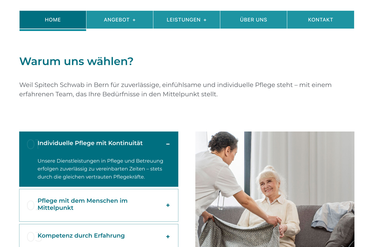
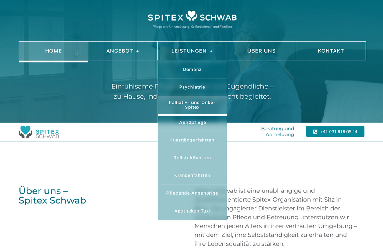
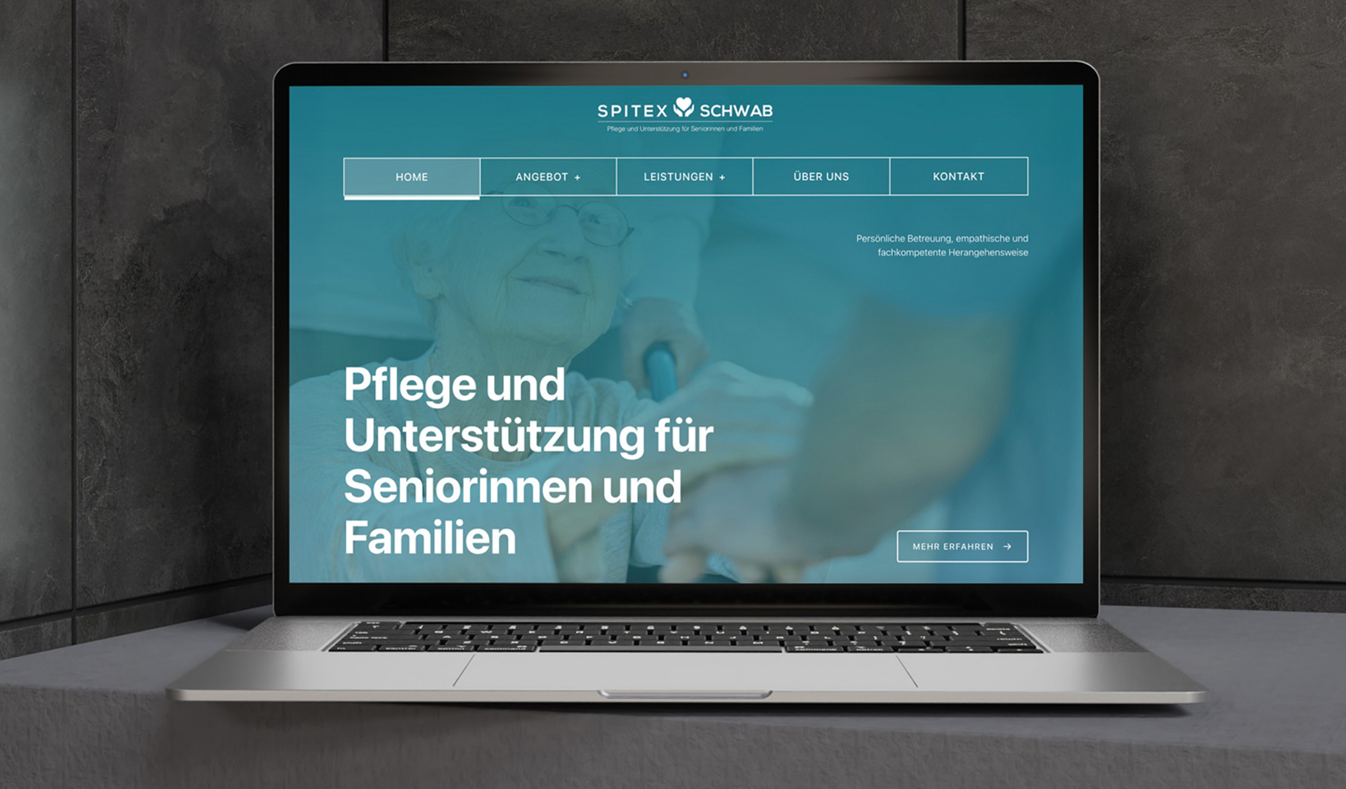
The visual design uses Spitex’s deep teal color as the core identity, paired with white text and thin white borders to create a clear, trustworthy interface. The main navigation adopts a subtle glass-style effect with a teal gradient for a light, modern feel. When users scroll, the header gently reduces in height, keeping only the essential navigation visible so the page feels open, minimal, and distraction-free.
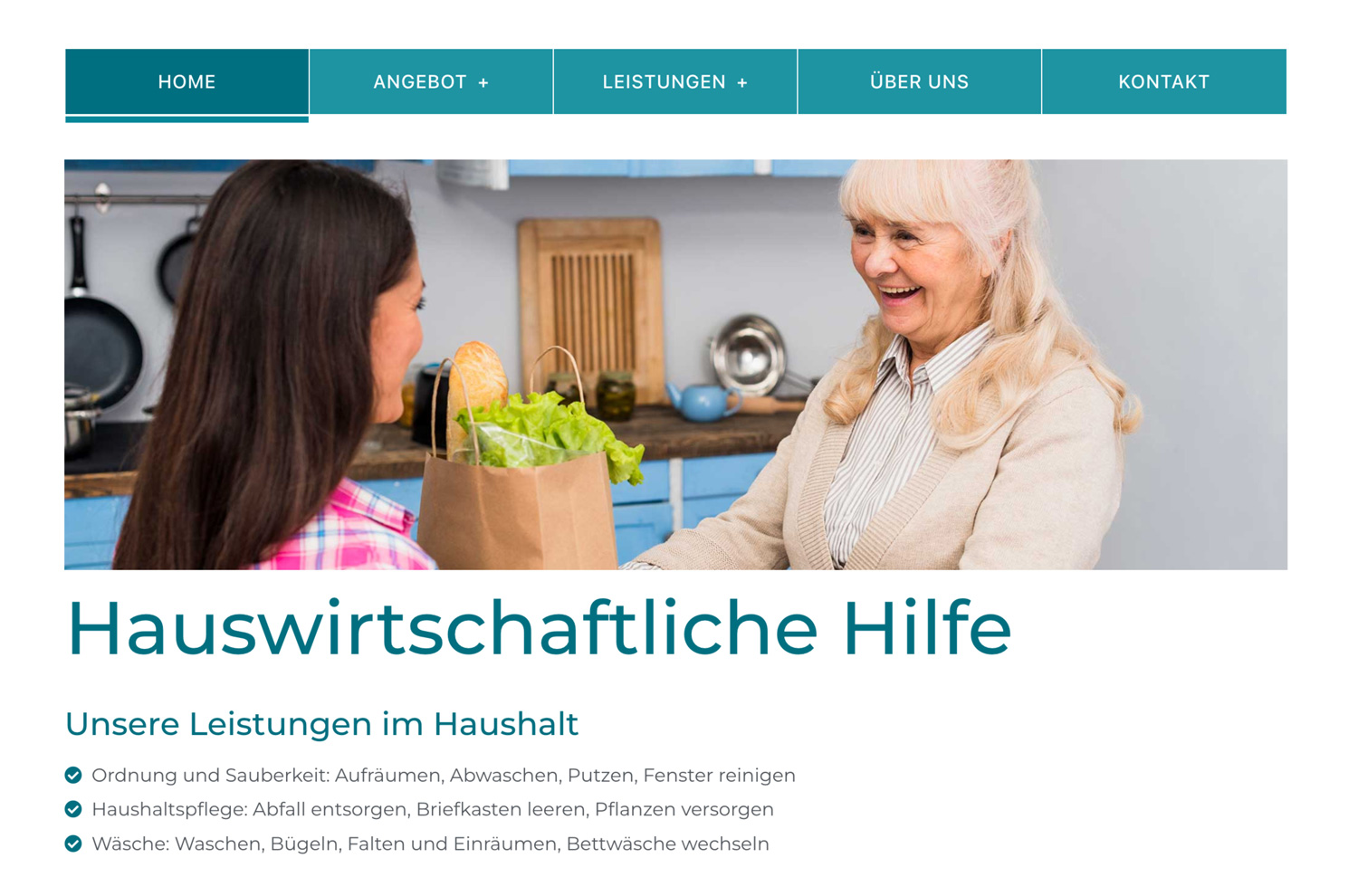
The build is fully responsive and lightweight, with a transparent submenu that blends naturally into the header. Services are easy to explore, key information is easy to reach, and the contact flow is intentionally simple—helping users connect with support quickly and confidently.
Less, but intentional.
This project follows a single rule: every element must earn its place.
Space, typography, and motion are used as functional tools—not decoration.