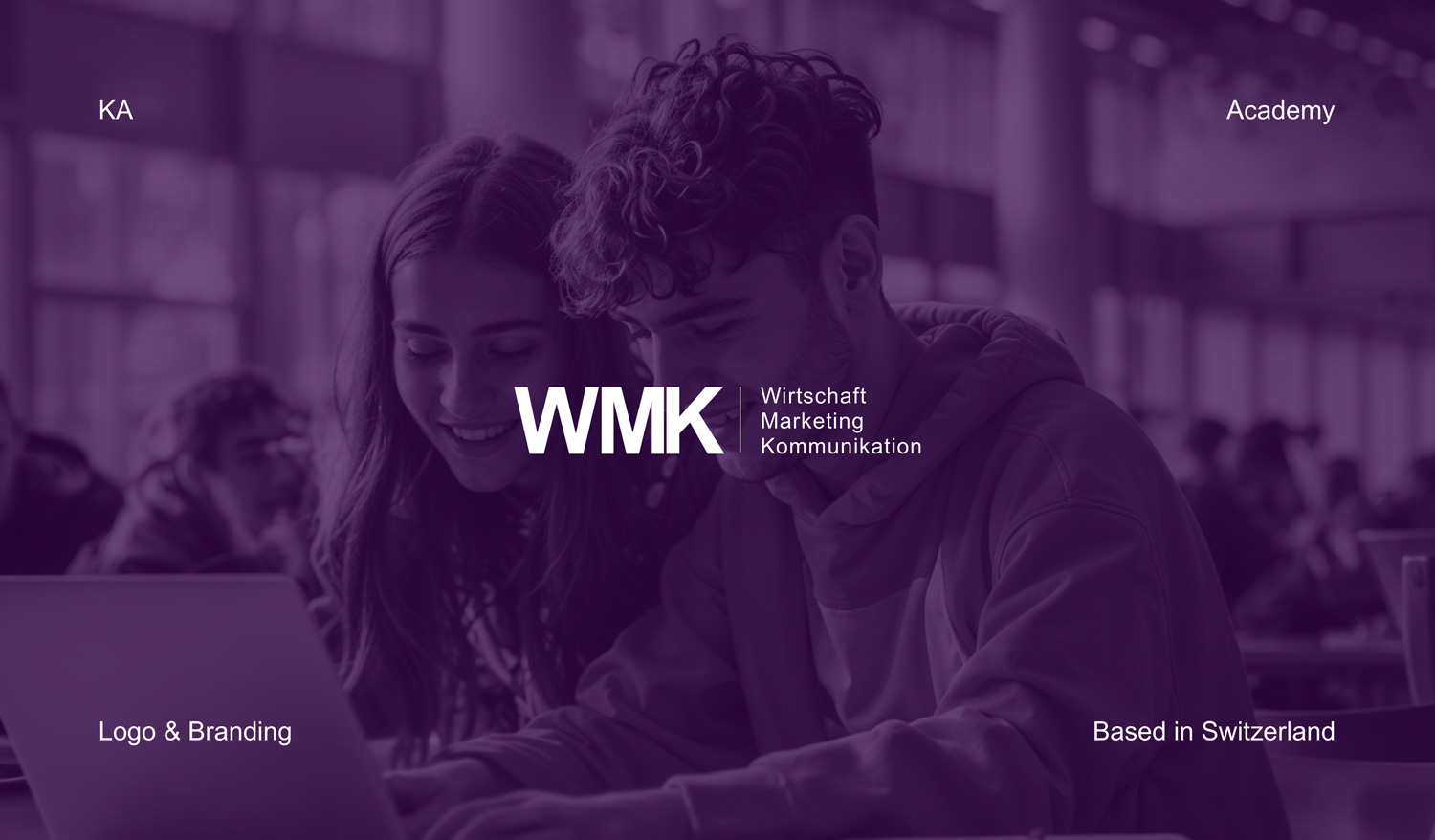
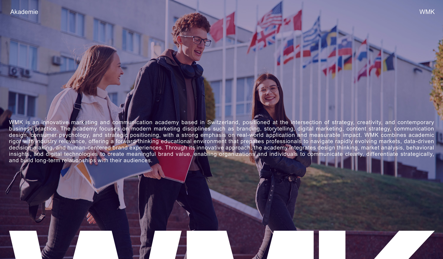
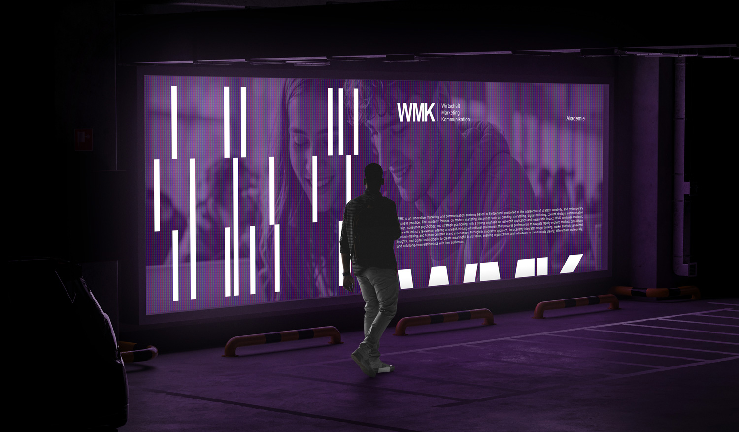
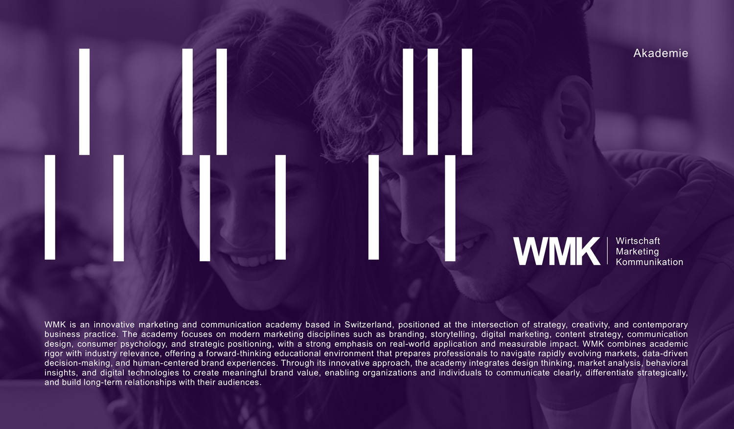
WMK
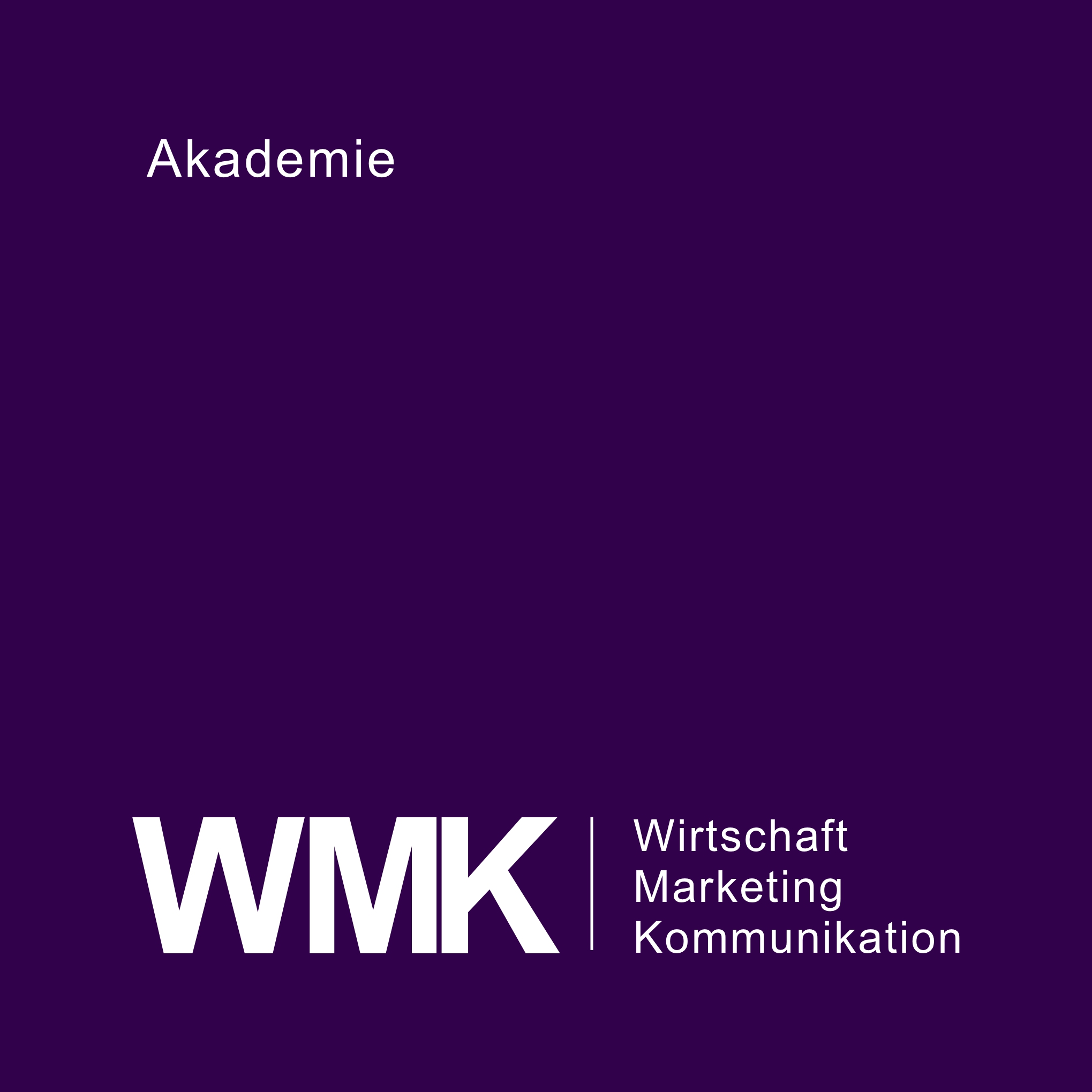
The WMK logo was developed as a clear and contemporary identity for a Zurich-based academy in Switzerland, dedicated to educating professionals in modern digital disciplines, from building effective online presence to performance-driven marketing such as Google Ads and digital strategy. The logo is intentionally constructed from three simple letters—W, M, and K—standing for Wirtschaft, Marketing, Kommunikation—and reflects the academy’s core values of clarity, structure, and knowledge transfer. By reducing the mark to its essential elements, the design communicates accessibility and focus, aligning with WMK’s human-centered educational philosophy.
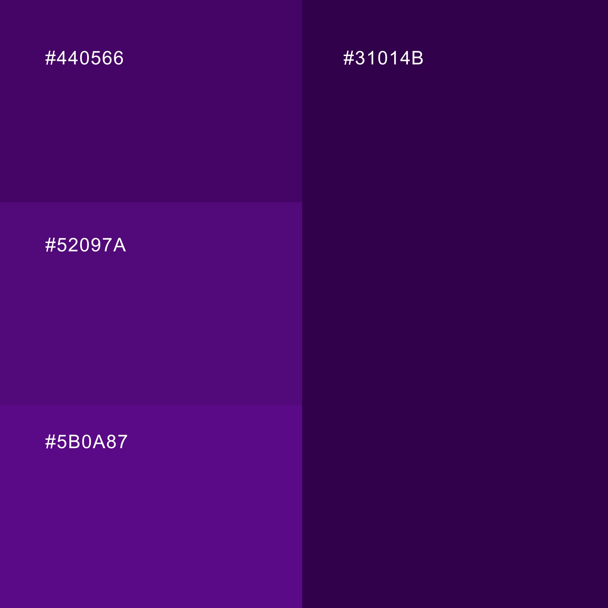
The visual language is minimal and academic, yet distinctly modern. Clean typography ensures legibility and authority, while the restrained color palette—built around deep, sophisticated purple tones (#31014B, #440566, #52097A, #5B0A87) combined with white—creates a sense of professionalism, technological depth, and trust. This balance allows the brand to feel both institutional and innovative, supporting its role as a forward-thinking academy in the digital education space.
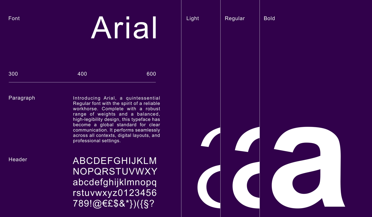
After exploring multiple early design directions, this concept quickly emerged as the most authentic representation of WMK’s vision and was accepted immediately. From this foundation, the entire brand ecosystem was developed, extending from logo and color system to typography, layout principles, and visual applications across digital and print channels. The result is a coherent and scalable identity system in which the logo serves as a central anchor—ensuring consistency, clarity, and a strong academic-tech presence across all brand touchpoints.