Doratec AG
- Industry
- Windows &
Doors - Service
- Research · Product Design ·
Development - Location
- Switzerland
- Stack
- Figma · WordPress (custom theme) · PHP · Advanced Custom Fields · JavaScript ES6+
Company
From choosing a window to fitting it
Doratec AG supplies and installs PVC windows and doors in Switzerland, so the same company is there from the moment a customer chooses a model to the day it is fitted. It runs an office and a showroom alongside the installation work. This was a direct engagement in 2025.
The problem
Too much detail for most, too little for some
A single window model carries a long list of specifications: profile, material, glazing and dimensions. Put all of it on the page and most visitors are lost before they reach the picture. Hide it, and the architect or builder who needs it looks elsewhere. The information had to be complete without being the first thing anyone sees.
Until this project, the only way to understand Doratec's range was to call the office or visit the showroom.
Research
How people look for windows and doors
Research began where a buyer begins: with a search for PVC windows and doors, followed through to a shortlist of suppliers. Alongside that I looked at the brand and who its customers are.
What stood out was two different starting points for the same product. Some people start from appearance, browsing for a style that suits their house. Others arrive already knowing what they need and go looking for the technical detail to confirm it. Both kinds of visitor end up on the same product page.
Solution
Appearance on top, specification underneath
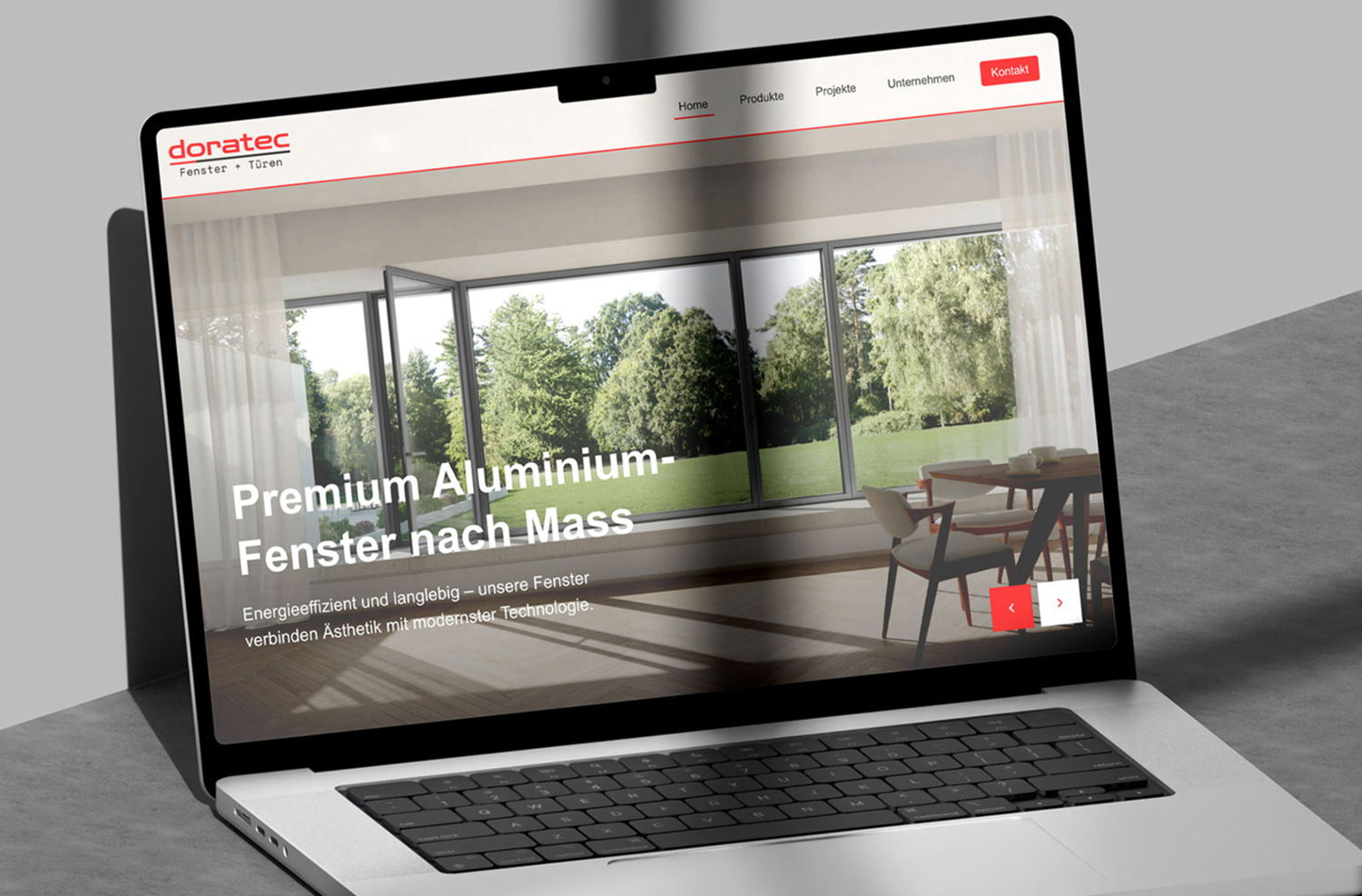
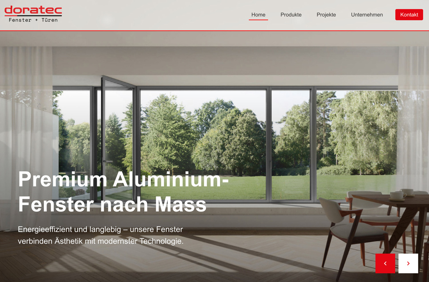
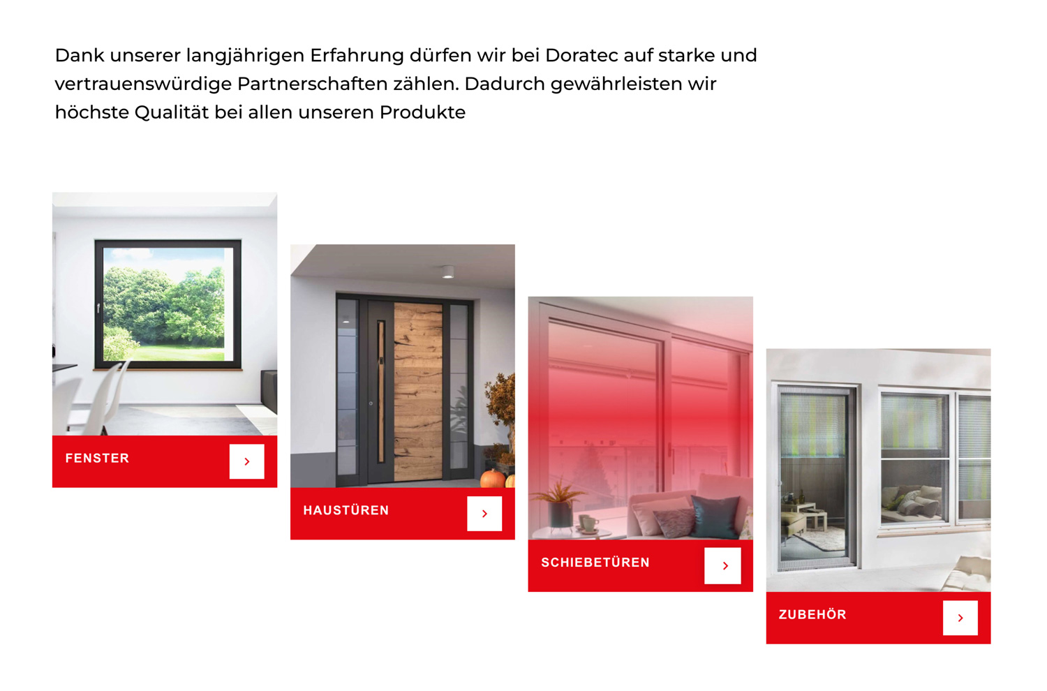
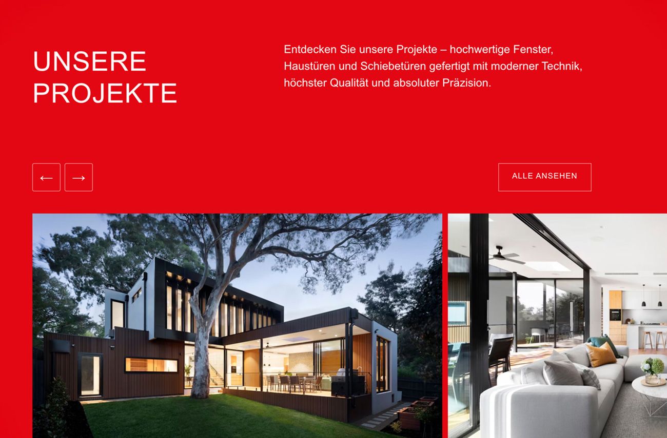
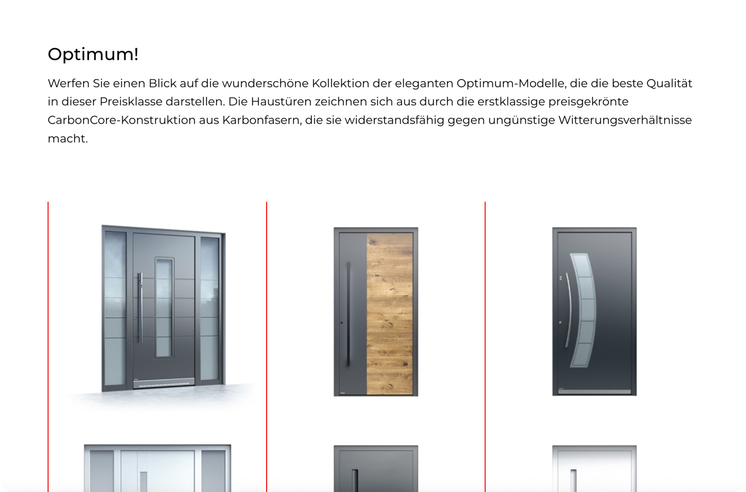
Each model leads with its image. A visitor sees the product before reading about it, so those who start from appearance are answered straight away.
Technical detail waits one step below. Profiles and specifications are there for the visitors who arrive knowing what they need, without crowding the page for everyone else.
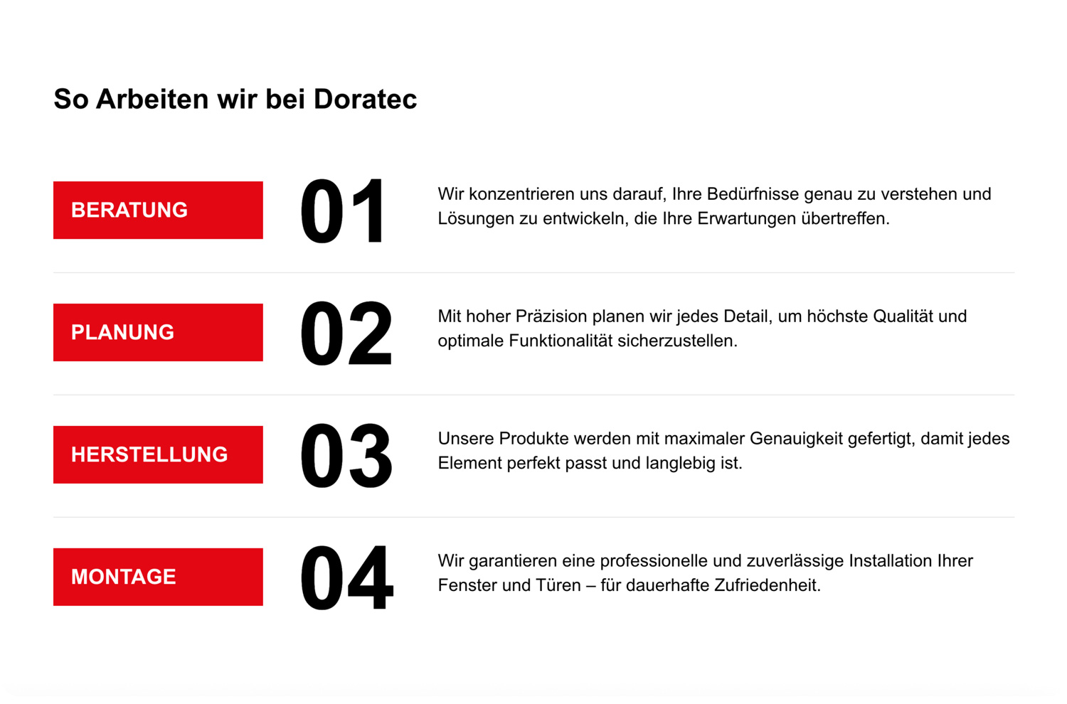
The people are shown alongside the product. A window is only as good as its fitting, and the fitting is done by Doratec's own team in the customer's home. So the company is presented as clearly as the range.
Design
Technical in structure, friendly in tone
The palette is Doratec's own red, black and white, but each colour is given a job. Black and white build the structure: strong contrast for headings and technical data, and plenty of white space around each model so the shape of a frame reads cleanly. Red is kept for the moments that ask the visitor to act, a call, a visit, a closer look at a model, so it keeps its pull every time it appears.
Montserrat sets the typography. Its wide, geometric letterforms echo the straight lines and exact angles of a window frame, and they stay clear at every size, from model names down to technical specifications.
The writing follows the same idea as the layout. Technical terms are explained in plain, friendly language, and the copy walks a visitor through the product in order rather than all at once, so nobody needs to be an expert to follow along.
A glass-effect header sits over the page as you scroll, blurring the content beneath it rather than hiding it. It adds depth and keeps navigation and contact in reach without breaking the view of the product.
Development
Products as structured data
The build started with a data model rather than a page. Every window and door model is stored as a structured entry with the same set of fields for profile and technical specification, and one template reads that data twice: once for the visual view that leads the page, once for the technical layer beneath it. Because both layers come from the same record, a specification can never disagree with the product it describes, and every model in the range is presented to the same standard.
Outcome
The range, explained before the first call
The first phone call to Doratec starts further along. Customers can arrive having already seen the models, compared the profiles and learned who will be installing them, so the conversation begins with what they want, not with an introduction.