Spitex Schwab AG
- Industry
- Home
Care - Service
- Research · Product Design ·
Accessibility · Development - Location
- Bern,
Switzerland - Stack
- Figma · WordPress (custom theme) · PHP · Vanilla JavaScript · SCSS
Company
Care that comes to the home
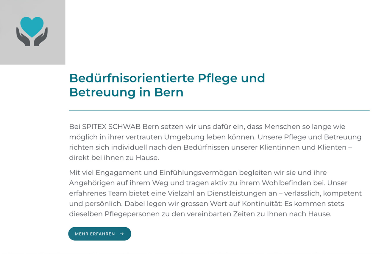
Spitex Schwab AG is an independent home-care provider based in Bern. Its nurses and carers support people of all ages in their own homes, so they can keep their independence there, with services ranging from basic and medical care to psychiatric, palliative and oncology care, dementia support, a children's Spitex and Spitexpress, a 24-hour emergency service. Spitex Schwab came to me directly in 2025.
The problem
Printed brochures, and nothing for the people searching
Before this project, everything Spitex Schwab had to say about itself was in printed brochures. They worked for people already in contact with the company. For anyone searching online, the company did not exist.
That gap matters more in home care than in most sectors. The need for care often arrives suddenly, after a fall or a hospital stay, and people look for help quickly and under pressure.
Research
Simple pages, scattered information
The work started with a content audit. Together with the client I went through the brochures and every service Spitex Schwab offers, a long list written for print and for people who already knew the company. The client also told me something that shaped everything after it: in most cases, first contact comes from a son or daughter arranging care for a parent, not from the person who needs it.
I then reviewed leading Spitex organisations across Switzerland, looking at how they explain their services, how they handle first contact, and how quickly a relative can find what they need. The review turned up one thing worth keeping and one worth fixing. The design of the best sites was simple and uncluttered, with no visual overload, and that became the benchmark for the look. The problem was the information. Explaining care properly takes words, so the amount of text was not the issue in itself. The issue was where it lived: information was scattered across the site, and a relative had to piece answers together from several pages.
That set the priority for the information architecture. I reorganised Spitex Schwab's services under five headings a relative can grasp at once, care, household help, personal support, coordination and the 24-hour Spitexpress, with one page per service, so every answer sits in one predictable place.
Users
The reader is rarely the patient
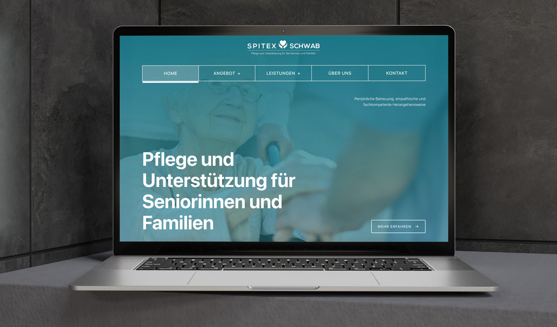
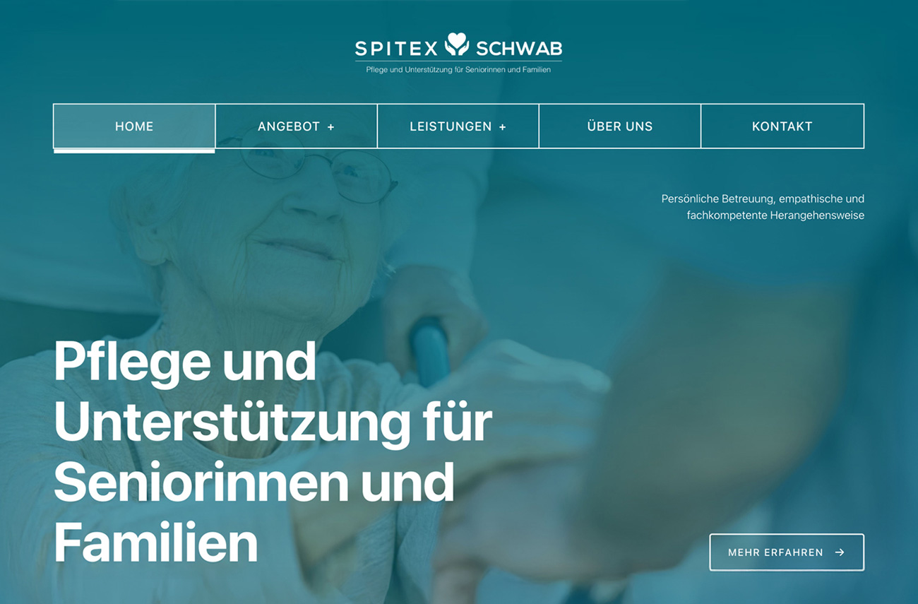
That one fact from the client changed who the site was for. The reader is arranging care for a parent, often at short notice, often while managing everything else in their life, and making a decision on someone else's behalf. The site says so in its first line: Pflege und Unterstützung für Seniorinnen und Familien, care and support for seniors and families.
Stress narrows attention and reduces how much a person can hold in mind at once, so a reader in that situation cannot be asked to decode care terminology, hunt for a phone number or work through a long form. My background in clinical psychology made this the starting point rather than an afterthought: the site had to ask as little as possible of someone already stretched.
Solution
Designed for the worst day, not the average one
Text large enough to read without effort. Body text is set larger than usual, so nobody has to zoom in or lean closer, and a tired reader can take in a page at a glance.
The phone number never leaves the screen. For many families the first step is a conversation, not a form. The number stays in view throughout the site, so calling is always the easiest thing to do.
Care described in everyday words. Services are explained the way a relative would ask about them, not in the terminology of the care sector.
Fewer steps to contact. Getting in touch takes as few steps as possible, and the contact form asks only for what Spitex needs to call back.
Design
Deep teal, drawn with white
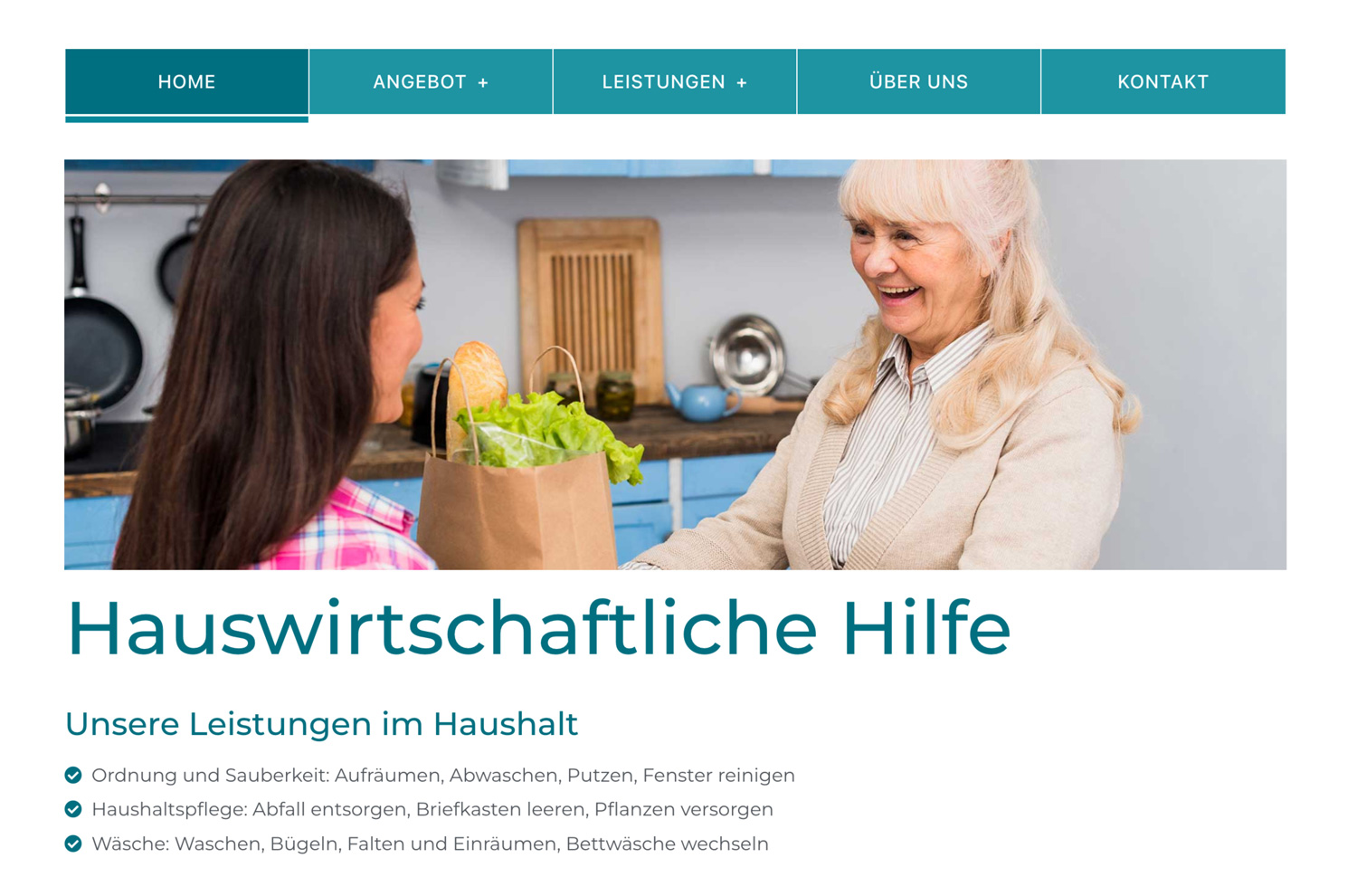
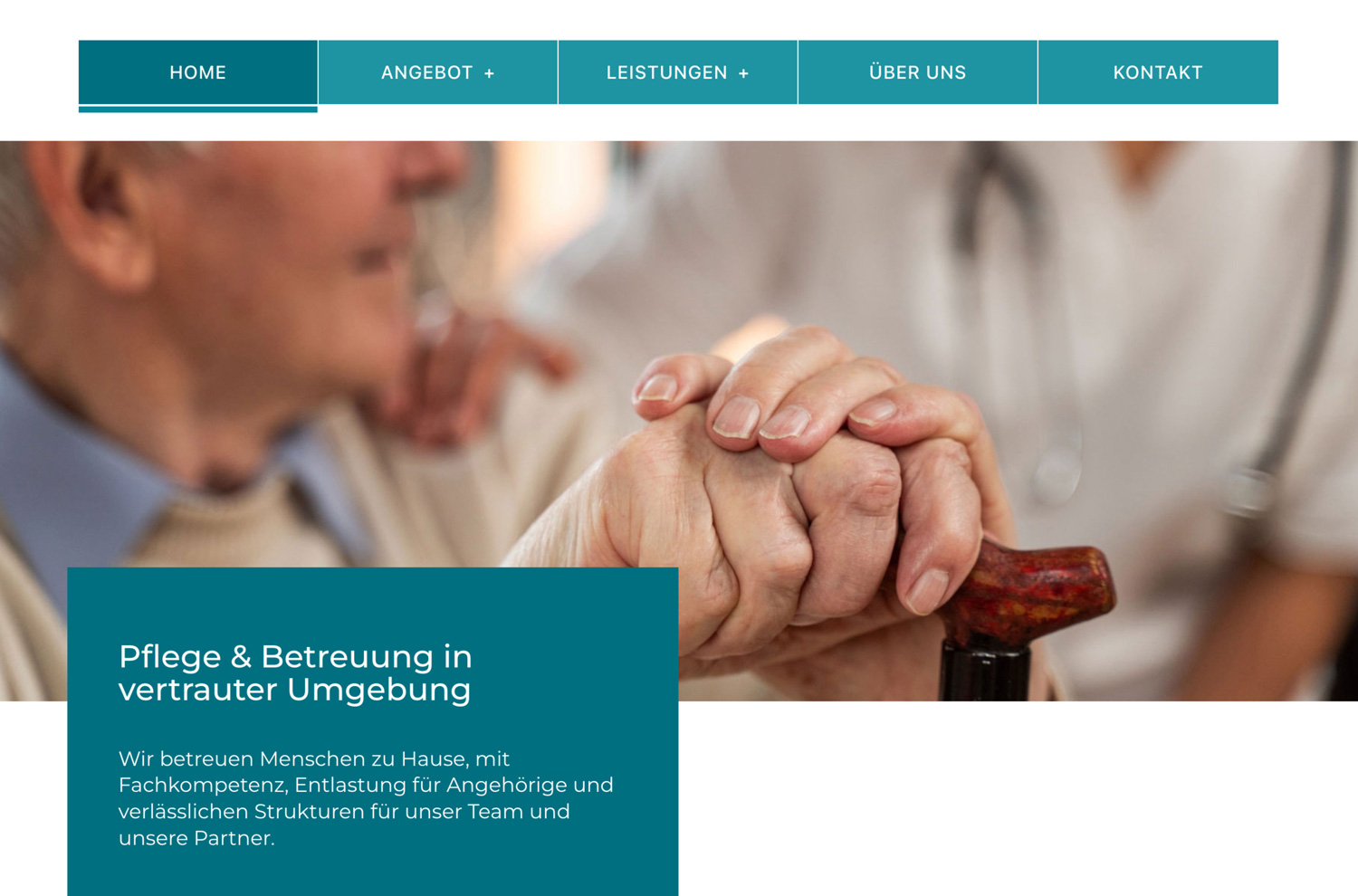
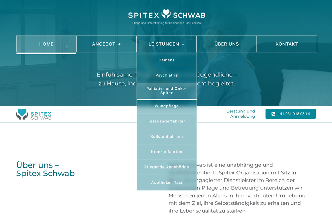
Spitex's own deep teal carries the identity, with white type and thin white lines drawing the structure on top of it. White on a teal that deep keeps contrast strong, which matters to readers whose eyesight or attention is under strain. On the first screen the photograph is washed in teal, so the page opens as one calm field of colour with the headline standing out in heavy white. Further down, photographs keep their natural warmth, and text sits in solid teal panels that overlap them rather than being printed over the image, so it never has to be read against a busy background.
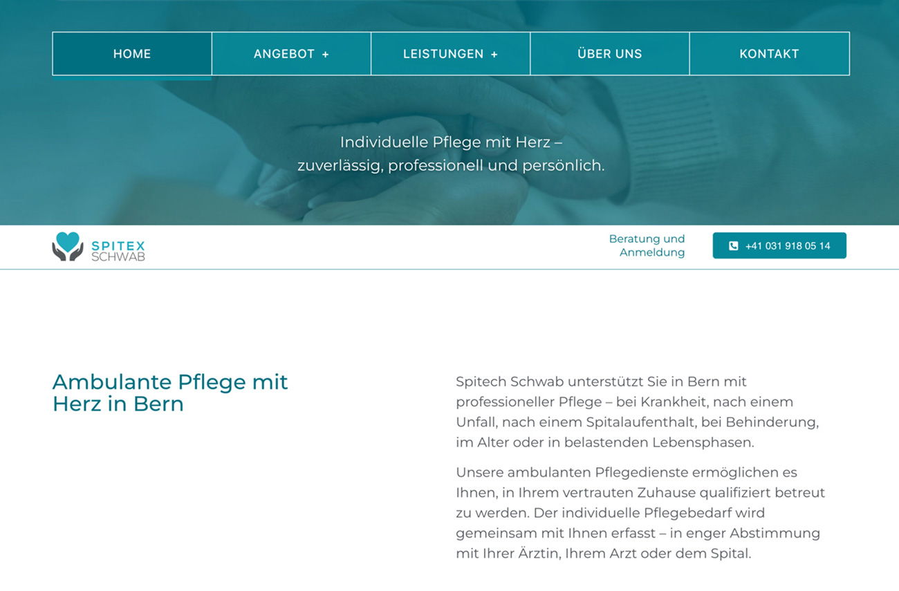
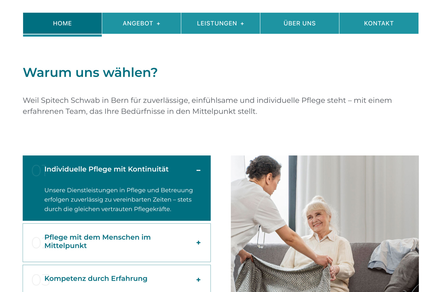
The navigation is built from five equal boxes rather than a line of small links. Each item is a wide, unmistakable target, easy to hit with an unsteady hand or on a small screen, and a plus sign marks the ones that open a submenu. Over the hero the boxes are outlined in white; once the visitor scrolls they turn into solid teal tiles on white, with the current page marked by a darker tile and a heavy underline.
Contact has its own place at the top right of every page: a teal button carrying the phone number, labelled Beratung und Anmeldung (advice and registration), so it says what a call is for before anyone has to wonder. The 24-hour Spitexpress service goes one step further, with its number written directly into its description, because in an emergency nobody should have to go looking for a number.
Services are laid out as a grid of square tiles, alternating filled teal and white, each with a simple solid icon, a clear name and two or three lines of plain description. Headlines are set large and heavy, body text in a clear geometric sans with open line spacing, and the whole page reads as unhurried, which is exactly what its readers are not.
Development
Accessibility built in, not added on
The site is a custom WordPress theme built around the five service headings from the research.
The accessibility decisions live in the code rather than in a plugin. Text is sized in relative units, so the larger default still respects each visitor's own browser settings and scales cleanly from phone to desktop. Every phone number, in the header button and in the Spitexpress description, is a live link, so on a mobile device a single tap starts the call.
The build is deliberately lightweight, with vanilla JavaScript used only for the header's change of state on scroll, so pages load quickly even on older phones and slow connections.
Outcome
More calls, more emails, and a surprised client
Since launch, the client has seen more phone calls and more emails than before, enough that the result surprised them. For a service that had previously reached people only through printed brochures, that is exactly what the site was built for: families finding Spitex Schwab and picking up the phone.