HBS
- Industry
- Construction
- Service
- Brand Identity · Logotype ·
Brand Guidelines - Agency
- Monun AG
- Location
- Switzerland
- Deliverables
- Brand positioning · Logotype · Colour palette · Typography · Brand pattern · Brand workbook · Business cards · Letterhead · Brochure
Company
The identity came first
HBS Swiss AG is a Swiss construction company that plans, manages and supervises building projects. The work came through Monun AG in 2025, and this identity was the first of two projects I did for HBS.
The brief
Twenty-five years on one logo
HBS had used the same logo for nearly 25 years. It had dated badly: hard to read, poorly constructed, and out of step with the company HBS had become. The brief was a renewed identity that matched the company's current standards and where it was heading.
I led the redevelopment and was given full creative freedom, which meant the identity could be rebuilt from first principles rather than adjusted piece by piece.
Exploration
The direction that won
I developed four directions for the new mark and presented all of them to the client. The one built on a structural frame was chosen, and it became the definitive identity. The rest of this case study follows that direction from concept to system.
Concept
A frame to build inside
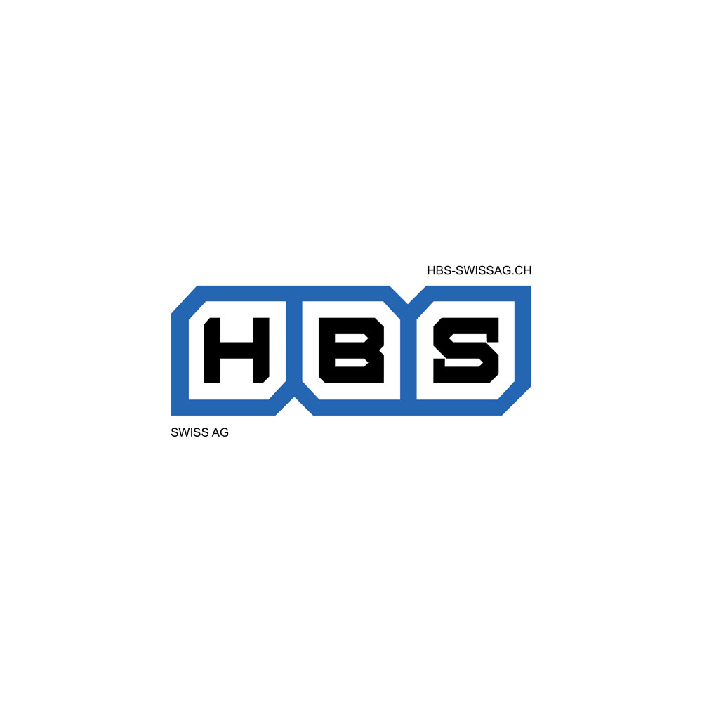
The idea comes from how buildings are made: the structure goes up before anything is fitted inside it. The mark starts as a frame of three connected cells, drawn with strong geometric lines and chamfered corners, inspired by building walls and the structural logic of construction. It works like a foundation. The letters H, B and S are fitted into it, one per cell, each sitting exactly within the space the frame gives it.
Nothing in the mark is ornamental. The frame carries the meaning, stability, precision and structural integrity, and the letters sit within it the way a building's elements sit within its structure.
Construction
Frame, typeface, letterform
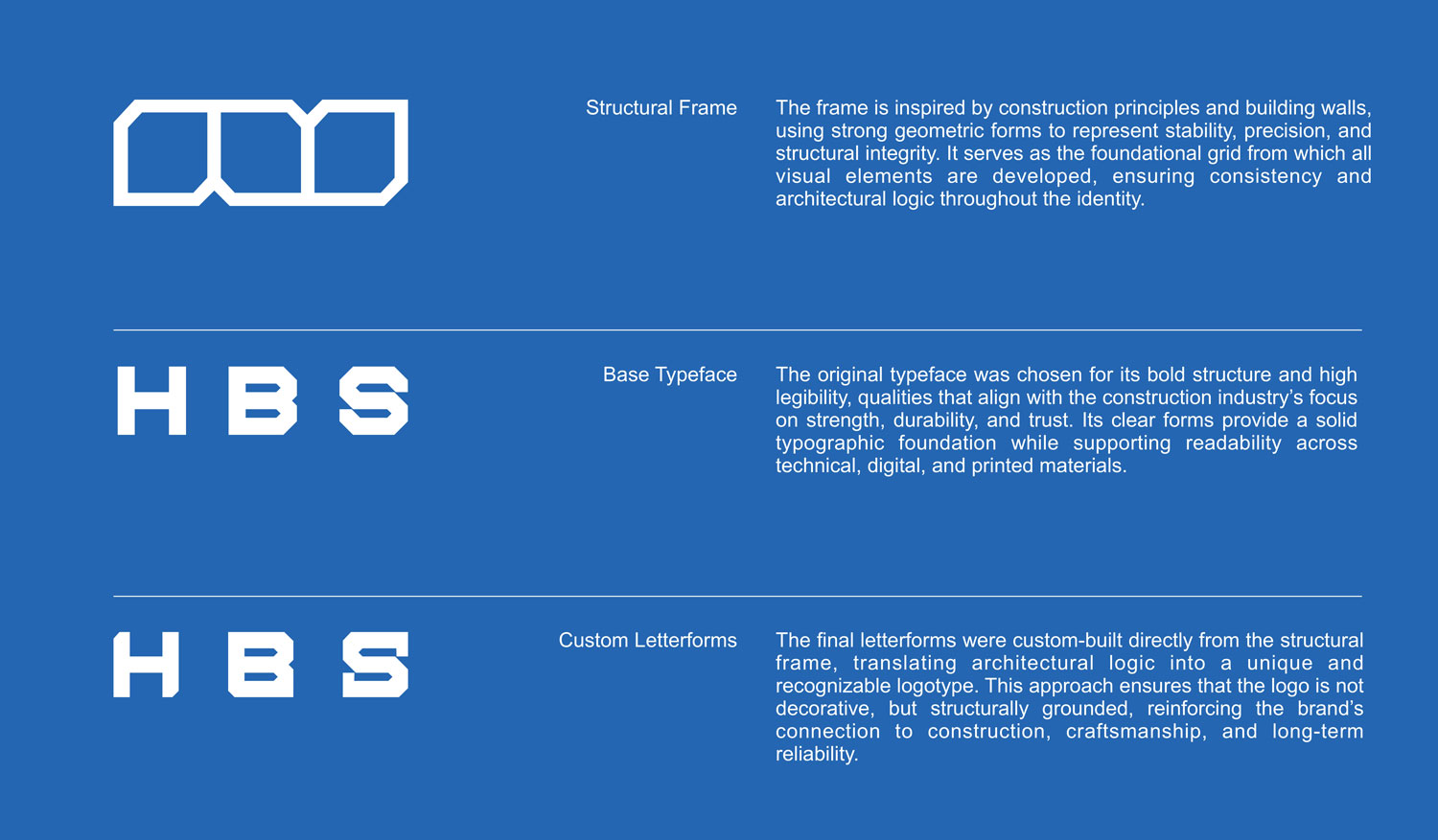
The logo was built in three steps, and each one is still visible in the final mark.
First, the structural frame: three cells joined into one outline, with angled cuts where they meet and at the outer corners. It is the grid every other element of the identity is drawn from.
Second, a base typeface, chosen for its bold structure and high legibility, exactly the qualities the old logo lacked. It gave the letters strength and readability across technical documents, screens and print.
Third, custom letterforms. Starting from the base typeface, each letter was redrawn to fit its cell, with its corners cut to echo the frame's chamfers, so frame and letters read as one construction rather than a typeface placed inside a box.
The system
One blue in four tones, one typeface, one pattern
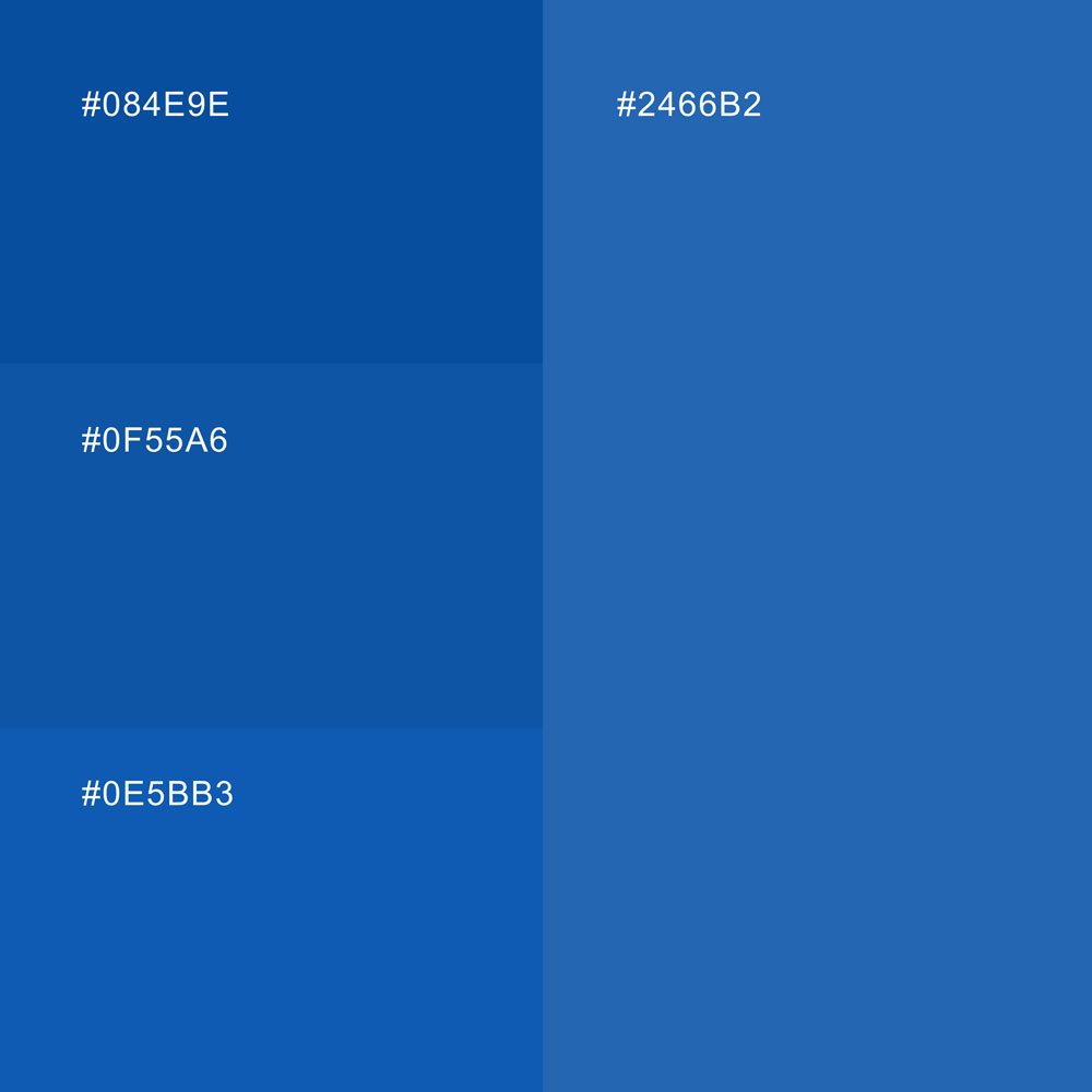
Colour is a single blue in four tones, from #084E9E to #2466B2, used with black and white. Keeping the palette to one hue gives HBS a colour it can own, and the tonal range gives enough depth for print, screens and signage without introducing a second colour.
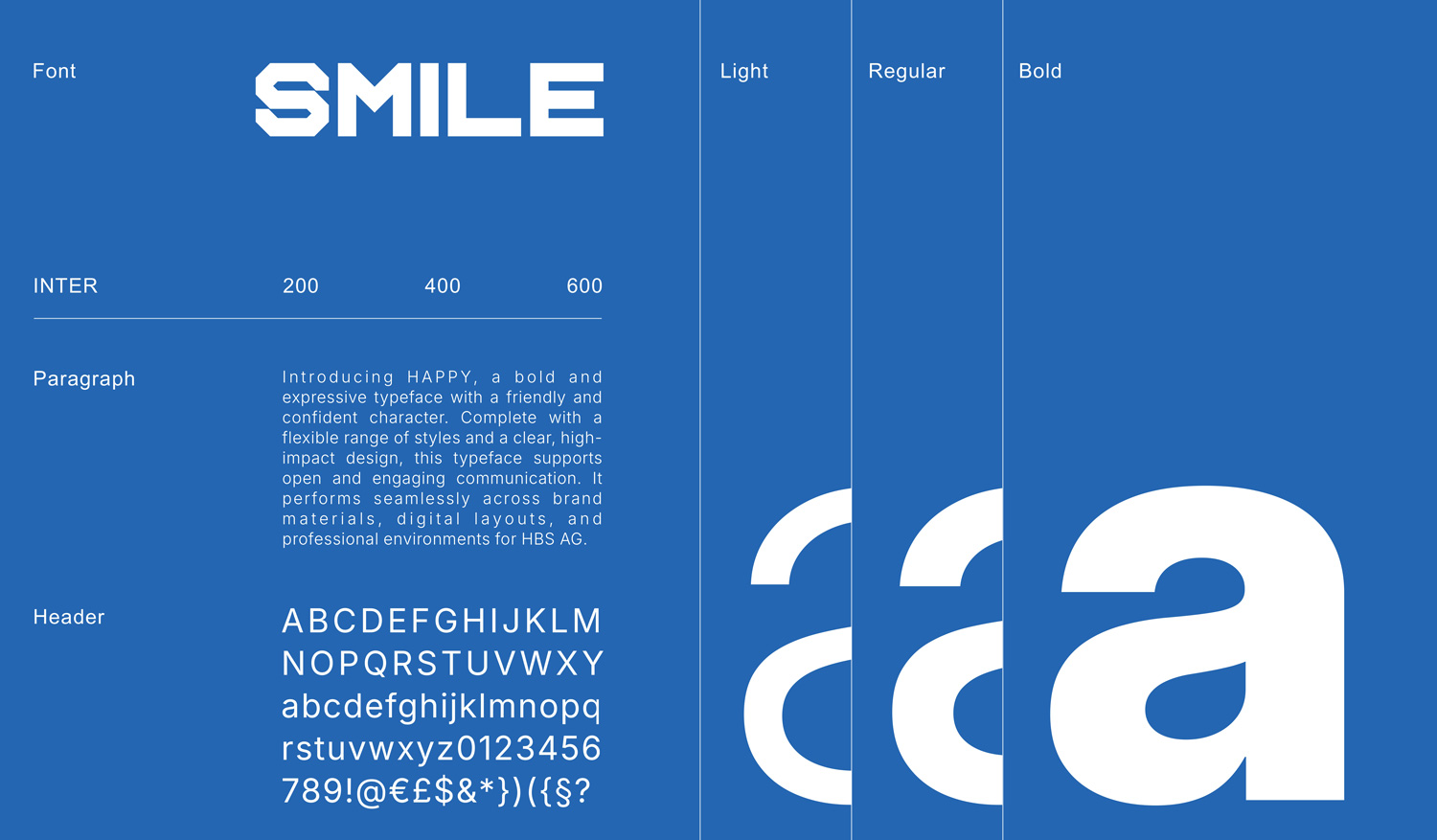
Typography is Inter throughout, in three weights: 200 for light use, 400 for text and 600 for emphasis. It stays legible at every size and is neutral enough to leave the logotype as the only expressive typographic element.
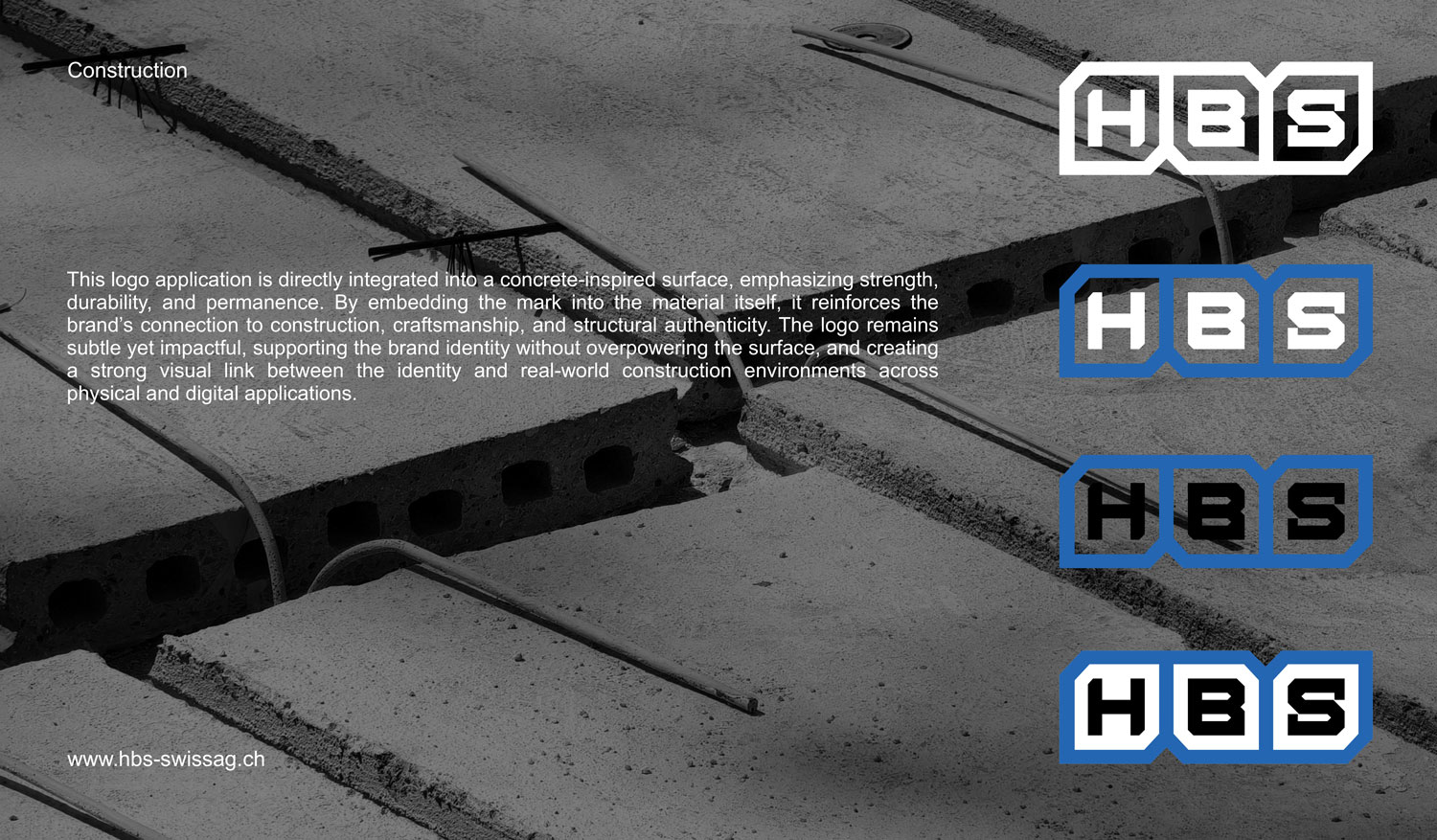
The logo comes in four versions: the full-colour primary mark with a blue frame, white cells and black letters; two transparent versions with a blue frame and either white or black letters; and an all-white version.
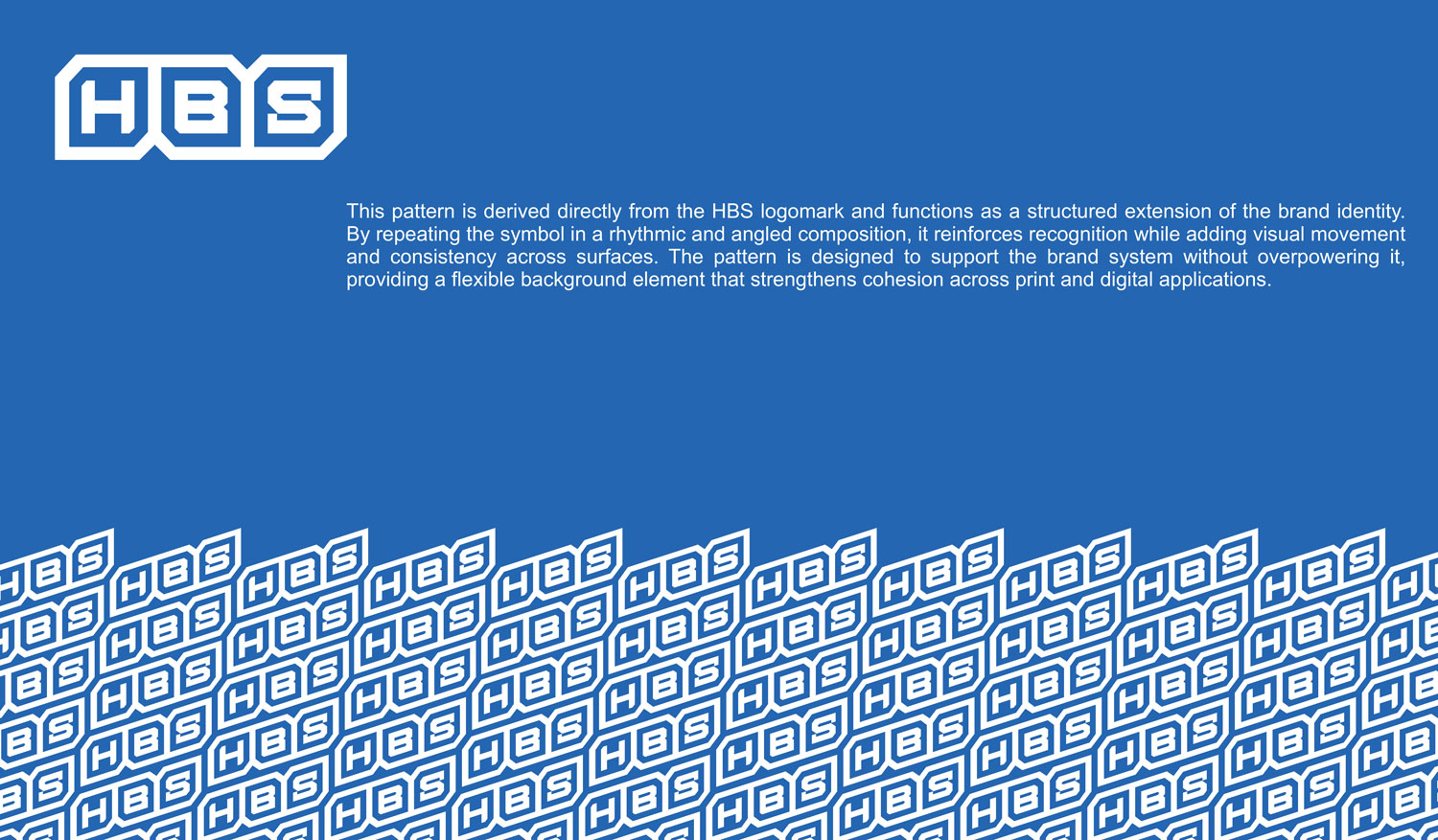
A brand pattern completes the system: the logomark repeated in a rhythmic, angled composition. It lets HBS fill large surfaces with the brand without repeating the logo at full size, adding recognition and movement in the background of print and digital layouts while the logo itself stays the focal point.
Applications
From concrete to screen
The identity was designed to hold up wherever HBS appears, and each logo version has its ground. The full-colour mark works on white paper and documents, the transparent versions on blue and light backgrounds, and the all-white version on dark surfaces and photography. There is always a correct version, so the logo never ends up somewhere it cannot be read, a problem the old mark had everywhere.
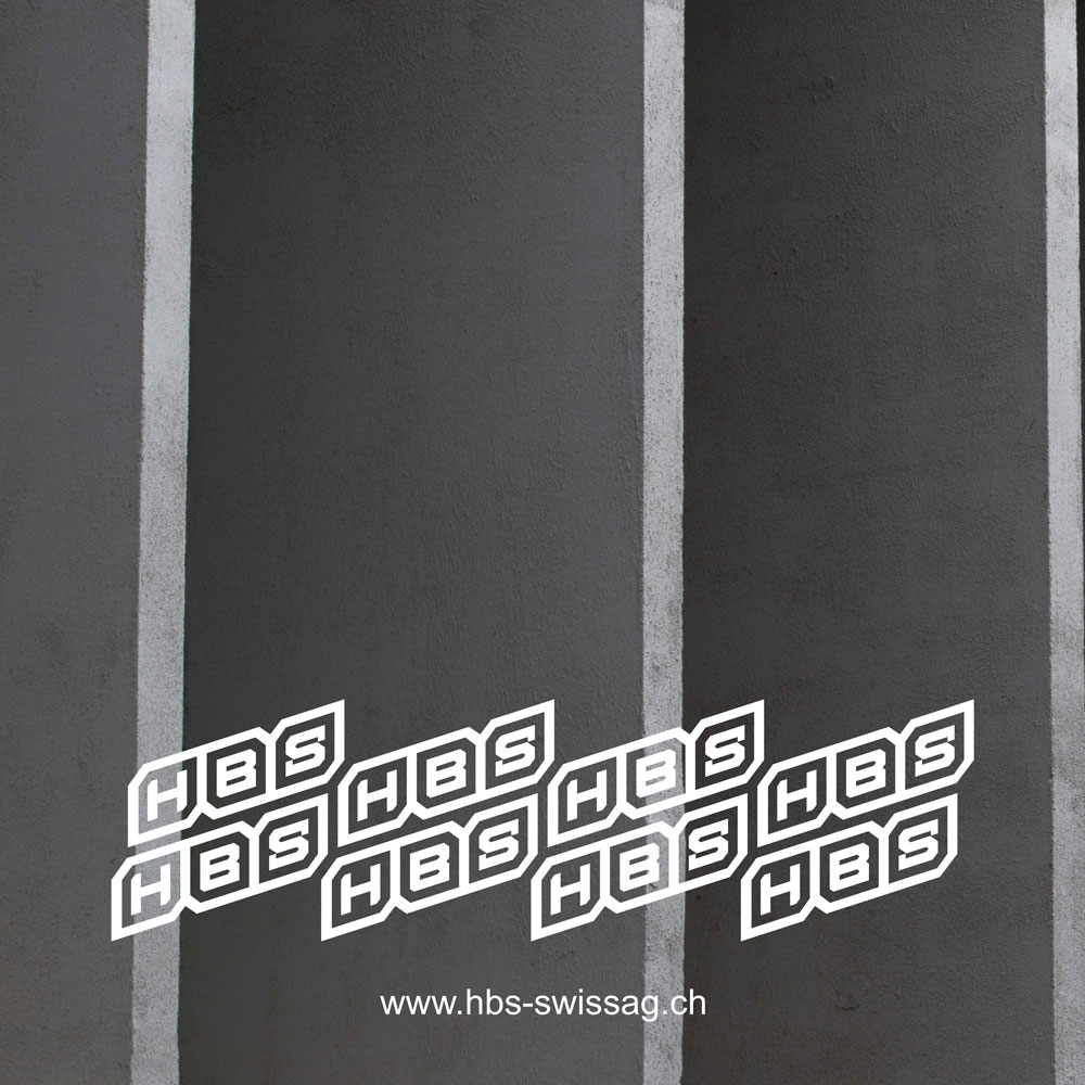
In the workbook the identity is shown against concrete walls and slabs, with the pattern running along a raw wall and the mark sitting on poured concrete. The point is to show it stays legible and strong on the materials of a building site, not only on a white page.
In print, the system became a full set of company stationery: business cards, letterhead and a brochure. Each uses the same blue, Inter for all text and the logo version suited to its background, so a card handed over on site and a brochure sent to a client read as the same company.
When I built the HBS website, the system carried straight over: the four-tone blue became full-bleed sections, Inter became the single typeface of the interface, and the logo sits at the top of every page.
Outcome
Accepted at first sight
Of the four directions presented, the client chose this one immediately and accepted it on the spot. After almost 25 years on a logo that was hard to read, HBS now has an identity built on reasoning it can explain: a frame drawn from construction, letters fitted inside it, and a system that keeps them consistent wherever they appear.
The workbook keeps it that way. Colours, typeface, logo versions and pattern are documented in one place, so anyone producing material for HBS, whether a printer or a web developer, works from the same rules rather than from guesswork. The stationery and the website were the first proof of that: both were produced entirely from the system, and nothing about the brand had to be decided twice.