- Industry
- Restaurant
- Service
- Brand Identity · Logo Design ·
Brand System - Agency
- Monun AG
- Location
- Näfels,
Switzerland - Deliverables
- Logotype, colour palette, typography, graphic pattern
Company
A restaurant with its own guests
Glaré is the restaurant of Cityhotel, a four-star hotel in Näfels, in the canton of Glarus. It shares the hotel’s building but not its guests: hotel guests book weeks ahead, while Glaré’s guests are mostly local and come for the food. Until 2026 the restaurant appeared under the Cityhotel logo. When the company decided to present it as a business in its own right, it needed an identity of its own. The work was done at Monun AG in 2026.
The brief
Minimal and modern, not classic
The client came with a clear direction: a logo that is very minimal and modern, and that avoids the classic look of traditional restaurant branding. It had to stand next to Cityhotel without reading as a sub-brand, and work in print and on screen at any size. The name was given: Glaré, taken from Glarus, the canton the hotel stands in.
The logo
One line, five letters
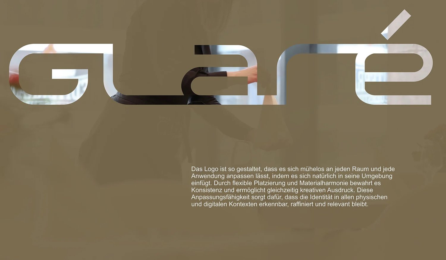
The wordmark is drawn from a single line. One stroke of constant weight builds every letter, and the letters connect along a shared baseline, so the name reads as one continuous form rather than five separate characters. The construction is strict (straight horizontals and verticals, rounded corners), which keeps the mark minimal and modern. The rounded corners keep it warm, which matters for a restaurant.
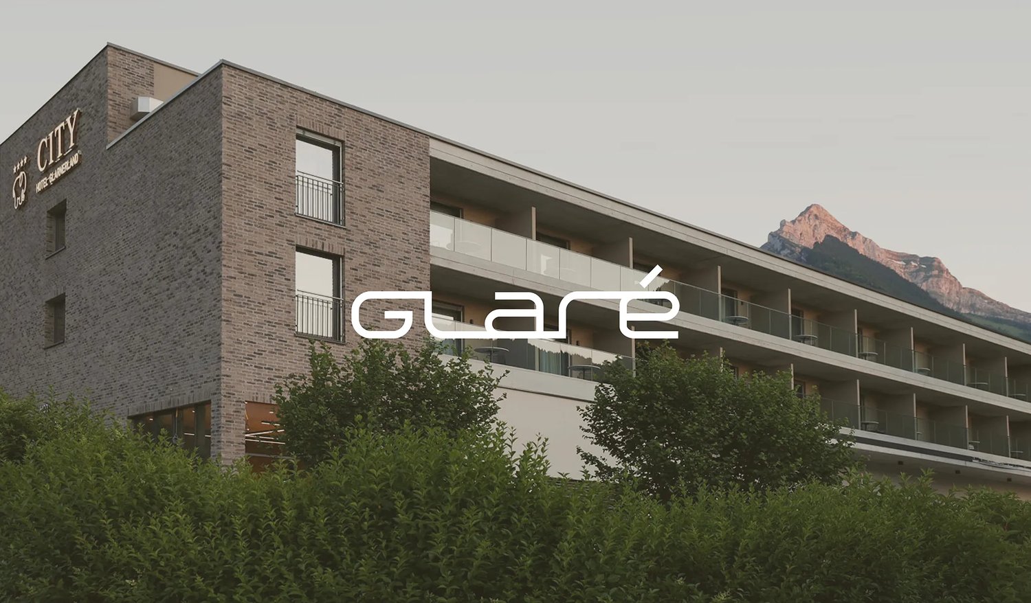
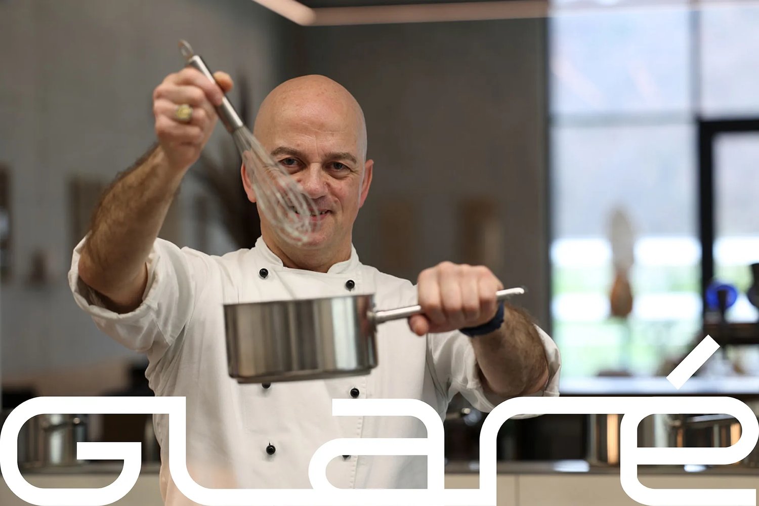
The accent is the only stroke that leaves the line: a short diagonal set apart above the e, and on light grounds the one element in bronze. The mark holds up reversed out on olive, in black on cream, and at full width as a cut-out over photography.
Colour
Taken from the building
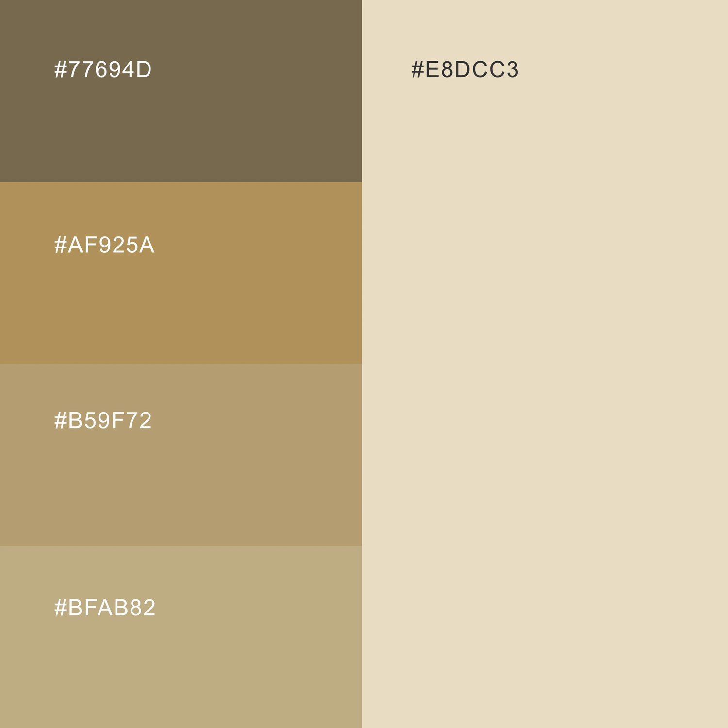
The palette comes from the hotel itself: its wooden window frames and doors, and its tiles. Olive (#77694D) is the primary ground and bronze (#AF925A) the accent. Two sand tones (#B59F72 and#BFAB82) sit between them, and cream (#E8DCC3) is the light ground. Because the colours come from the materials guests see when they sit down, the brand and the room read as one. They also sit close to the cream and bronze of the Cityhotel website, so the two brands share a family resemblance without sharing a logo.
The system
A pattern from the letterforms
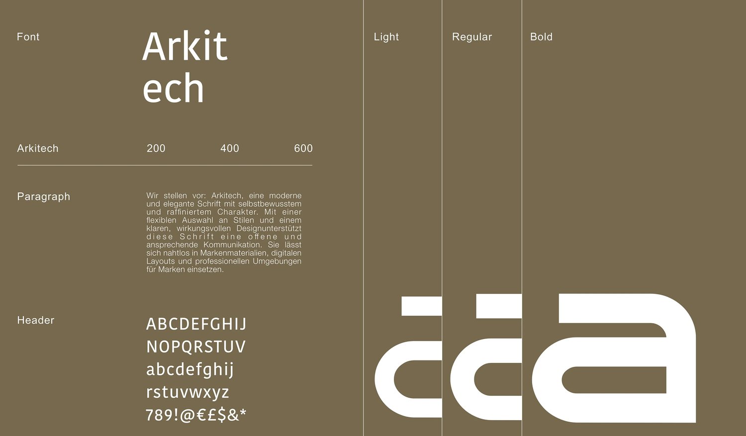
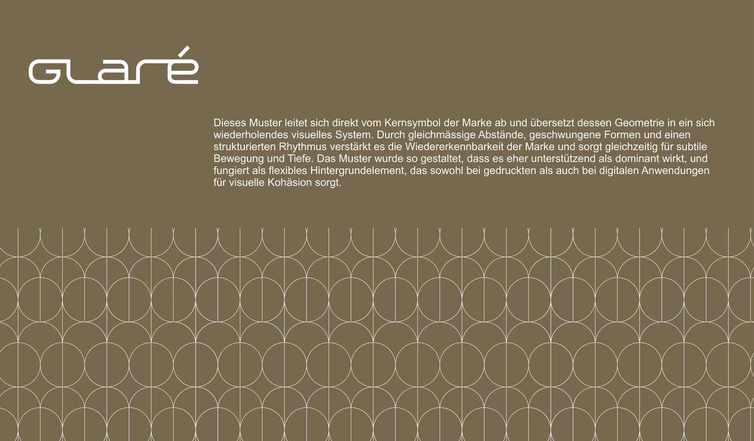
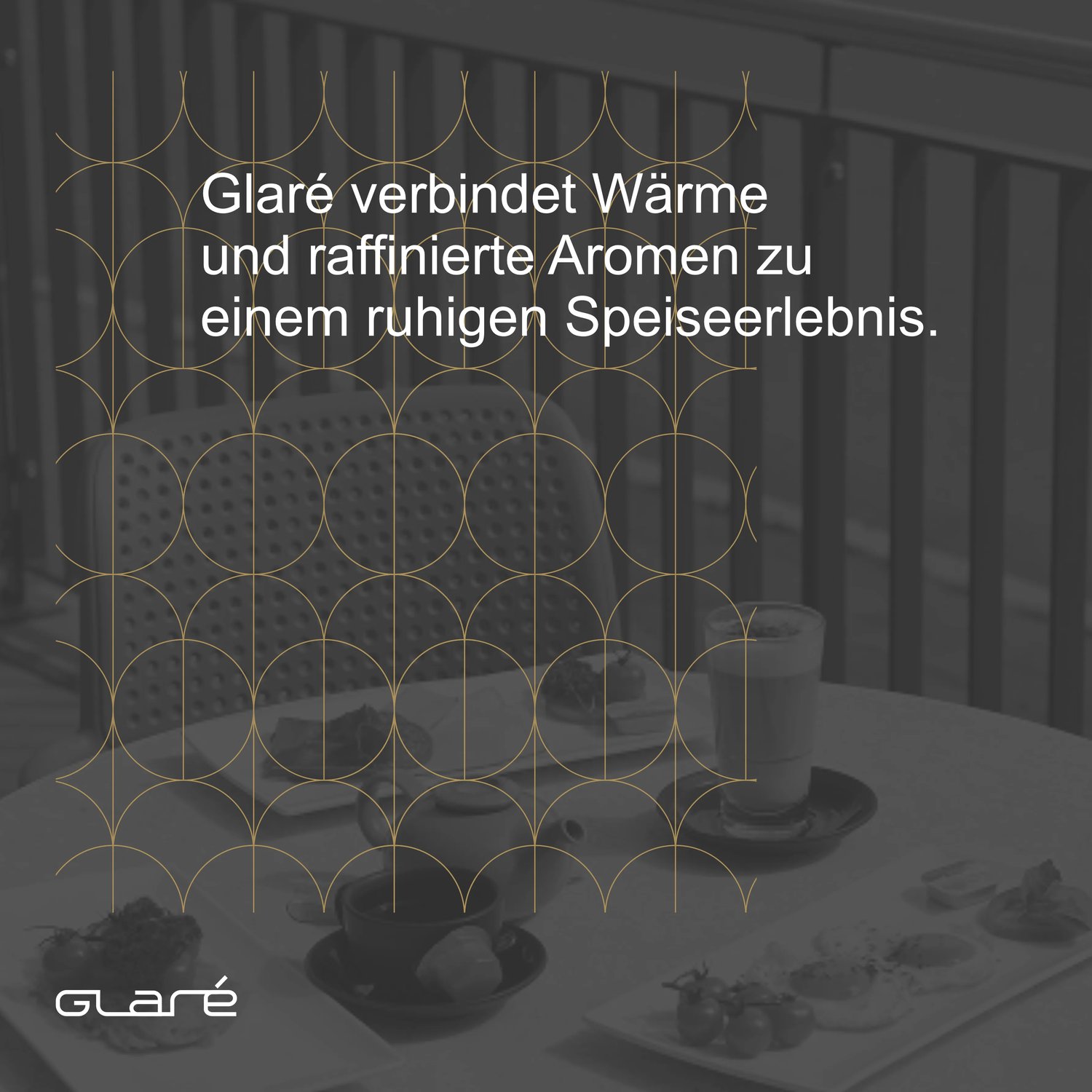
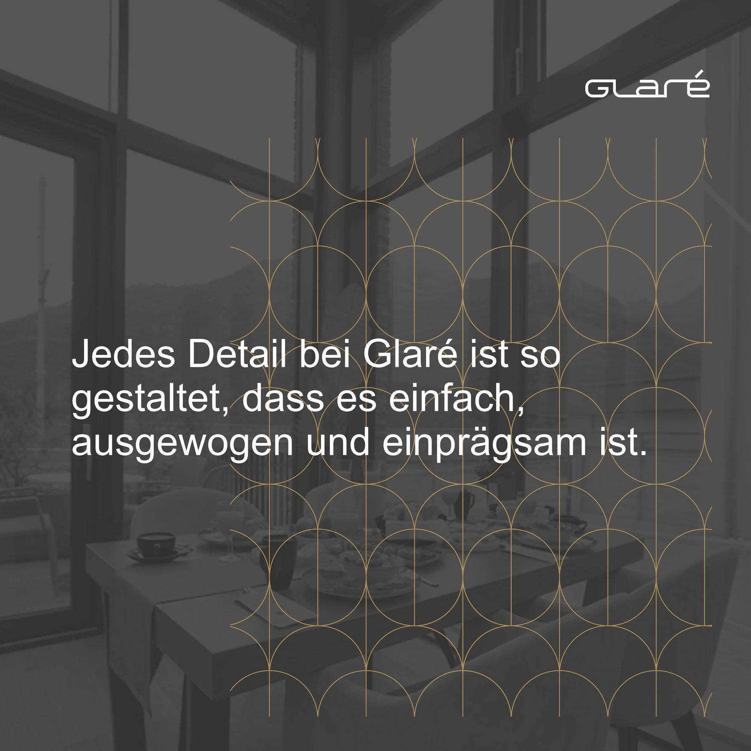
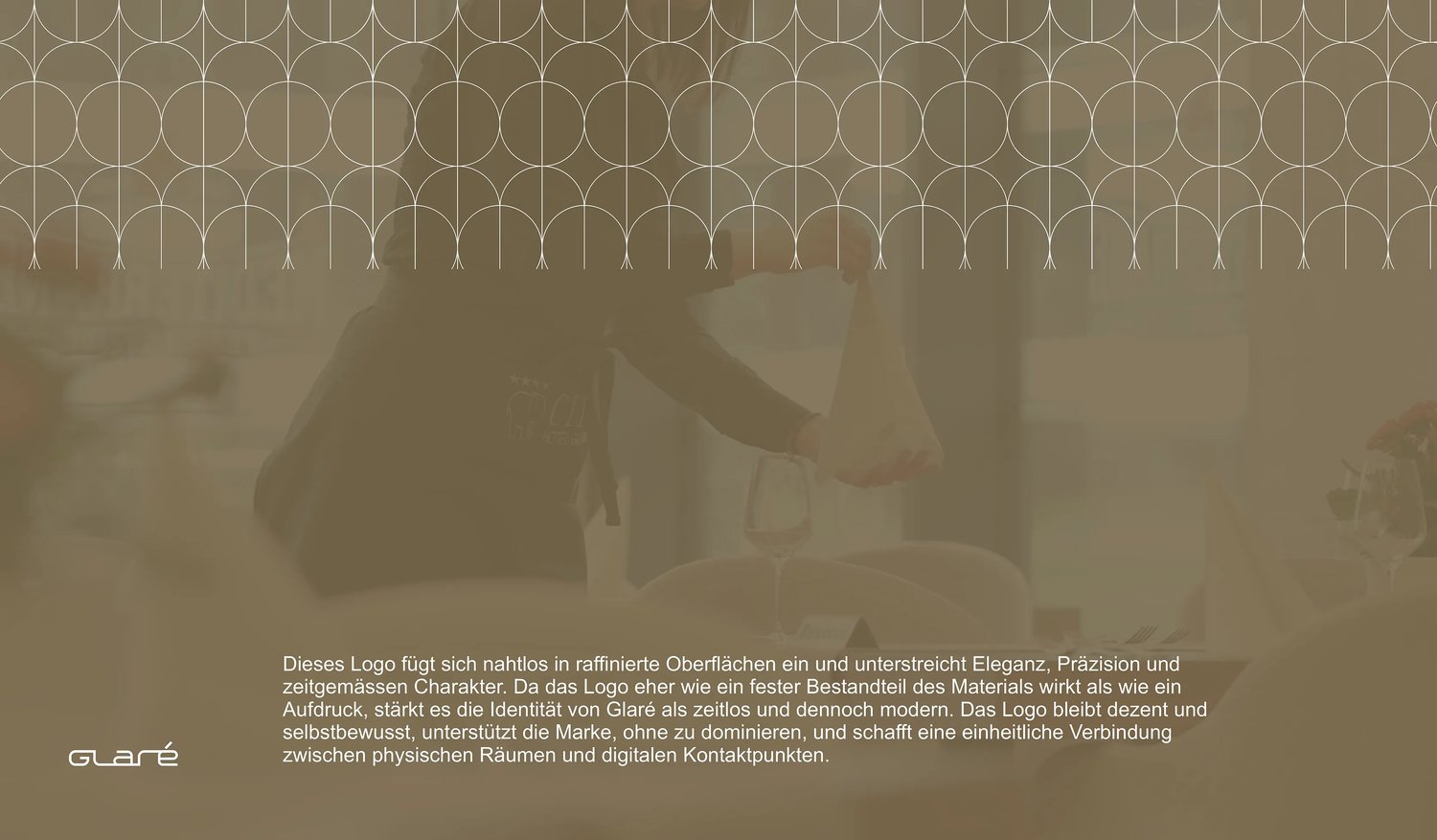
The pattern is built from the same geometry as the wordmark: vertical lines and arcs, repeated at equal intervals. It adds rhythm and depth without competing with the logo, and works on a flat olive ground and as a fine bronze line over black-and-white photography. Arkitech, in light, regular and bold, sets everything around the mark.
Outcome
A restaurant with a name of its own
Glaré now has an identity separate from the hotel’s, but clearly from the same house. The logo is in use, including on the Cityhotel website, where the header switches to Glaré on every restaurant page.