WMK
- Industry
- Education
- Service
- Brand Identity · Brand System ·
Art Direction - Location
- Zurich,
Switzerland - Deliverables
- Brand strategy · Logotype · Colour palette · Typography · Graphic pattern · Photography style · Brand guidelines · Stationery · Digital and print assets
Company
A new academy for people who work in marketing
WMK is a private academy in Zurich that teaches modern marketing and communication, from building an online presence to performance marketing, content strategy and consumer psychology. Its students are marketing professionals, career changers and company employees building new skills. The name carries its subjects: Wirtschaft, Marketing, Kommunikation.
The academy was new, so this was a brand built from nothing. I worked with WMK directly in 2026.
The brief
Look established on its first day
A new academy has no reputation yet, so its brand has to supply the credibility that years would normally provide. At the same time, WMK teaches the newest parts of marketing, and a brand that looked like a traditional institution would contradict what it teaches. It had to feel academic and current at once.
The client added one clear instruction: keep the logo simple, and put the richness into the branding around it.
Research
Clear, simple, and all alike
Before designing anything, I went through a wide range of academies and business schools. Almost all of them had the same kind of brand: a simple mark, a simple concept, and nothing wrong with either. The problem was that simplicity had made them similar. Few of them gave a reason to remember one over another.
The client had said the same thing in their own words: they wanted to be different, above all in colour and in branding. The research showed where that difference could come from. Simplicity in the logo was worth keeping, because it is what makes an academy look clear and trustworthy. Colour and the system around the mark were where the category had nothing to say, so that is where WMK would speak.
The logo
Three letters, and what they stand for
The mark is the three initials set in a heavy grotesque with tight spacing, so they read as one solid block. A thin vertical rule separates them from the three words they stand for, Wirtschaft, Marketing and Kommunikation, stacked in a lighter weight.
The logo explains itself. An acronym on its own expects the reader to already know the name. Here the meaning sits right beside it, so a first-time visitor learns what WMK teaches in the same glance that shows them the name. For an academy nobody had heard of yet, that did more work than a symbol could. Of the early directions I explored, this one answered the brief most directly, and it was accepted immediately.
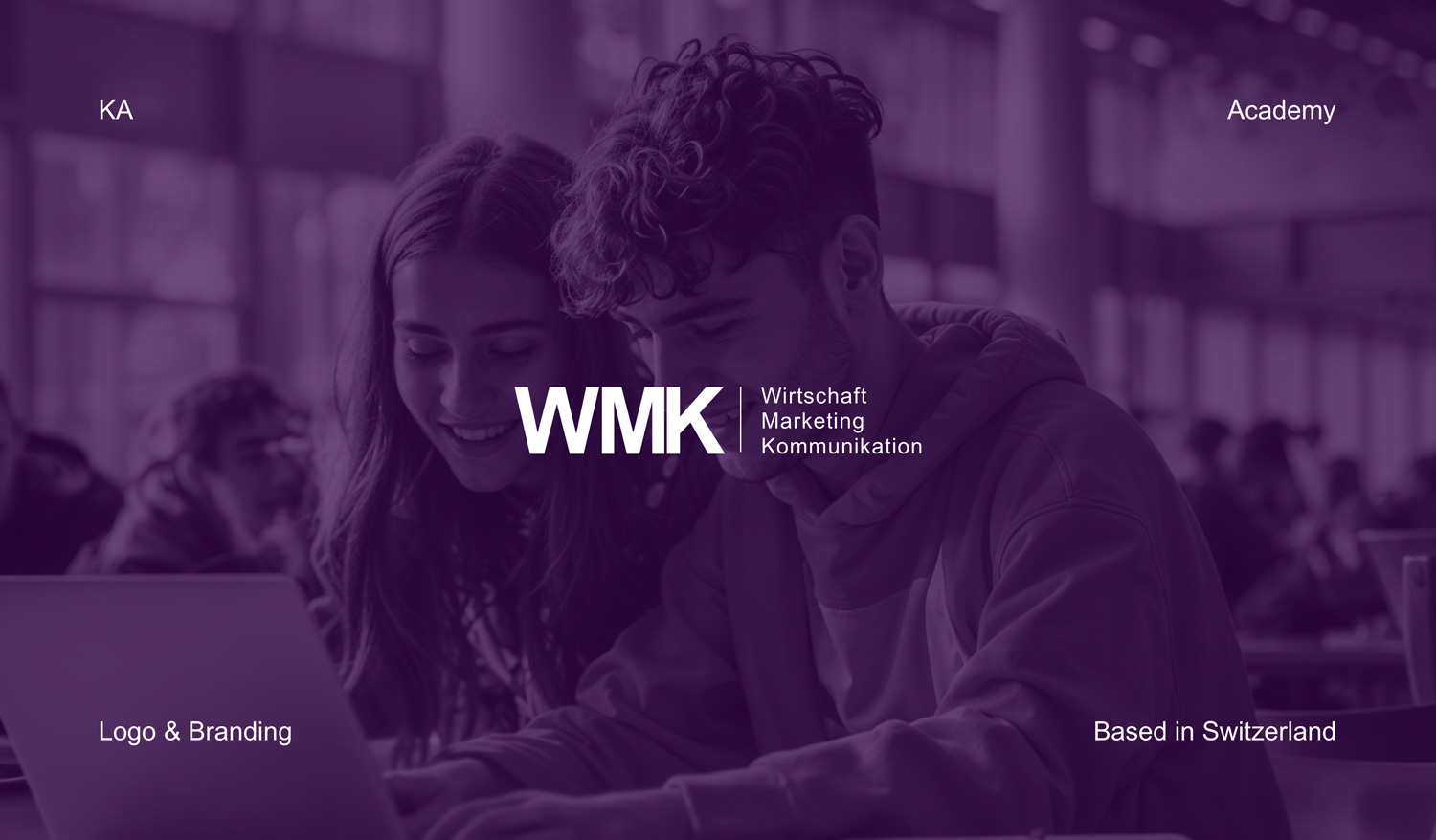
The logo also steps down with the space it has. Where there is room, the full lockup appears with all three words. In tighter spaces the initials stand alone, and over photography the brand often signs off with just Akademie and WMK in small type, leaving the images and the pattern to do the rest.
Colour
Creative, but still serious
Colour was the first place WMK could stand apart from the academies around it, so it needed a colour with a point of view. WMK teaches creative disciplines, so I proposed purple, and the client approved it. It signals creativity without tipping into playfulness, and in its deeper tones it carries the weight an academy needs.
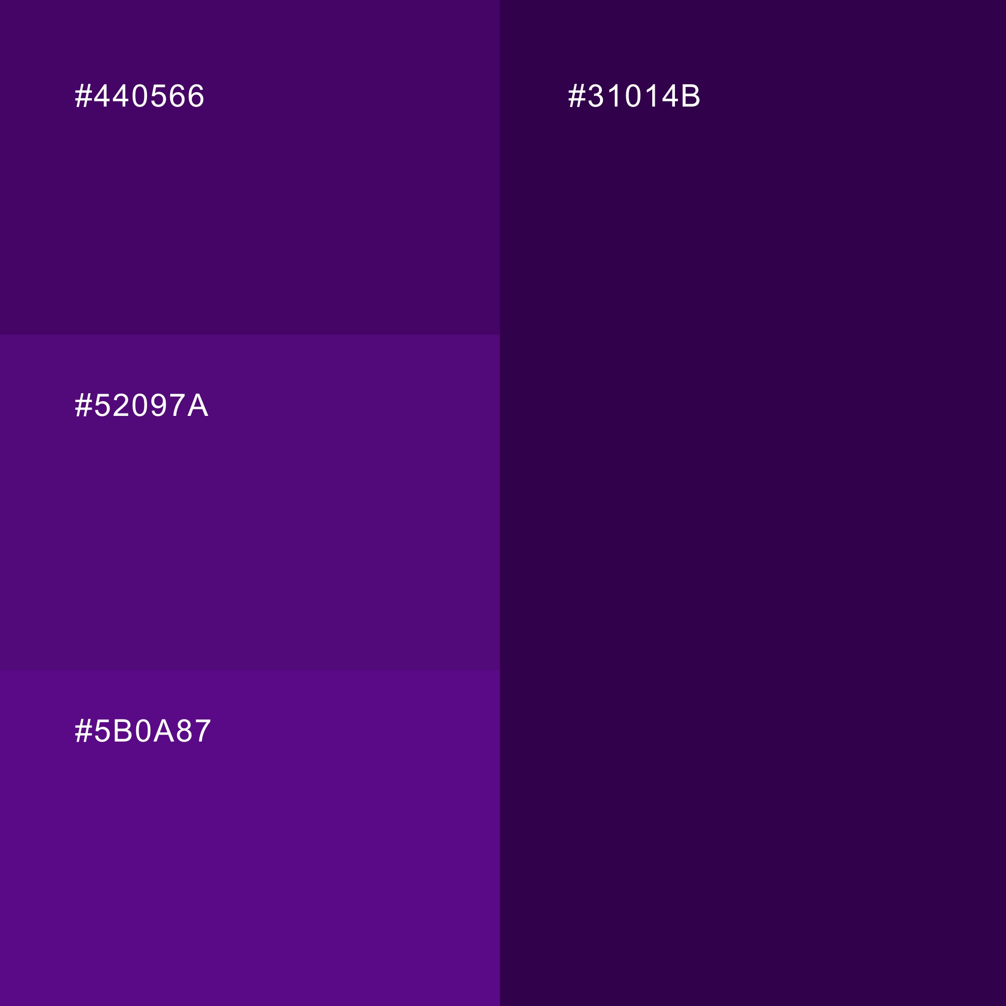
The palette is a range of deep purples, #31014B, #440566, #52097A and #5B0A87, used with white. The darkest tone is the main ground for type and pattern, and the lighter purples carry the photography.
Every tone in the range also works with white text. Against white type, the four purples reach contrast ratios between 11.4:1 and 17:1, well beyond the 7:1 that WCAG sets for its highest level, so text can sit on any purple in the palette without a legibility problem.
Typography
A typeface everyone already has
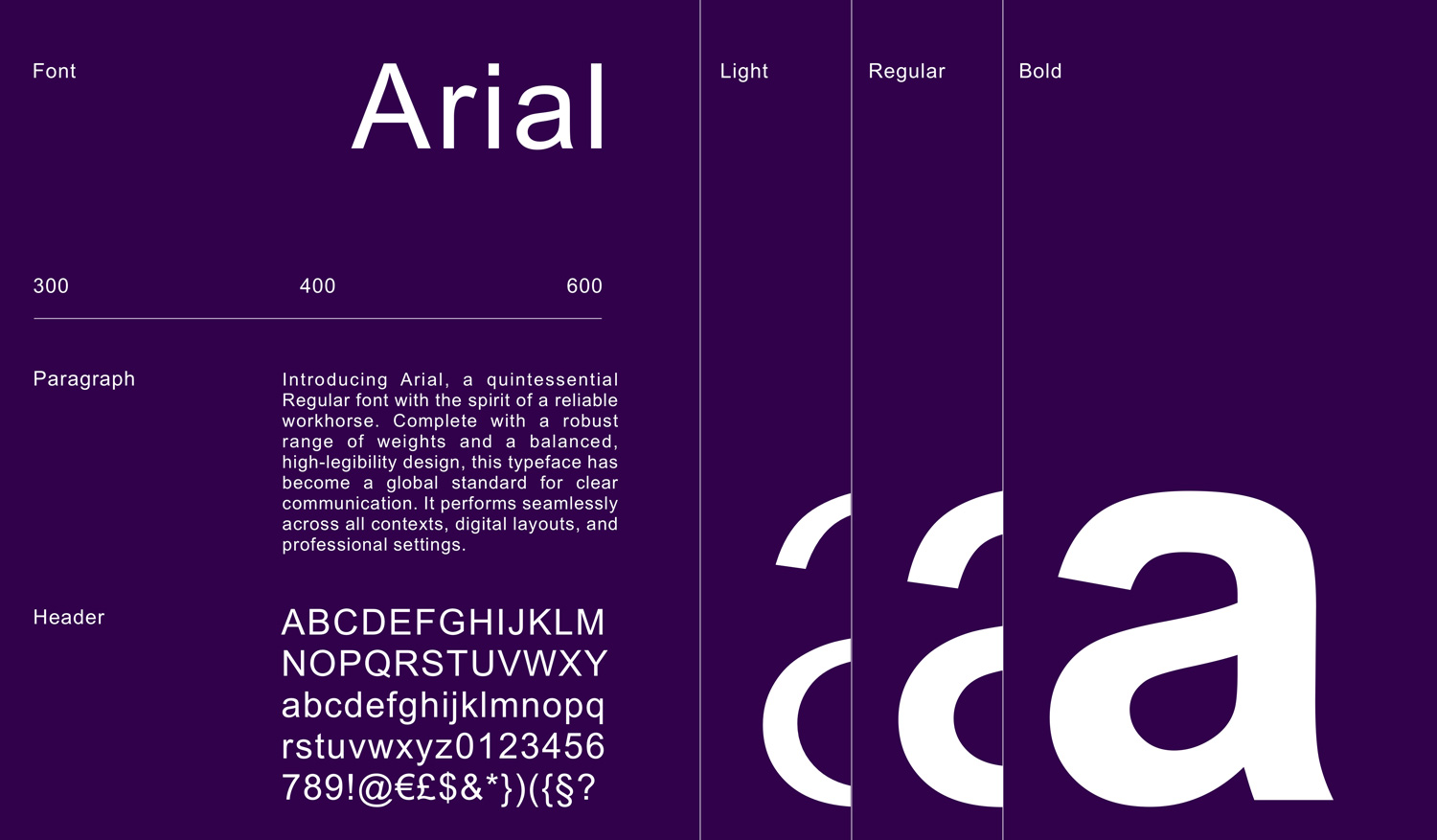
For a brand system, Arial is an unusual choice, and a deliberate one. An academy produces a constant stream of material, course documents, slides, emails and social posts, much of it made by staff rather than designers. Arial is installed on practically every computer and renders the same in office software and email, so the brand holds together even in material I will never see.
Regular and bold cover everyday use, with a lighter weight kept for larger display text.
The system
Everything the logo leaves out
Because the logo stays simple, the character of the brand lives in three elements around it.
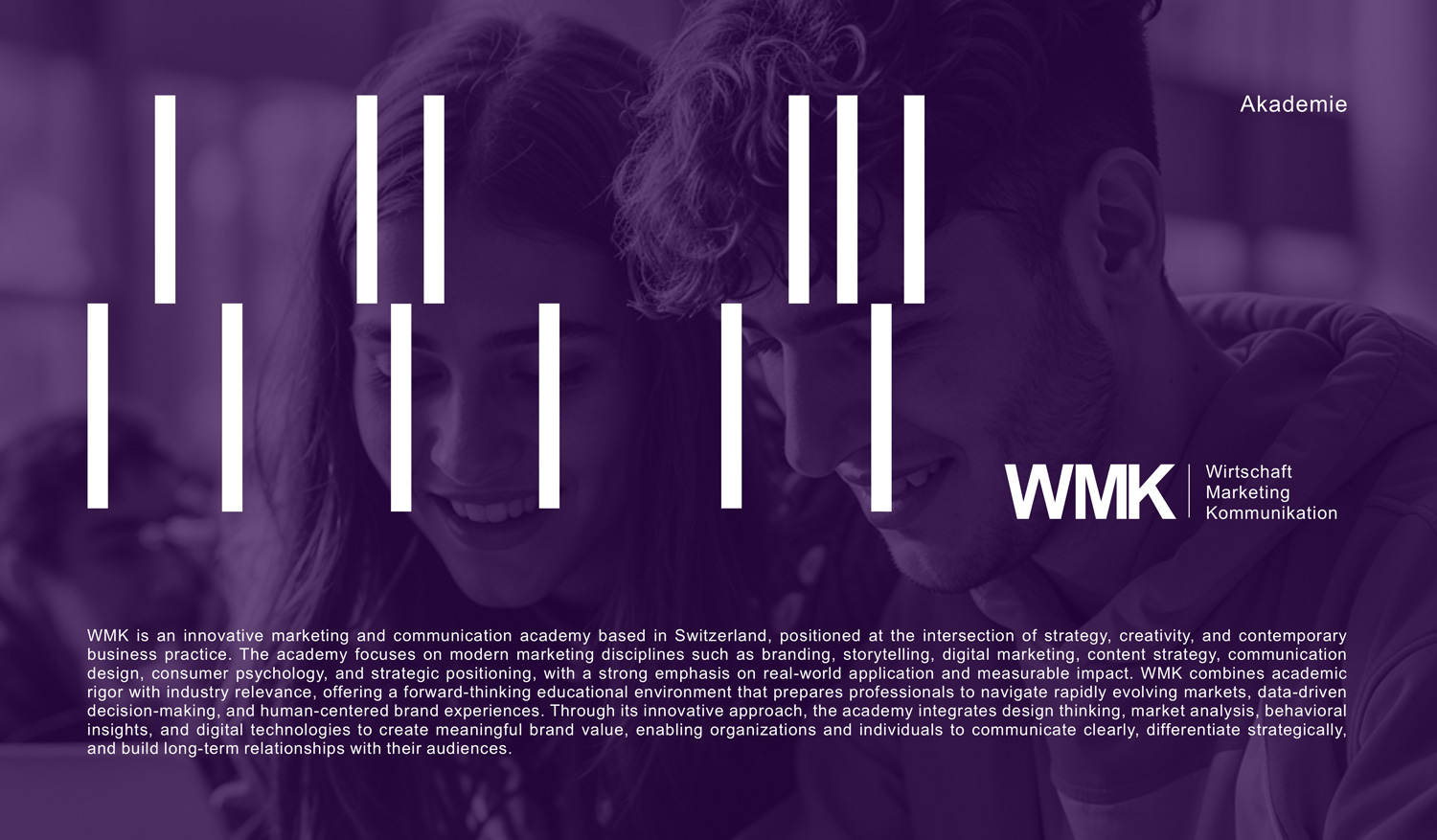
The first is a pattern of vertical white bars in different lengths, set in staggered rows. The bars stand for movement. Marketing and technology are fields that never stand still, and the people learning them are moving too, from one skill and one stage of their career to the next. Offset at different heights, the bars read as momentum rather than as a fixed grid. The pattern can be packed densely to fill a poster on its own, thinned out to sit behind a headline, or reduced to a handful of strokes over a photograph.
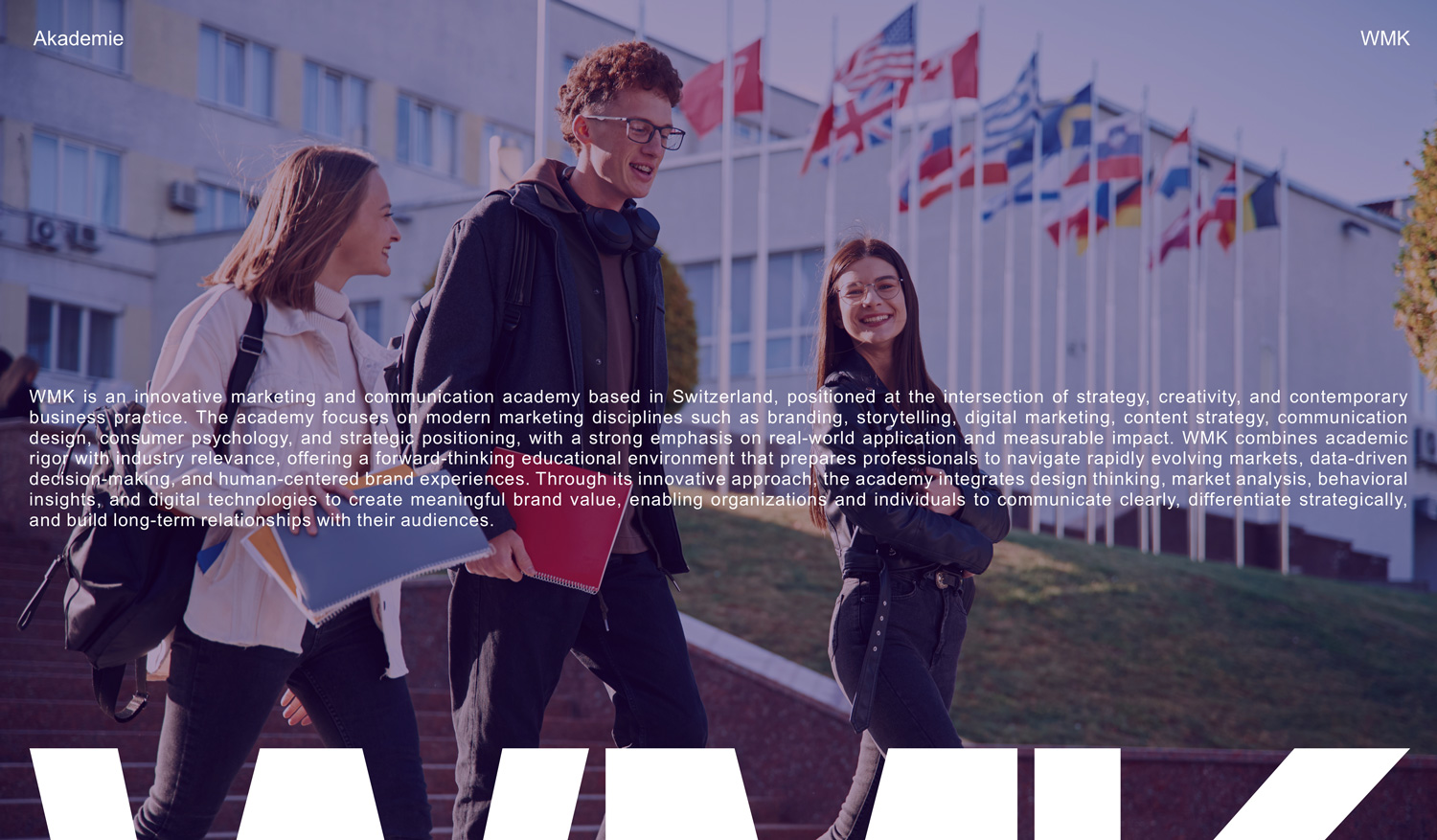
The second is photography. The images show learners in real settings, and every photograph is set in a purple duotone, so pictures from different sources share one voice while the people in them stay the focus.
The third is the logo itself used as a supergraphic: the letters W, M and K enlarged and cropped at the edge of the format, so even a fragment of a letter is recognisably WMK. Headlines complete the voice with short, confident statements, such as Good marketing tells a story, set in capitals and sometimes turned vertical to run the full height of a poster.
Applications
From a phone screen to a wall-sized display
The foundation of the system is a set of three posters that show the same ingredients at three levels of intensity: the bar pattern alone, the pattern with a headline, and the pattern with a headline over photography. Every other format is built from one of those three.
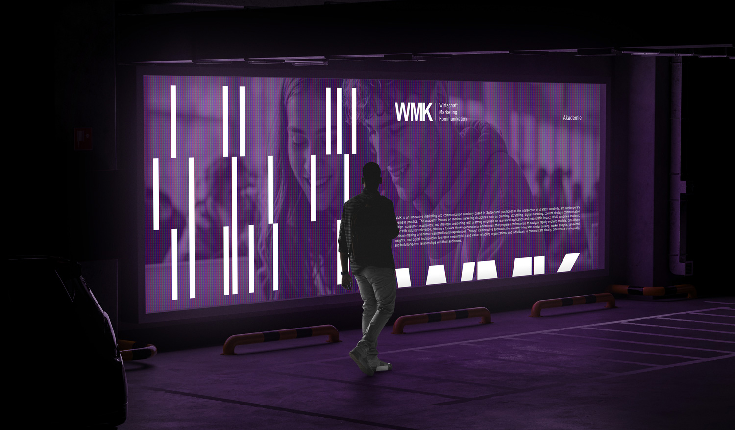
From there the system runs across WMK's media, from digital products to print: square social formats, landscape layouts for screens and presentations, printed materials, and large-format digital displays where the bars and cropped letters work at architectural scale.
Outcome
Launched looking complete
The concept was accepted immediately, and the full system went into use across the academy's media. For an academy with no history, that meant launching with a brand that already looked settled: recognisable from a fragment of the pattern or a cropped letter, consistent across every format, and simple enough at its core that the staff can keep it that way.