Riesen Holzbau
- Industry
- Timber
Construction - Service
- Logo Design ·
Brand Identity - Agency
- Business Leaders AG
- Location
- Switzerland
- Deliverables
- Brand positioning · Icon and wordmark · Colour palette · Brand workbook · Print applications · Workwear
The contest
One of five concepts, and the one they chose
Riesen Holzbau AG has built in timber since 1997: houses, cabins and custom wooden projects. Its original logo had dated and no longer represented the company Riesen had become, so it ran a small design contest to find a new identity. The project came to me through Business Leaders AG, where I was working at the time. Five concepts were presented, mine was chosen, and I then developed it into the full identity.
The idea
A house cut from a single log
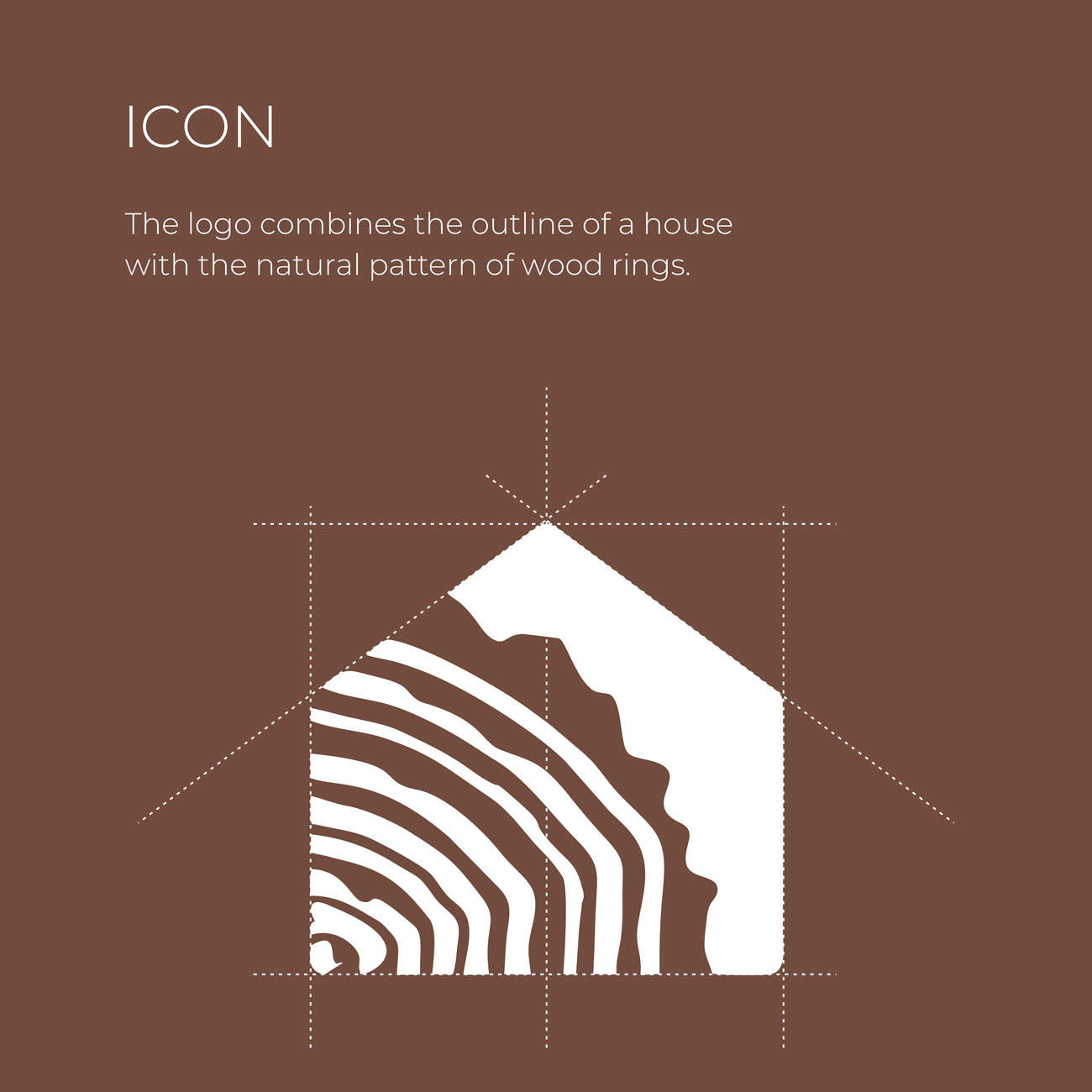
Holzbau means timber construction, and the icon says exactly that in one shape: a house made of wood. Its outline is the plain silhouette of a house, a pitched roof over straight walls. Inside it, instead of a door or windows, sits the end grain of a tree trunk, its growth rings running across the facade.
The mark holds two kinds of form in balance. The house is geometric, drawn on a strict grid with the roof pitch and the walls fixed by construction lines. The wood is organic and uneven, grown rather than drawn. That meeting of the built and the grown is what a timber construction company does every day, and it is what makes the mark recognisably Riesen's rather than any builder's.
Anatomy of the mark
Five parts, one mark
The house. A pentagon set on a construction grid, with the roof angle and wall lines fixed by guides that extend beyond the shape. It gives the mark a stable, architectural base that reads instantly as a building.
The rings. The growth rings radiate from the bottom corner, where the heart of the trunk would be, and widen as they move outward, so the house appears to have been cut from the end of a log.
The outer edge. Toward the roofline the rings give way to a solid band with an irregular edge, like the bark at the outside of a trunk, which carries the organic character right up to the geometric outline.
The wordmark. Riesen Holzbau AG is set in wide, extended capitals with larger initials, a steady horizontal line of type that echoes a timber beam. A rule underneath runs the full width of the logo and grounds the whole composition like a sill.
The tagline. Stolz auf Holz, proud of wood, is the only handwritten element in the identity. Set in a loose script beneath the rule, it adds a human voice to an otherwise engineered logo: the signature of people who work with their hands.
Colour
Wood, charcoal and fresh timber
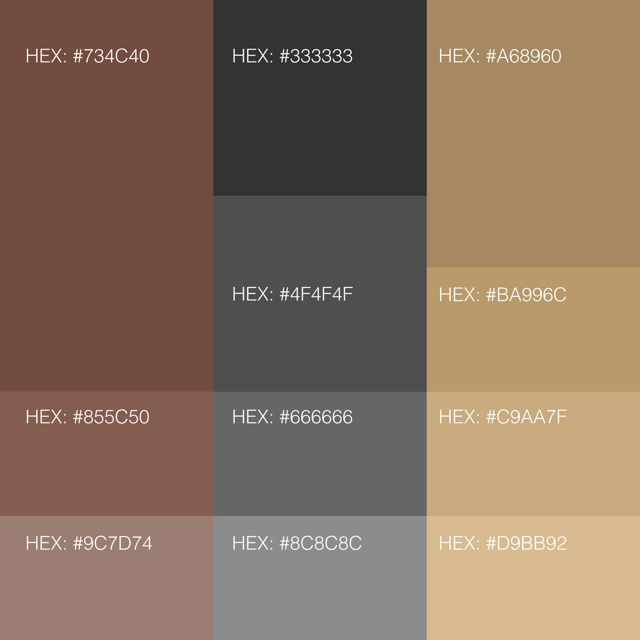
The colours come from the material itself, in three families. A warm wood brown, #734C40, is the primary colour, with lighter tints for backgrounds and secondary use. A charcoal range from #333333 to #8C8C8C covers dark grounds and text. And a range of light timber tones, from #A68960 to #D9BB92, recalls freshly cut wood and brings warmth to dark surfaces.
The logo works in two main versions: brown on white for paper and bright surfaces, and timber tan on charcoal for dark ones. Both stay within natural, material colours, so the brand looks like the same company wherever it appears.
On the building site
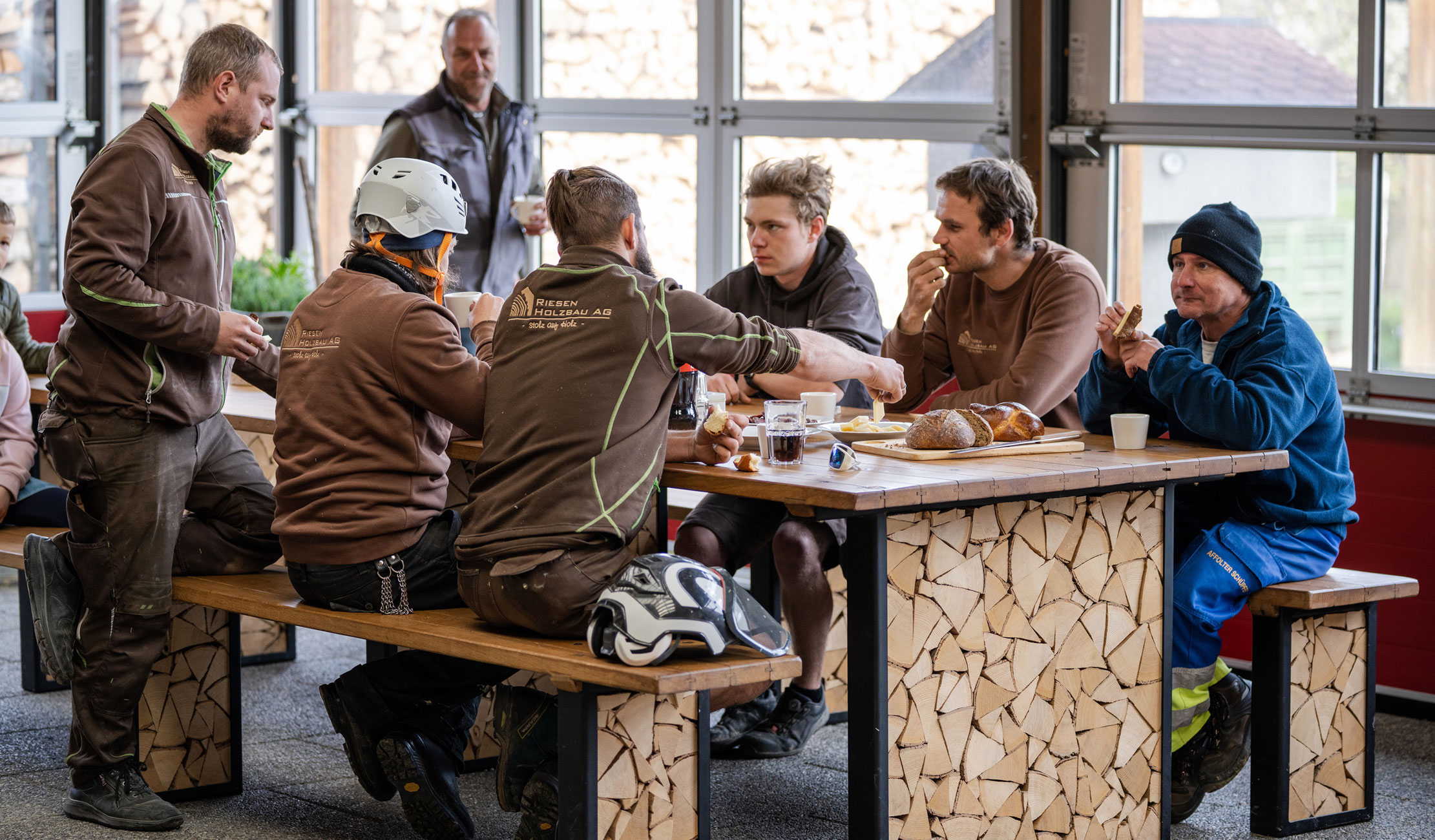
Worn by the people who build
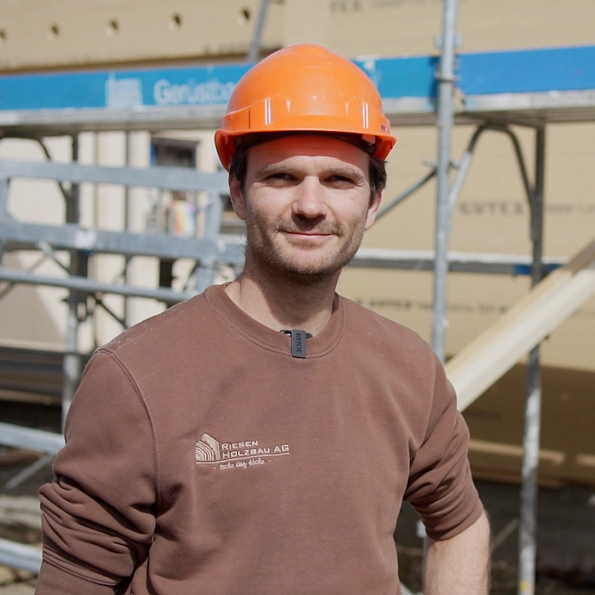
A timber company's brand is seen most on the building site, so it had to work where the work happens. The logo is embroidered on the team's brown workwear in a tone-on-tone timber colour, and even at that size, stitched onto fabric, the house and the rings still read. The same system runs through the company's printed materials.
It is there at the moments that matter to clients, too. At a topping-out ceremony, the Aufrichte, when the roof structure is complete and the traditional small tree goes up, the team stands on the frame in branded shirts. The identity travels on the people, and for a craft business, that is where trust is earned.
Since then
Part of how Riesen looks today
Since the contest, the logo has become a central part of the company's modern appearance: on the team, on site and in print. For a business building in timber since 1997, it is an identity designed around what Riesen is, a builder whose material is also its signature.