Bären Baugruppe AG
- Industry
- Construction &
Roofing - Service
- Logo Design · Lettering ·
Brand Identity - Agency
- Business
Leaders AG - Location
- Urtenen-Schönbühl,
Switzerland - Deliverables
- Logo and lettering · Bear symbol · Colour palette · Typography · Identity pattern · Photography direction · Brand workbook · Site and sponsorship applications
Who they are
From a roofing firm to a building group
Bären Baugruppe AG is a Swiss construction company based in Urtenen-Schönbühl, near Bern. It started out as a roofing contractor and has grown into a building group covering roofing and sheet-metal work, flat roofs, façades, building protection, coatings, painting and renovation, and even drone inspections of tall buildings. It is also a major sponsor in Swiss sport, above all football. The project came to me through Business Leaders AG in 2024.
Before
A name written out, and nothing more
The previous logo was simply the word Bären, set in type with nothing else. It named the company but gave it no mark of its own: nothing to recognise at a distance, nothing that could stand alone on a helmet or a hoarding, and no sign of the animal the name refers to. The client wanted something new and distinctive, a self-contained mark that holds more of the company than a word alone could.
The lettering
The bear moves into the name
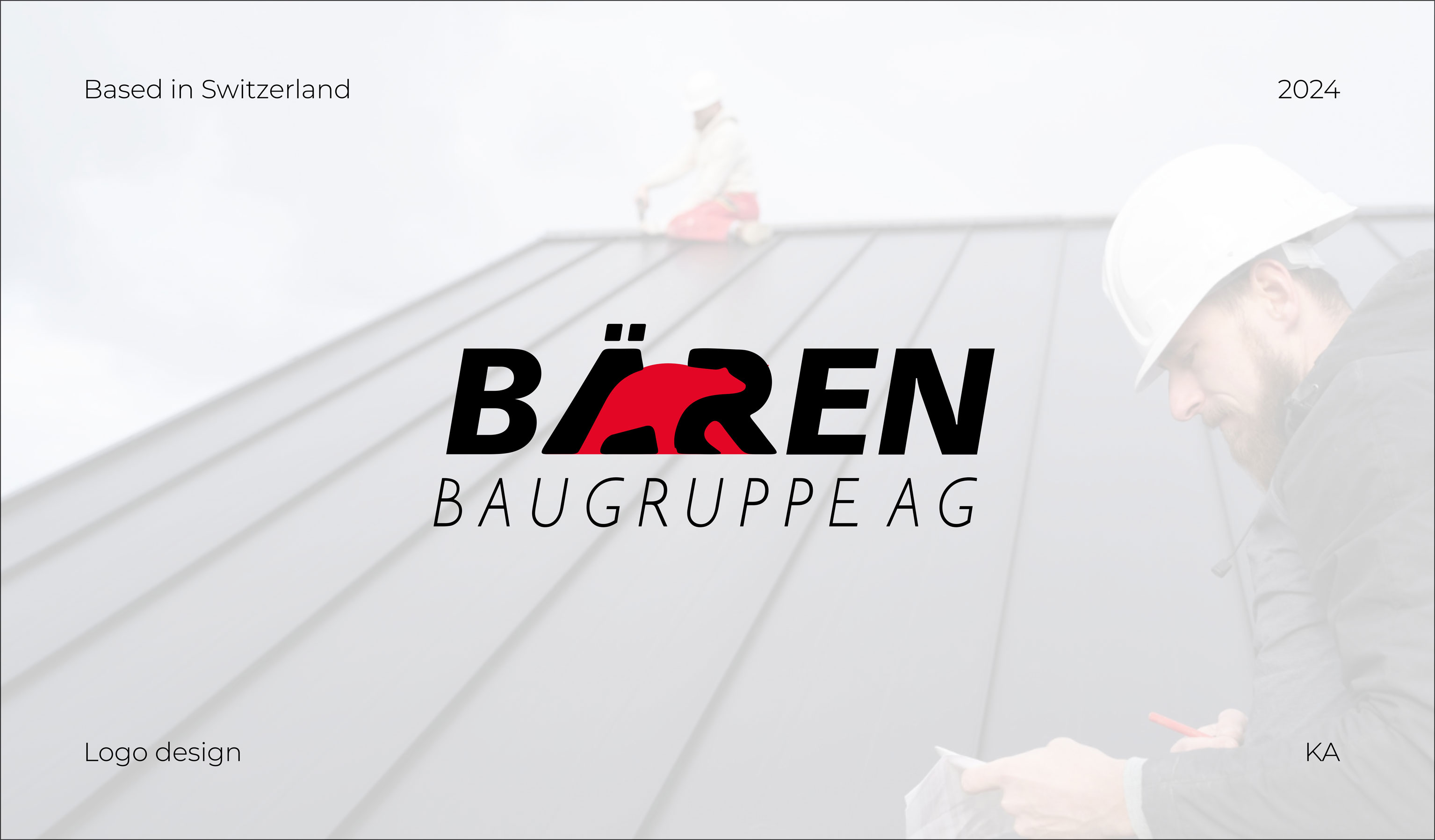
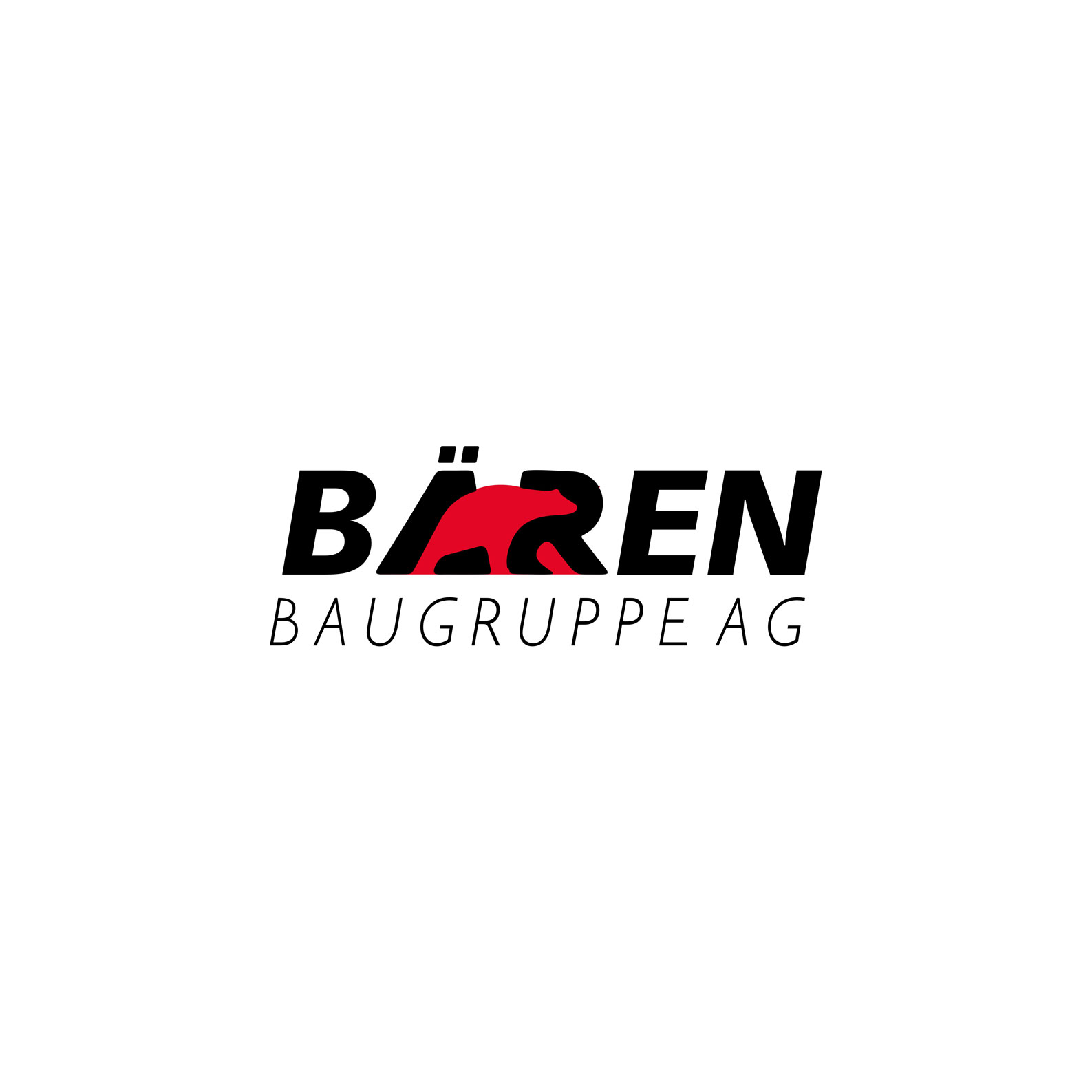
I started with the type. The plain lettering was replaced with a heavy, forward-leaning italic that gives the word real weight. Then, instead of placing a bear beside the name, I built it into the letters. A red bear walks through the middle of the word, taking the place of parts of the Ä and the R, with its legs standing in for their strokes and the umlaut dots still sitting above it.
The name and the animal are now one shape. Bären means bears, and the logo says it twice at once, in words and in image, without needing a symbol next to it. The italic slant and the bear's direction of travel point the same way, forward in the reading direction, which gives the mark its momentum. Below it, Baugruppe AG is set light and widely spaced, a calm counterweight to the heavy name.
Four states
One bear, four ways to appear
In the word. The primary logo: black letters with the red bear walking through them. This is the version for white grounds, print and anywhere full colour can be reproduced.
Carved into the letters. In one colour, white on black or black on white, the bear is not drawn at all. Its outline stays cut into the Ä and the R, so the animal is still there as negative space. The idea survives even when the colour can't.
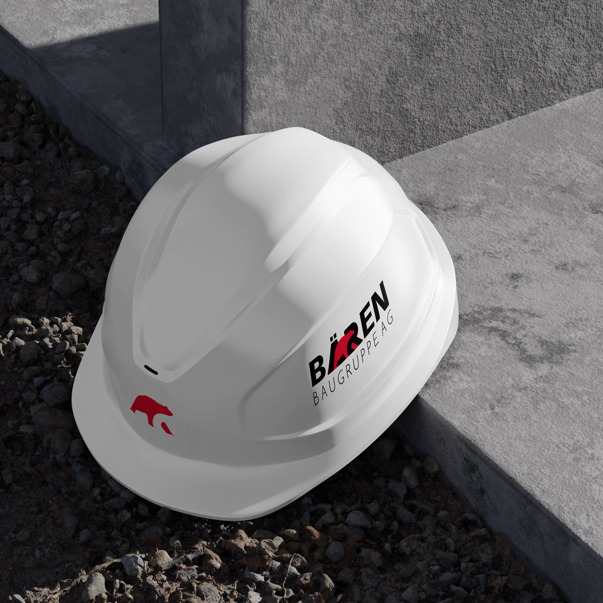
On its own. The red bear works as a standalone symbol, small enough for the brim of a hard hat and other spaces where the full name would be too wide.
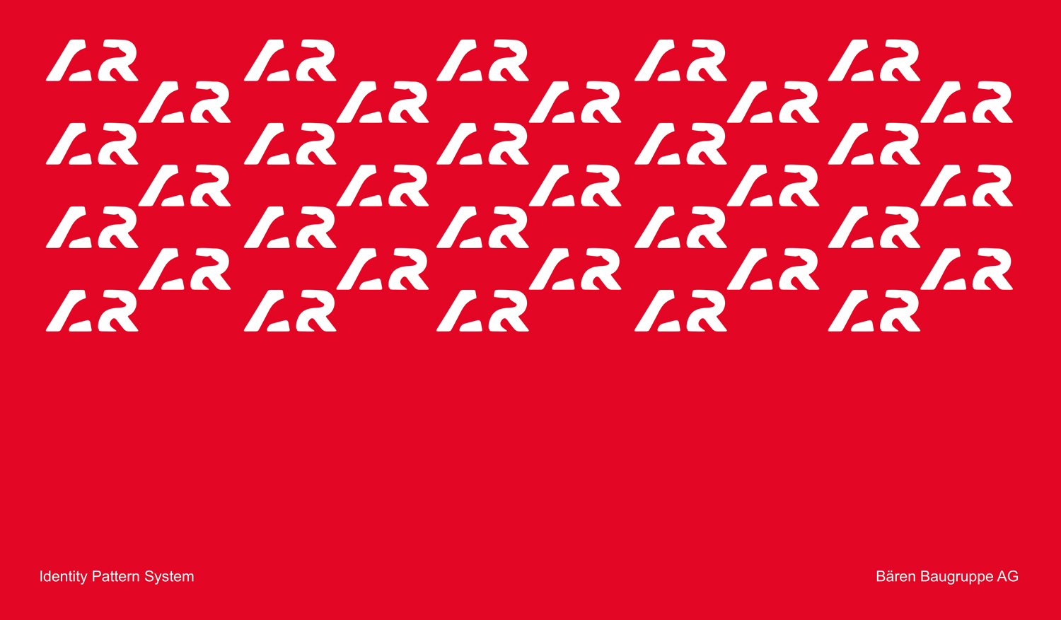
As a pattern. The letter fragments that frame the bear are repeated in white on red to form the identity pattern. The bear itself is left out, implied by the shapes around it, so the pattern belongs to Bären even though the logo never appears in it.
The palette
Red from the roof
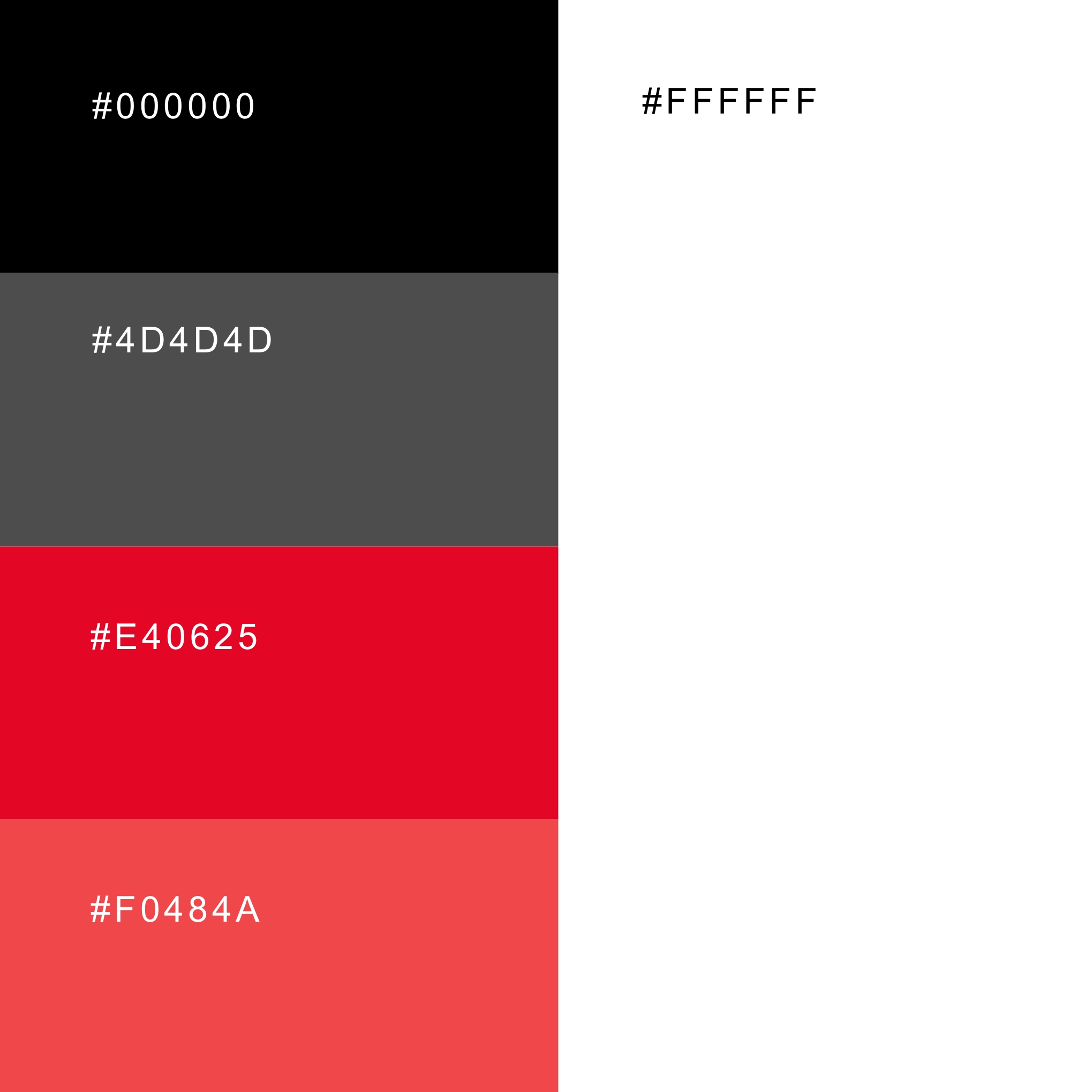
The red has a history. Bären started as a roofing contractor, and the colour comes from the roofs it built: the red of the tiles it laid. #E40625 is the primary red, with a lighter #F0484A for larger accents, set against black, a dark grey #4D4D4D and white.
The palette also holds up on legibility. White text on the main red reaches a contrast ratio of 4.8:1, enough to pass the WCAG AA standard, so the red can carry text on signage and print. The lighter red reaches 3.7:1, which only suits large type, so it is kept for big shapes and accents. White on the grey reaches 8.5:1.
Voice and imagery
A humanist face and real people at work
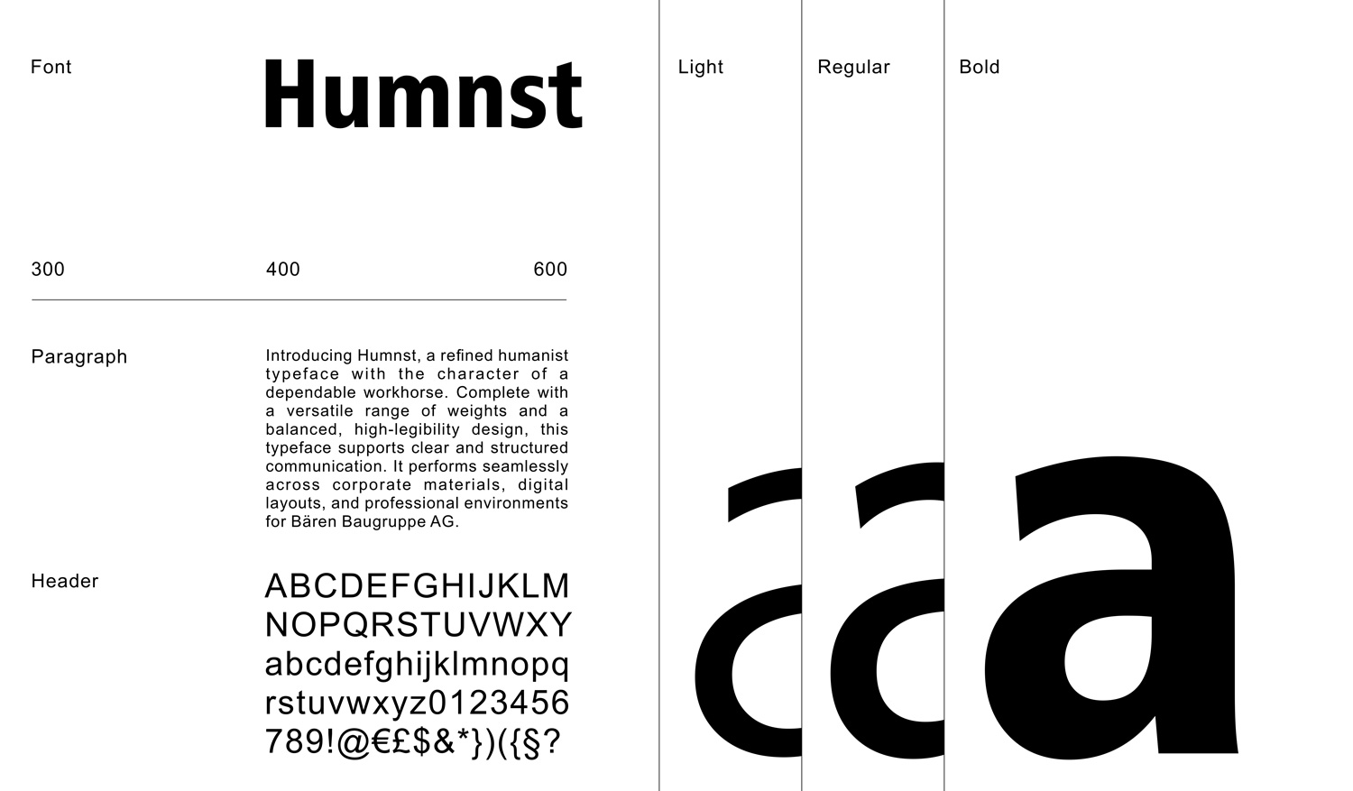
Typography is Humanist 777 in light, regular and bold. As a humanist sans it has more warmth and openness than a geometric face, which suits a company built on hands-on work, and it stays clear from a site banner down to small print.
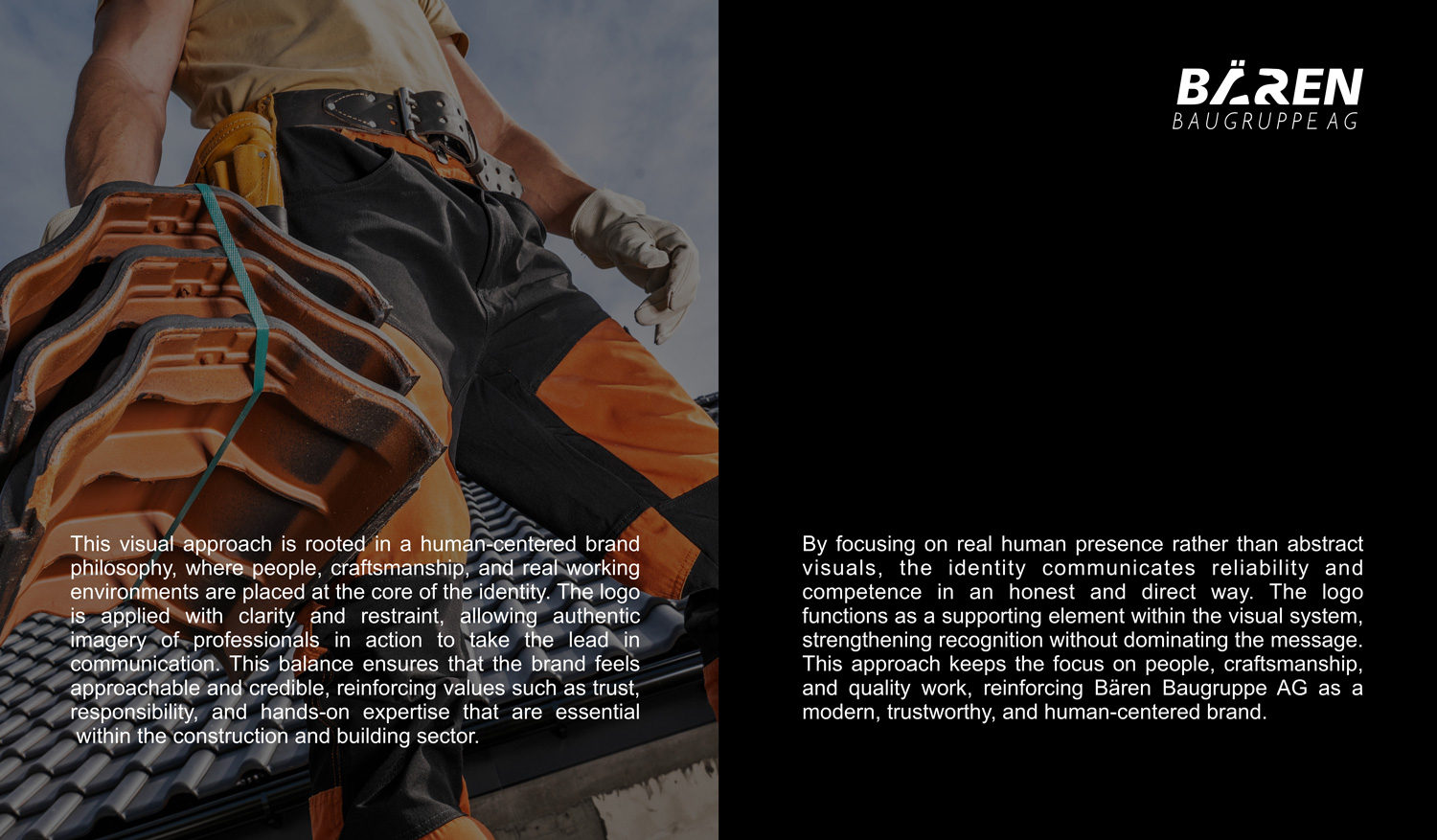
Photography follows the same principle. The images show real professionals at work, like a roofer carrying tiles up a roof, with the logo applied sparingly so the people and the craft come first and the brand stays in a supporting role.
In the field
From the hard hat to the football pitch
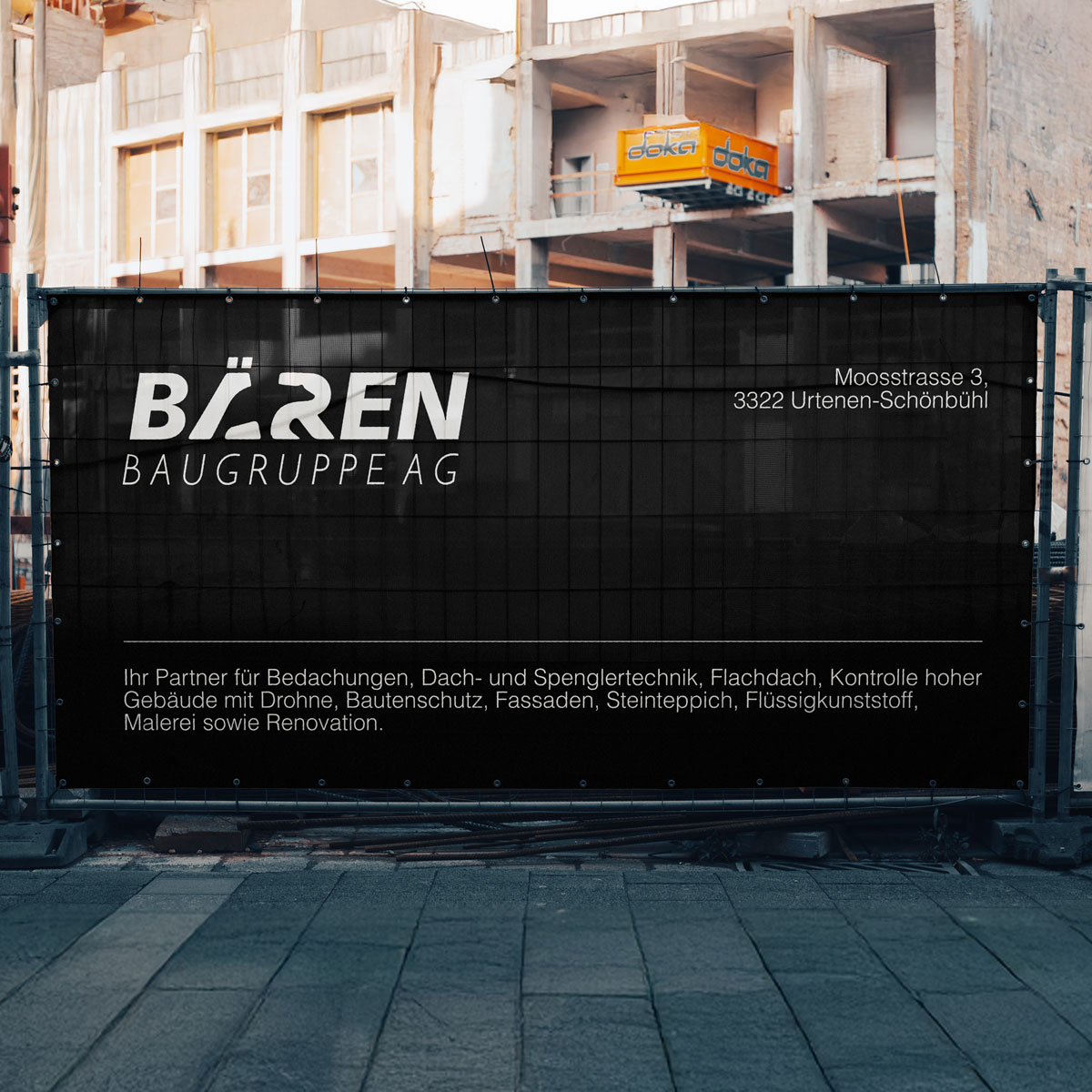
The identity runs across all of the company's applications, and it was built for where Bären is seen. On site, the full logo sits on the side of the hard hats with the red bear alone on the brim, and the site fences carry black banners with the white logo, the address and the full list of services, turning every building site into a sign for the company.
It also appears in the company's football sponsorship, where a logo is seen from the stands and on the move. A heavy italic wordmark in high-contrast red and black holds up there, readable at a distance and at a glance.
After
From a word to a mark
Bären went from a name written in type to a mark that holds the company in one shape: the bear from its name, the red from its roofing roots, and a forward lean that fits a group still growing. And because the same bear works in full colour, in one colour, as a symbol and as a pattern, there is nowhere the company appears without it.