Cityhotel
- Industry
- Hotel &
Restaurant - Service
- Research · Product Design ·
Front-End Development - Agency
- Monun AG
- Location
- Näfels,
Switzerland - Stack
- Figma · WordPress (custom theme) · PHP · JavaScript ES6+ · Tailwind CSS · GitHub · ESLint · Prettier · CI/CD
Company
Four stars in the canton of Glarus
Cityhotel and Glaré share one building. The hotel is the parent business, and Glaré, the restaurant, operates inside it with its own regulars and its own reasons to visit.
The work was done at Monun AG in 2026. The client supplied the content and the business requirements; the structure, interaction and front-end build were mine.
The problem
Two businesses, one website, neither can be a subsection of the other
Hotel guests and restaurant guests are not the same people. Guests book rooms weeks ahead, often from outside Switzerland, comparing rates against other options. Glaré guests are local, deciding within the week, and want a table, a menu and an address.
Building Glaré a separate site would have split a small business across two builds, two hosting bills and two things to keep updated. Folding it into the hotel site as another page would have made a restaurant with its own name look like a hotel amenity. Neither was acceptable to the client.
Research
Twenty hotels, then the people who answer the phone
I started by going through more than twenty Swiss hotel websites. For each one I looked at how the booking system actually works, how many steps it takes to get from landing to a confirmed reservation, where practical information sits, and how the site is structured overall. I paid particular attention to the small number of cases where two businesses share one website, since that was exactly Cityhotel's situation.
These were among the best hotel websites in Switzerland, and the point of looking at them was to learn what already works. A few things were consistent across almost all of them. Booking is always within easy reach, wherever you are on the site. Practical information that guests actually ask for is easy to find rather than buried in an About page. And the visual language is quiet, with photography setting the atmosphere.
The one thing none of them solved was the problem in front of me. Where a hotel also runs a restaurant, the restaurant is almost always a subpage, under the hotel's name and behind the hotel's navigation. For Cityhotel that would not work, because Glaré is somewhere locals go on its own terms.
Desk research only tells you what other designers built, so I also spoke to the hotel's staff and manager. They deal with guests every day and already knew what a website was failing to do. I asked what guests call and email about, what they complain about most when making a reservation, and what people struggle to find. I also asked the manager how the existing website worked from their side, what was easy and what wasn't.
Two things came up repeatedly. Guests could not find the restaurant reservation or the event enquiry, and calls came through to reception for both. The booking process itself was doing too much at once, asking people to work out which kind of reservation they wanted before it would let them start. The manager's problem was on the other side of the same site: updating it meant working through a back end that made simple changes, swapping an image or changing a seasonal detail, harder than they should have been.
Both findings pointed the same way and set one rule for the project: function comes first. If a guest has to hunt for a booking or for an answer they arrived with, the site has failed, regardless of how it looks.
Solution
One host, two identities, four ways in
Cityhotel is the host, and the site opens as Cityhotel. Arriving at the site, you are at the hotel. That mirrors how the business works: Cityhotel is the parent and Glaré operates inside it. Pretending they are two equal front doors would have misrepresented the company and given a first-time visitor no idea where they had landed.
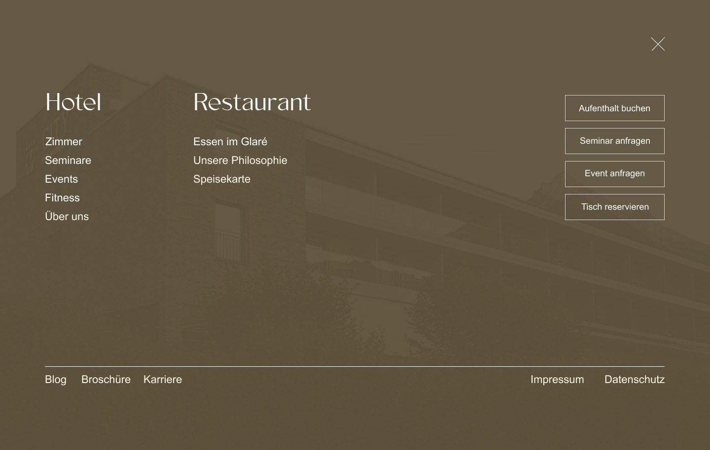
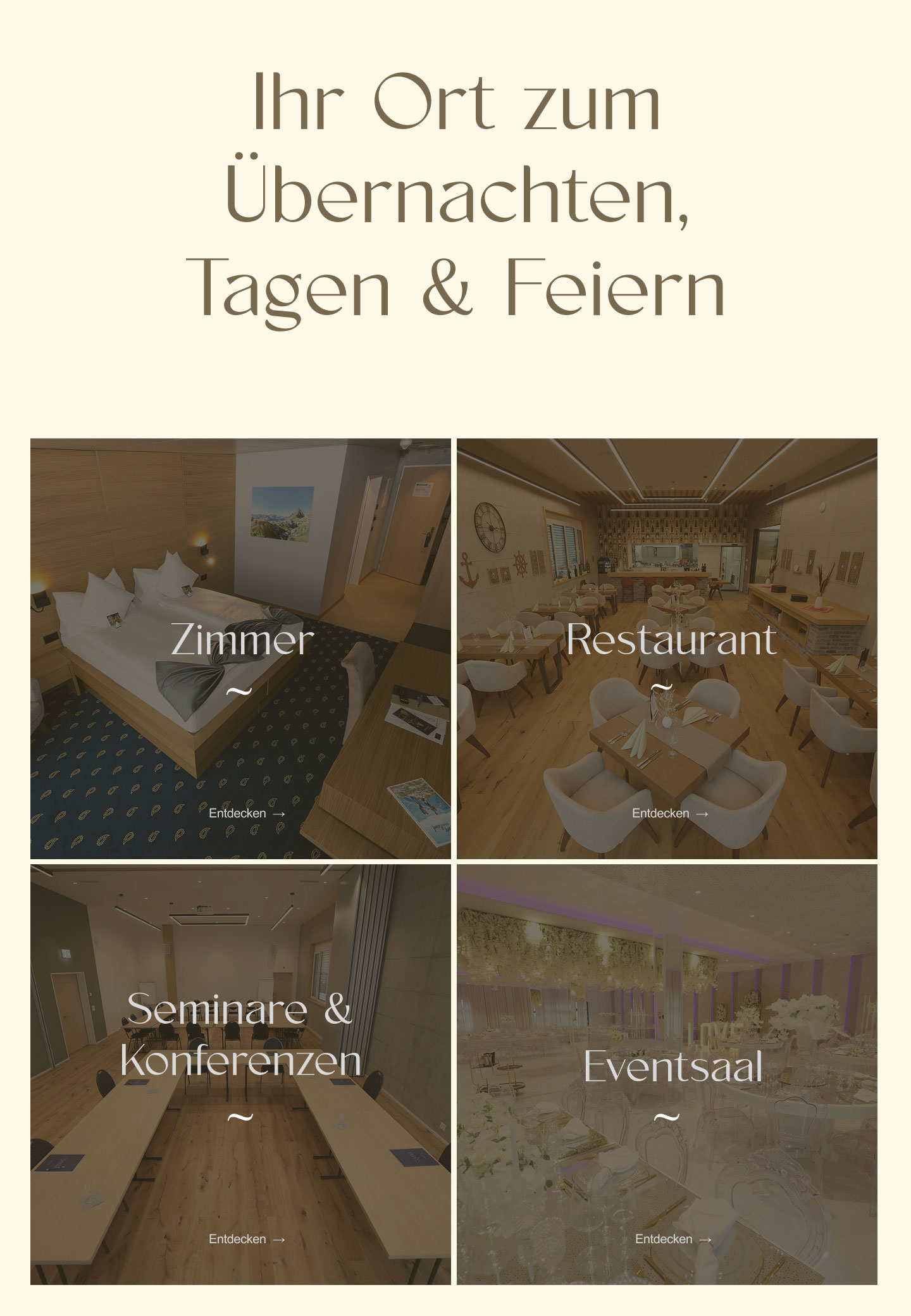
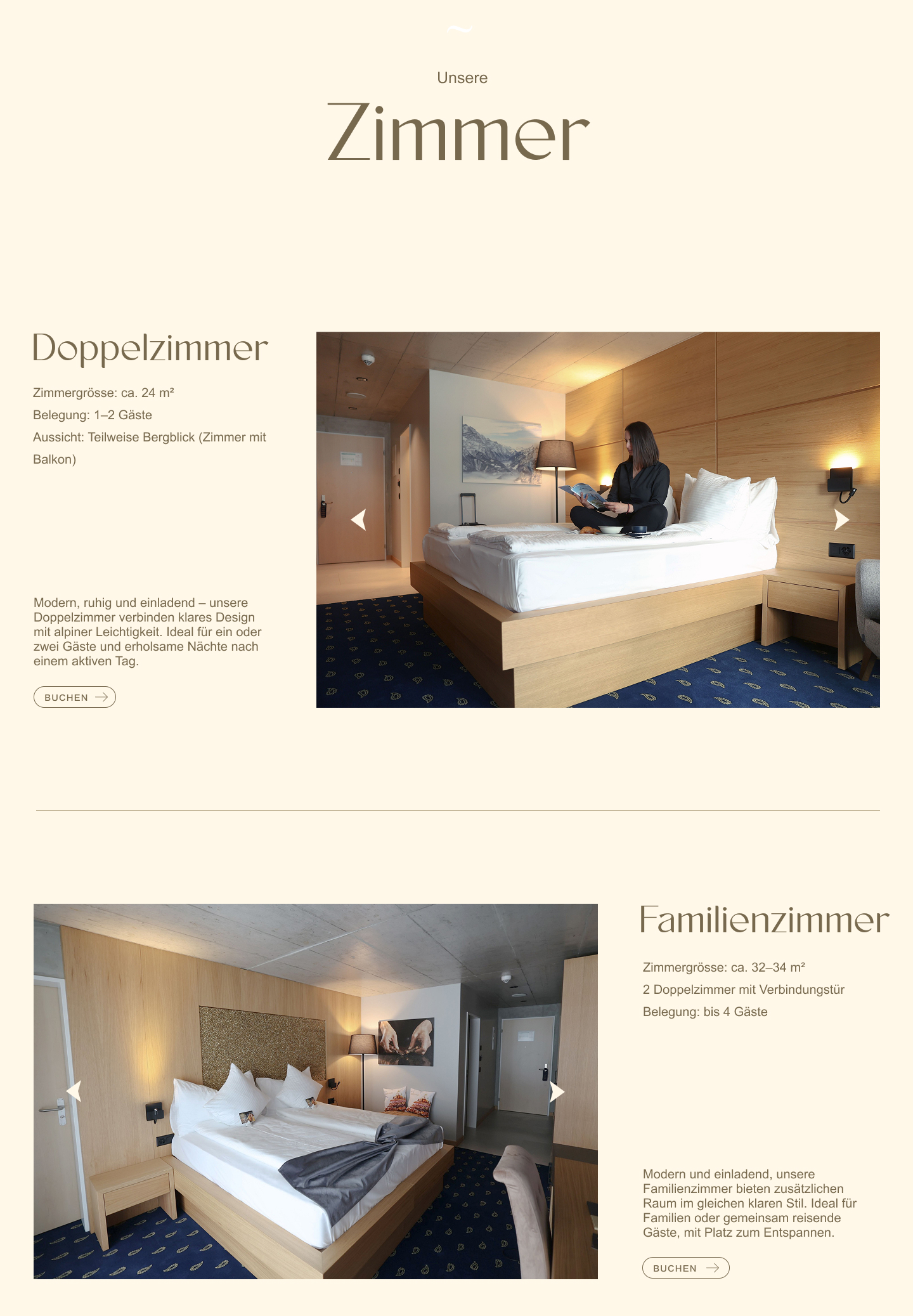
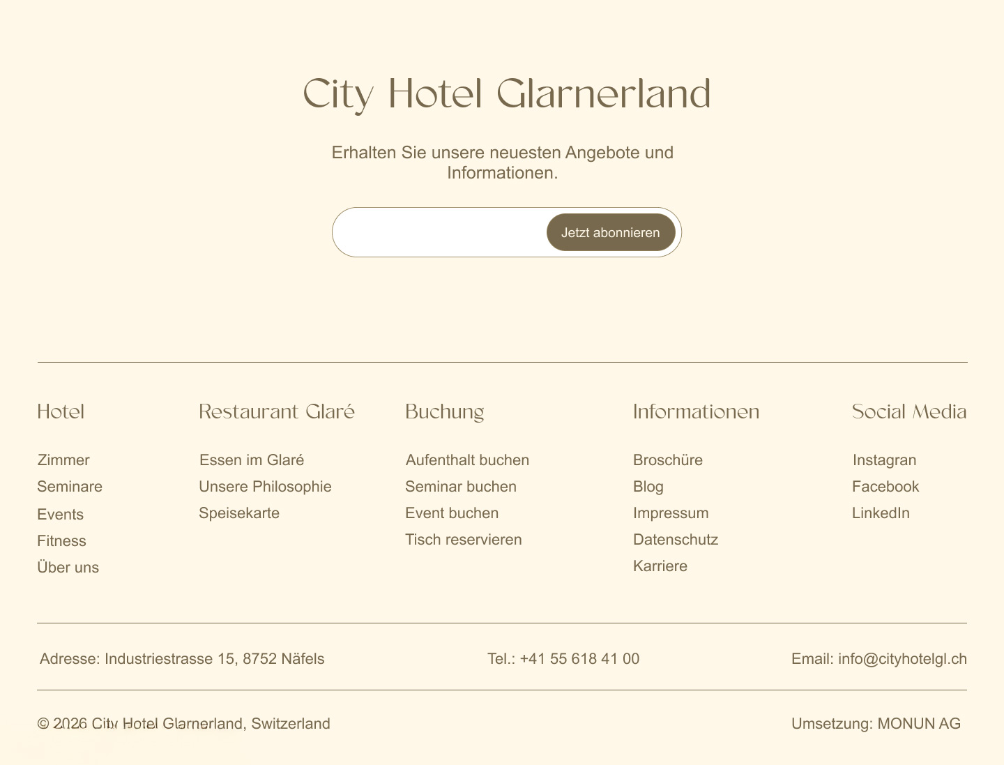
The menu presents them as equals. Open the main menu and Hotel and Restaurant sit side by side as two columns, each with its own contents. Hotel holds rooms, seminars, events, fitness and about. Restaurant holds the food, the philosophy and the menu. Nothing is nested inside anything else at this level, so a guest looking for Glaré finds it in one move rather than hunting through the hotel's pages.
Inside Glaré, the identity switches completely. Click into any restaurant page and the logo in the header becomes Glaré. Navigation, layout and behaviour stay identical, so nothing has to be relearned, but the guest is told in the one place they are always looking which business they are now dealing with. Glaré stands as a restaurant, not a page inside a hotel, and it needs no second domain to do it.
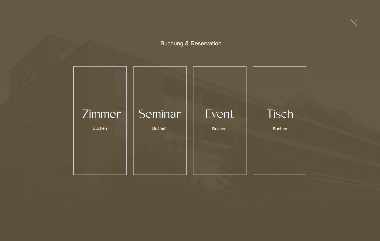
Four reservation paths, kept separate. Booking a stay, requesting a seminar, requesting an event and reserving a table are four different transactions, with different urgency, different lead times and different information required. One generic Book button would have forced every visitor through a choice they had already made before they arrived. Each stays visible and distinct in the menu, so the guest picks the one they came for rather than working out which path leads where.
A minimal header, a full menu. A hotel of this size carries more pages than a top bar can hold. Moving the full structure into a large menu meant the header stays out of the way while guests read, and the whole site, both businesses and all four booking paths included, is there the moment they are ready to move.
Design
Structure first, surface last
Wireframes in Figma came before anything visual. Only once the structure held did I move to surface.
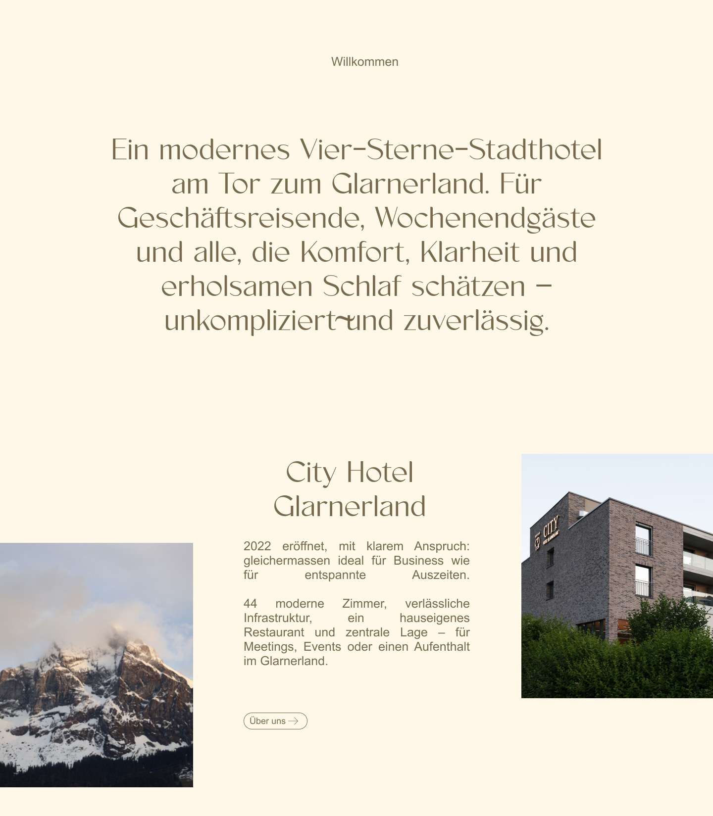
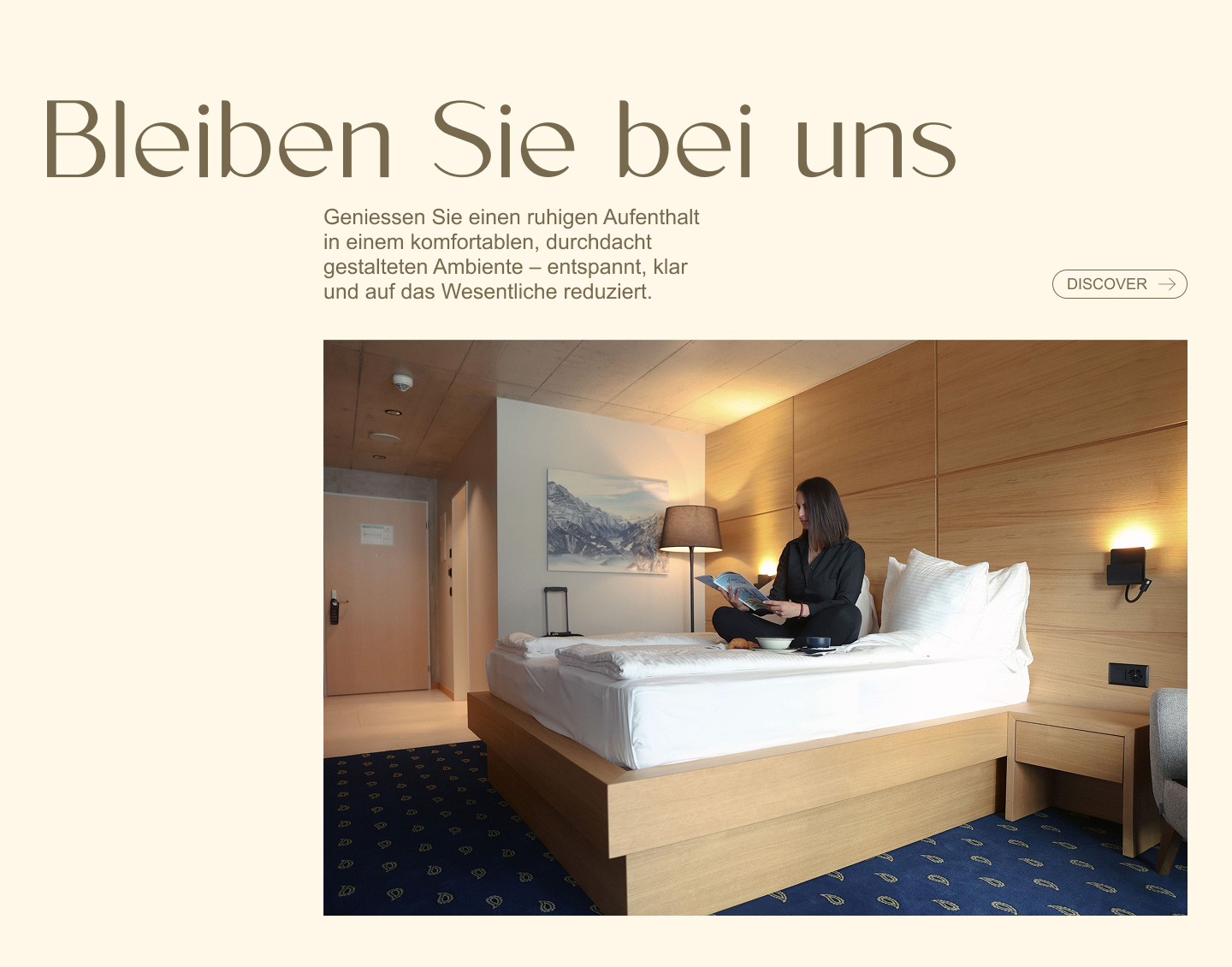
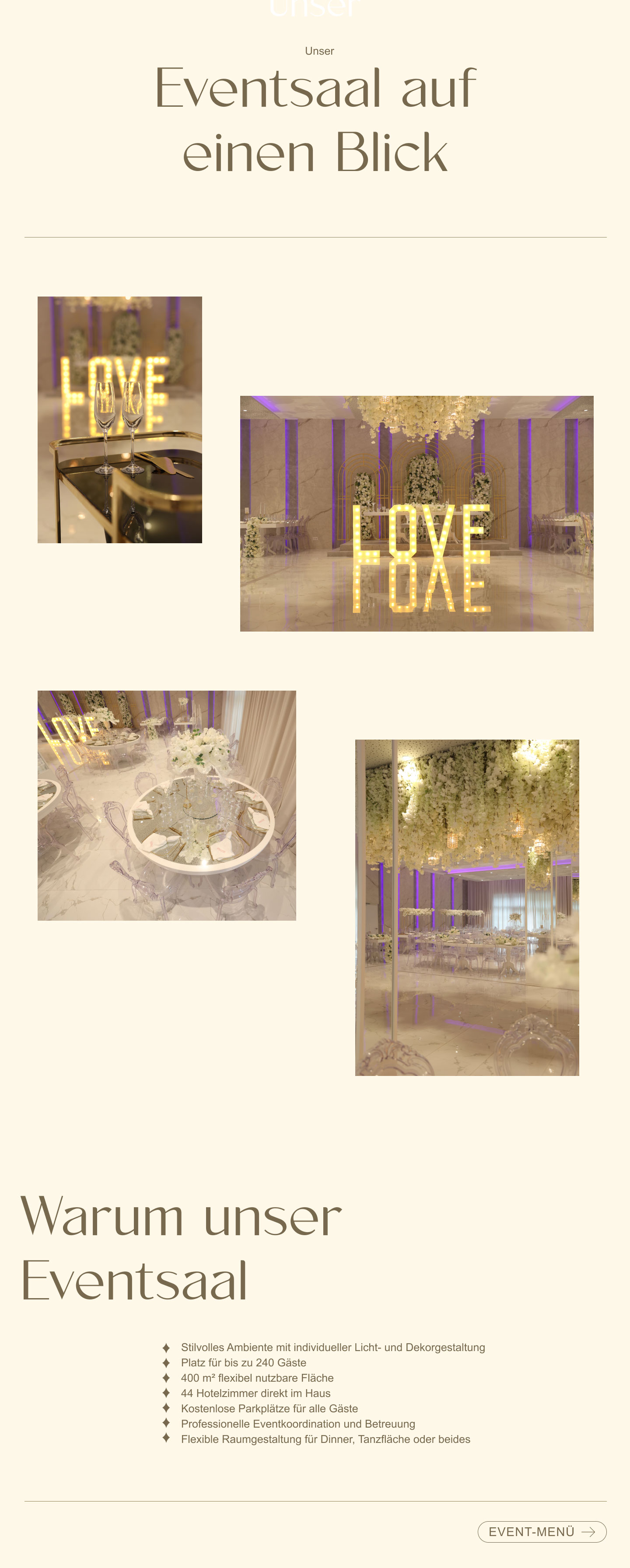
The palette is a cream ground with muted bronze text, warm instead of white and black, because a hotel sells rest. Two tones run through the whole site, so the photography is the only place colour enters unplanned. The type pairing does the rest: a high-contrast display serif for headings, set large with room around it, and a plain sans for body text, so the character sits in the headings while everything read at length stays easy. Buttons are thin outlines with no fill, set in uppercase, present without competing with the photography.
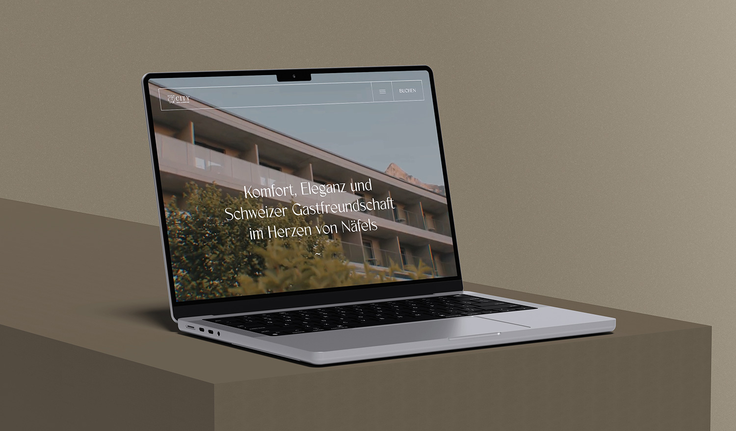
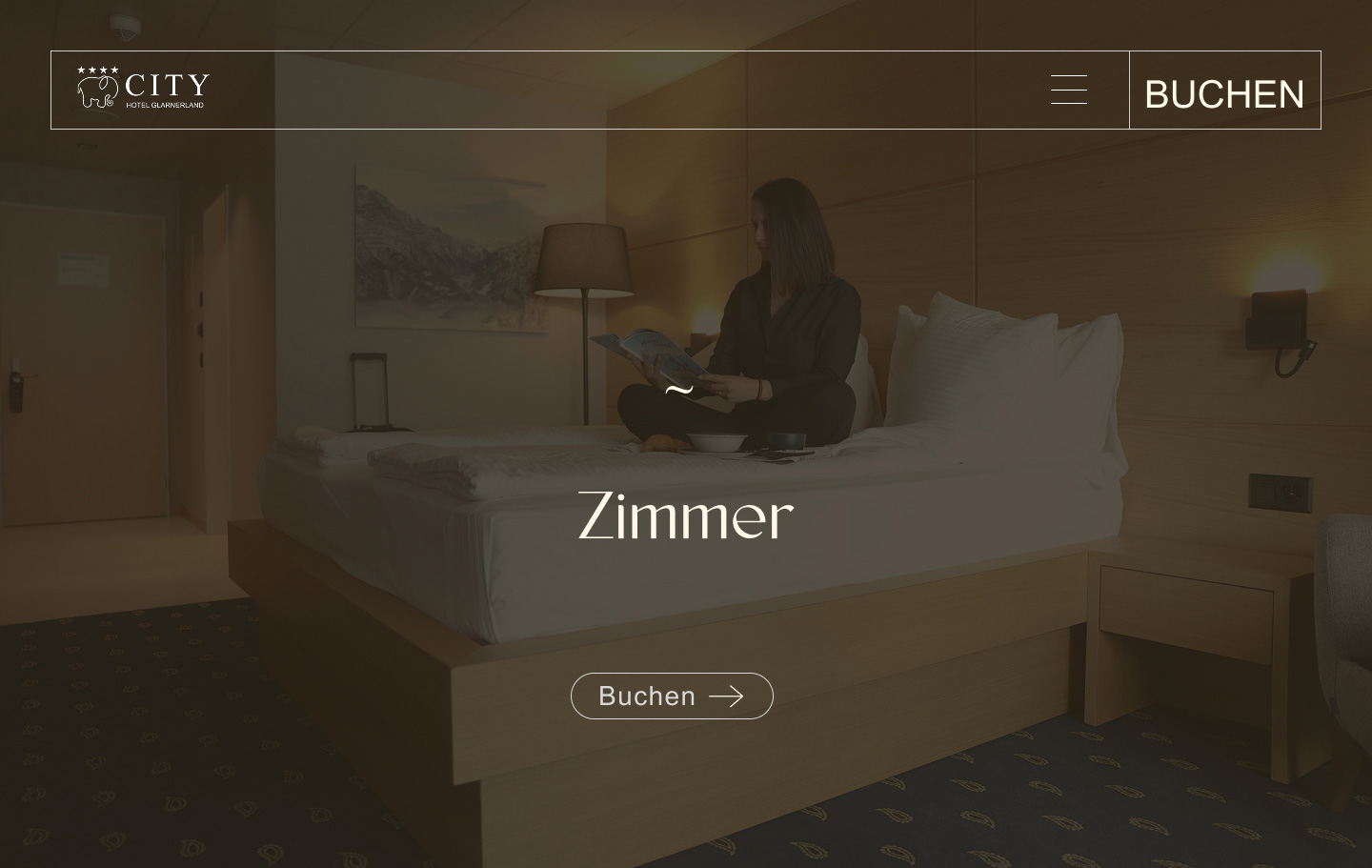
The header has three elements: the logo, the menu and Buchen. It sits transparent over the hero so the photograph arrives whole, then turns solid on scroll once there is text behind it. Below that, full-width images alternate with open space, and nothing moves unless it has a reason to.
Development
One codebase, two identities
Glaré is not a second website but a set of pages that know which business they belong to. That single rule decides which logo the header shows, while navigation, layout and behaviour are shared, so the two brands stay in step. The back end was rebuilt around the manager's complaint: rooms, menus and seasonal details now sit in simple WordPress fields, and swapping an image or a price is an ordinary edit rather than a request to a developer.
Outcome
Two findings from the staff, both answered
The staff interviews produced two findings, and each has a direct answer on the site. Guests who could not find the restaurant or event booking now see those paths in the menu next to the room booking, instead of phoning reception to ask where they are. And the back-end problem the manager described is gone.
For guests, the two businesses stay distinct without feeling like two websites.