HBS
- Industry
- Construction
- Service
- Product Design ·
Front-End Development ·
Design System - Agency
- Monun AG
- Location
- Switzerland
- Stack
- Figma · WordPress (custom theme) · PHP · Tailwind CSS · JavaScript ES6+ · GitHub · CI/CD
Company
Construction, coordinated end to end
This was my second project for HBS Swiss AG. The first was their new identity, so by the time the website began, the look was already decided. HBS runs construction projects from planning through project management to site supervision, and what remained was turning that identity into a site people could use. Both projects came through Monun AG.
The problem
Starting from nothing, with no reference point
HBS had no website. Not an outdated one, none at all. That removed the usual starting points: nothing to audit, no analytics, no existing structure to argue with, and no evidence of what visitors already struggled to find.
It also meant every decision was permanent in a way a redesign never is. The first version sets what the company looks like online, how it explains its work, and what people expect when they arrive. There was no previous version to blame and nothing to fall back on.
The brief itself was short. The company had to look premium, and it had to explain what it does properly. Both were open questions rather than answers, because coordinating a whole build is harder to communicate than a single trade.
Research
A market split between brochures and corporate sites
The competitive review is where that short brief turned into something I could design against.
Swiss construction websites tend to fall into one of two shapes. Either a thin brochure with a phone number and no evidence of work, or a dense corporate site that buries what the company does behind its history. I reviewed comparable firms looking at three things: how services are structured, how completed work is presented, and how easy it is to get in touch.
Representing HBS well, it turned out, meant something neither shape offers: proof that the company is real, careful and worth calling.
Then, together with the client, I mapped the service flow from first enquiry to completed build, as a customer would experience it, so the site could explain it to someone outside the industry.
Solution
Projects as proof, services as a map
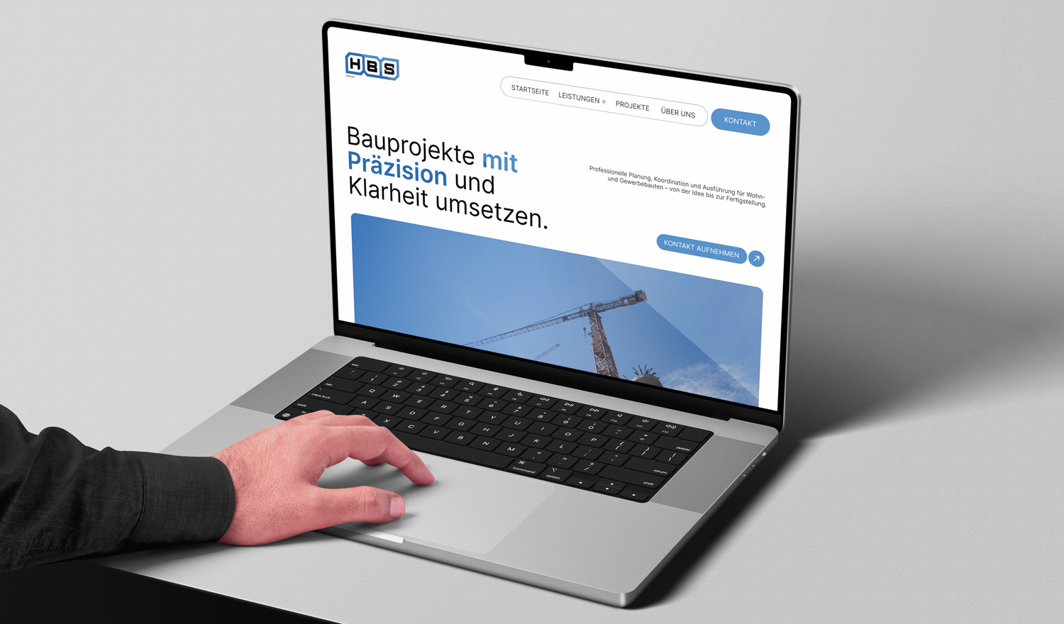
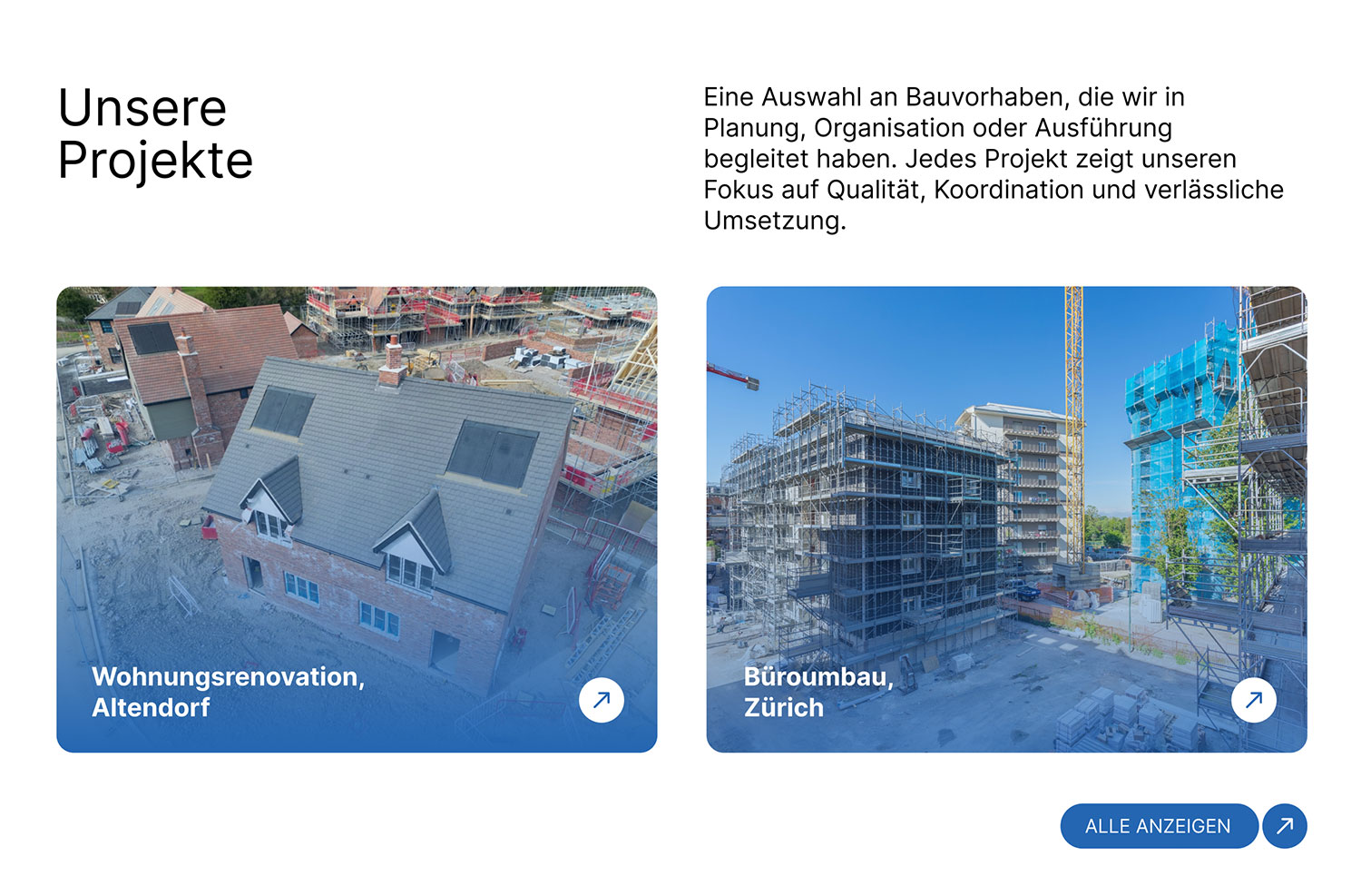
Projects get their own place, not a mention. Construction is a trust purchase. With no website and no reviews to point at, completed work is the only argument available, so Projekte sits in the main navigation, at the same level as the services.
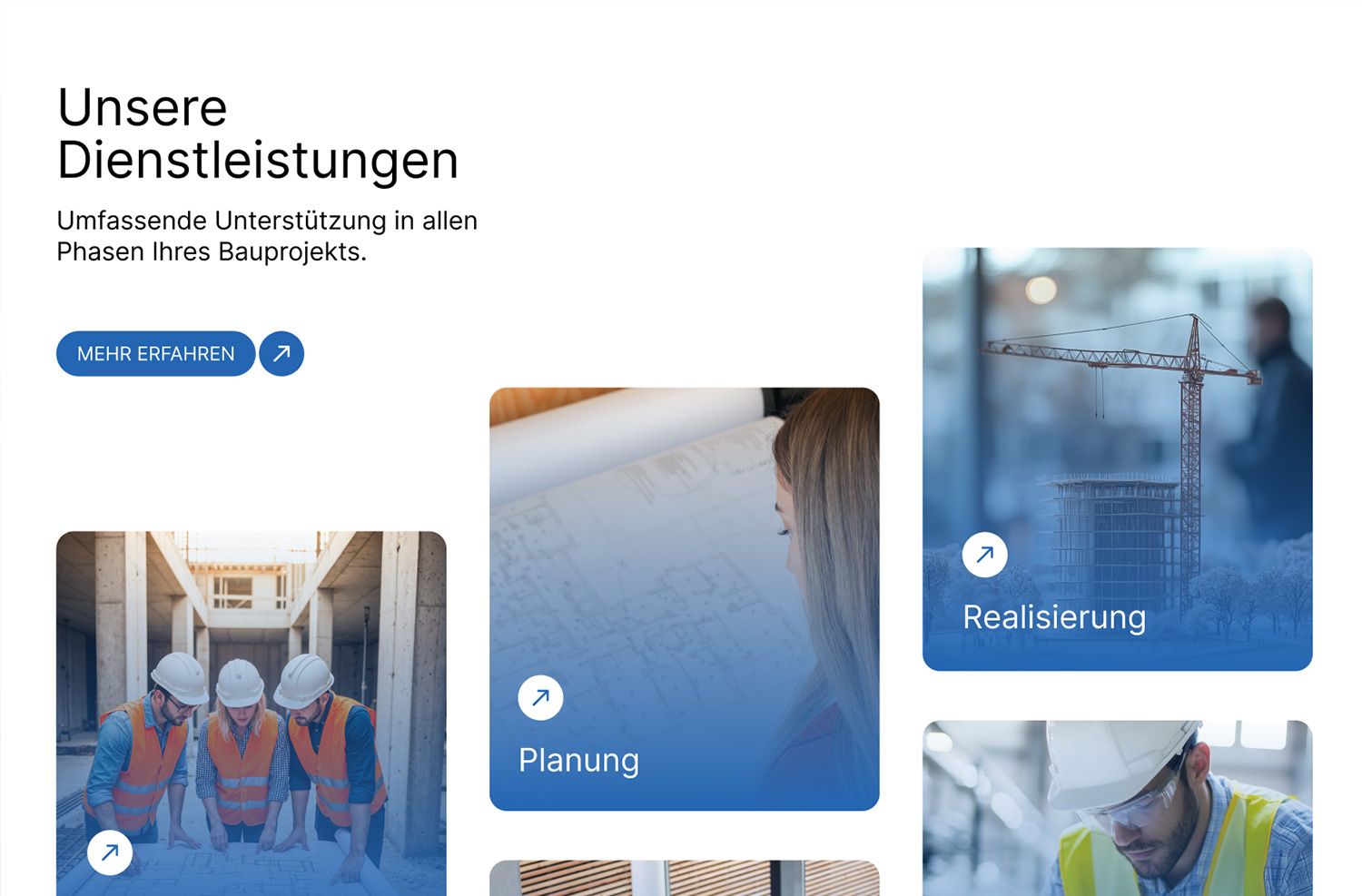
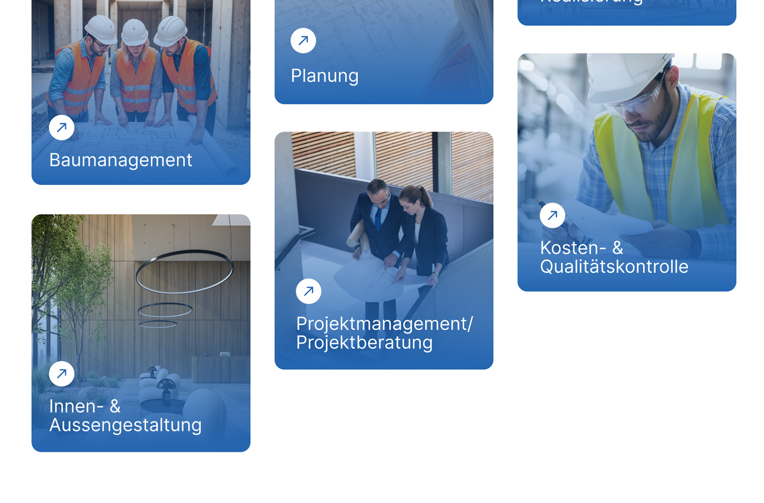
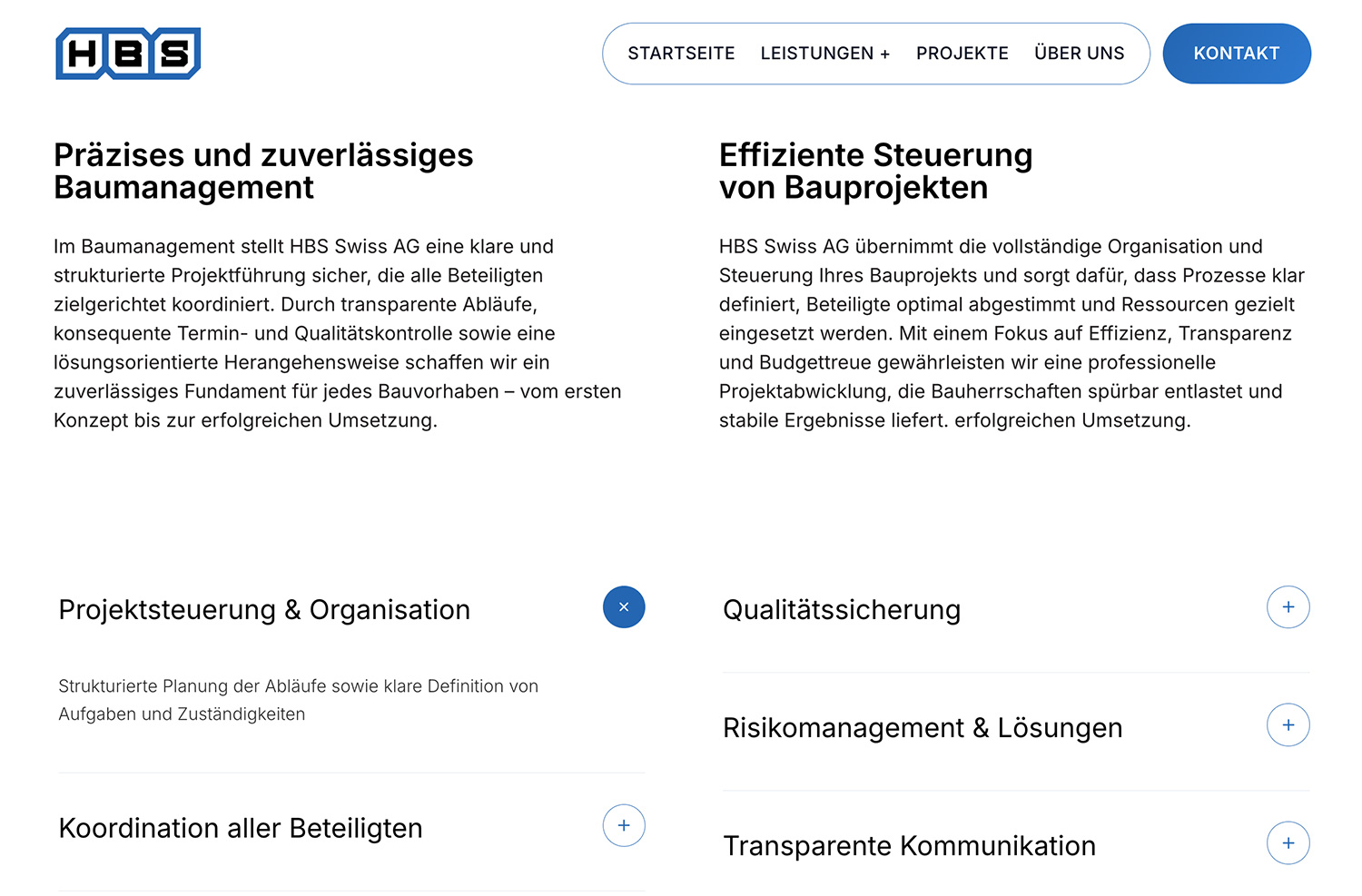
Services are explained rather than listed. Planning, realisation and the stages around them are laid out so a visitor can see where HBS fits into their own project, instead of reading a list of capabilities and working it out themselves.
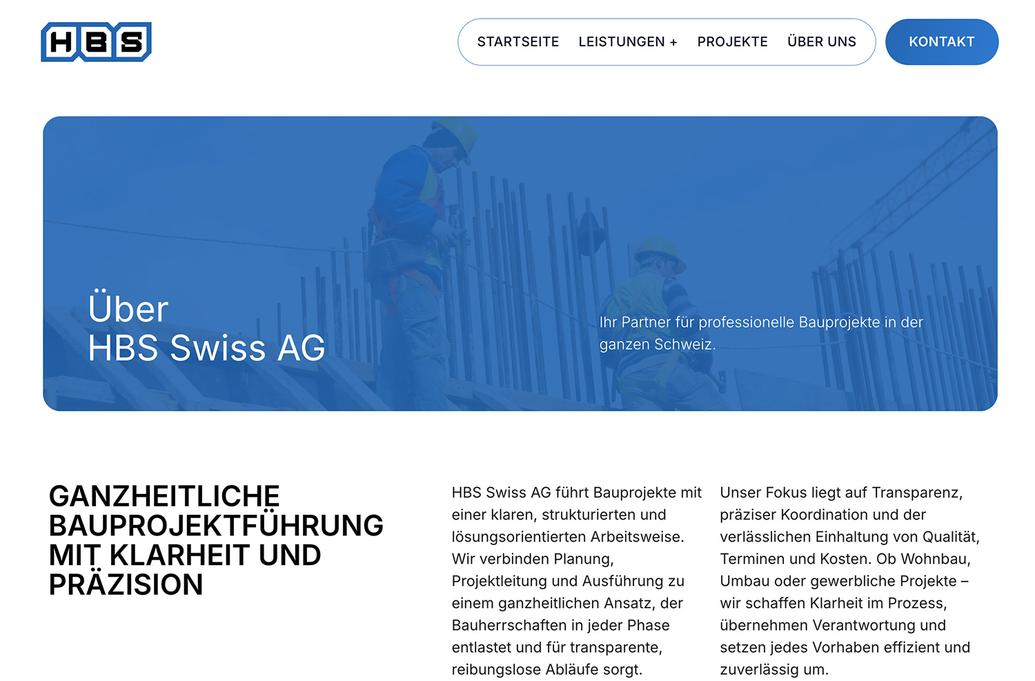
One persistent action, visually separated. Kontakt is the only filled button in the header, distinct from the navigation beside it. For a business whose entire digital presence starts here, the one thing that must never be more than a click away is reaching a person.
Design
Confident, not decorative
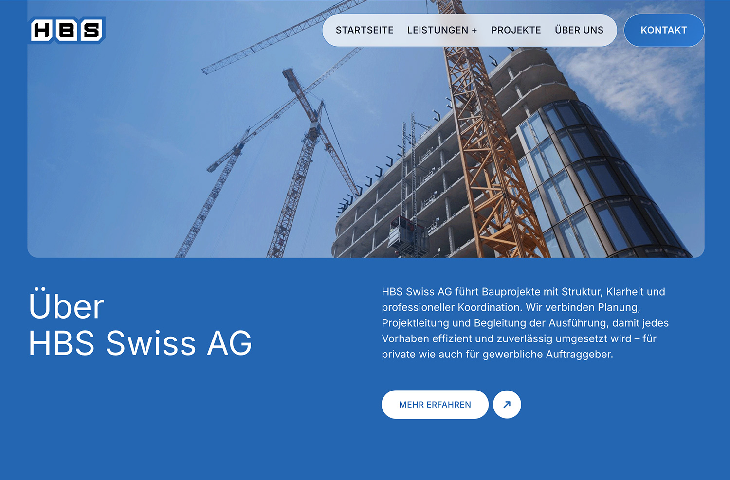
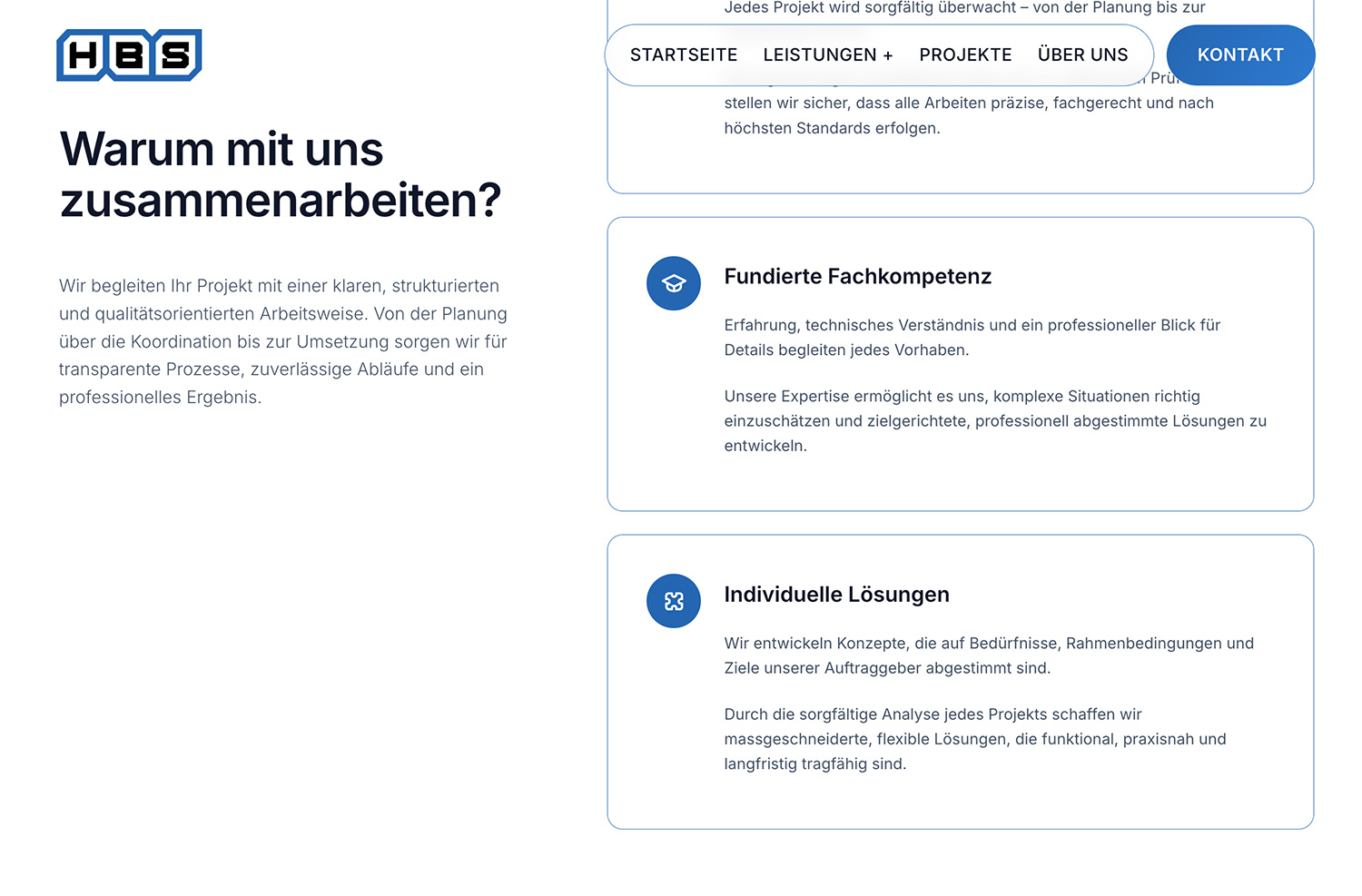
The interface is built from one repeated form: a softened rectangle. The navigation floats in a rounded bar rather than a full-width strip, buttons are pills, secondary actions are circles, and service panels and the hero share the same corner radius. One shape, repeated everywhere, instead of a new treatment on every section.
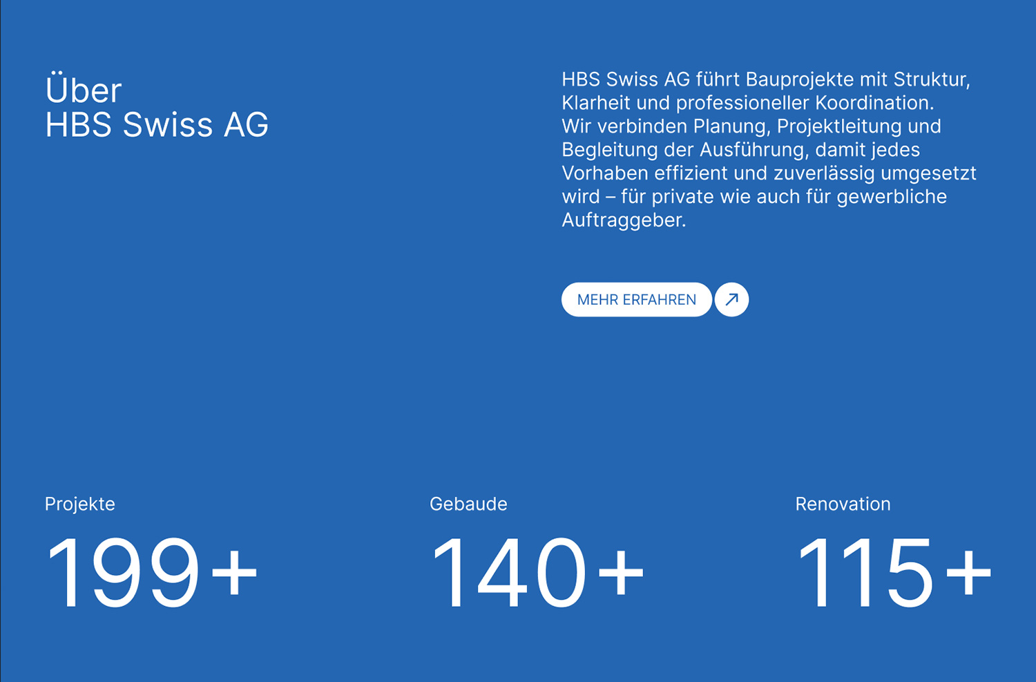
Blue carries the site: strong and saturated, used in full-bleed sections rather than as an accent, with white type on top. It reads as engineering rather than luxury, the right register for a company whose promise is that things get built properly. White sections between the blue ones break up long pages and give the eye somewhere to rest.
Type is a single grotesque throughout, set large for headings and plainly for body copy, with no display face and no second family. In a sector where credibility comes from precision, restraint in the typography says more than personality would.
Photography gets a blue gradient overlay, which solves a practical problem. Construction images arrive inconsistent, shot on different days in different light by different people. The overlay pulls a varied set into one family, so the site looks consistent whatever the client uploads next.
Development
The design system lives in the code
Corner radius, spacing and the blue palette are defined once as design tokens, and the floating navigation, pill buttons, circular actions and rounded panels are built as reusable components on top of them. Change a value in one place and it changes everywhere. That is how a single repeated shape stays consistent across a site that has only just started to grow.
Outcome
From invisible to findable
Search for HBS today and the company appears, with its services laid out and its completed projects as evidence. The first version also settled questions that had never been answered before: how HBS looks online, and how it describes the full span of its work, from planning to handover.