Monun AG
- Industry
- Marketing
Agency - Service
- Research · Product Design ·
Development · Heatmap Analysis - Location
- Switzerland
- Stack
- Figma · WordPress (custom theme) · PHP · React · Tailwind CSS
Company
Designing for the company I work for
Monun AG is a Swiss marketing agency. Its services run from social media and logo design to websites, software and CRM systems.
I work at Monun, which made this project unusual: the client was my own employer, and the website I was redesigning is the first piece of the agency's work a prospective client ever sees. Alongside the design and build, I set the content concept: what the site needed to say, and how briefly it could say it. The rebuild went live in 2025.
The problem
A marketing agency that looked like a gaming site
Monun already had a website, and the problem was not that it was broken. It looked wrong. The visual language was loud and overdone, closer to a gaming site than to an agency that sells design, and at the same time generic enough that it said nothing specific about Monun.
For an agency, that matters more than for almost any other business. A client deciding whether to trust Monun with their brand will judge Monun's own brand first. A site that feels generic or overdone is a bad sample of the work.
Research
Agencies that sell clarity rarely show it
I went through a large number of agency websites, looking at how they present a broad range of services, how quickly a visitor reaches the actual work, and how much reading stands in between.
The finding was almost ironic. Agencies sell clarity to their clients, yet most of their own sites were the opposite: long service descriptions, layered menus, paragraphs about process and philosophy, and so much explanation that the work itself disappeared underneath it. The more services an agency offered, the more text it seemed to need, and Monun, with a range running from social media to CRM systems, was exactly the kind of agency that falls into that trap.
Monun's old site had failed in a different direction, with too much styling rather than too much text. Neither approach answered the one question a prospective client actually has: can these people do good work? The answer to that is the work itself. For an agency, the portfolio is the pitch, and everything else on the site should either lead to it or get out of its way.
Solution
Less to read, more to see
The work comes first. Projects sit at the centre of the site, because a prospective client learns more from one finished piece than from a page of claims.
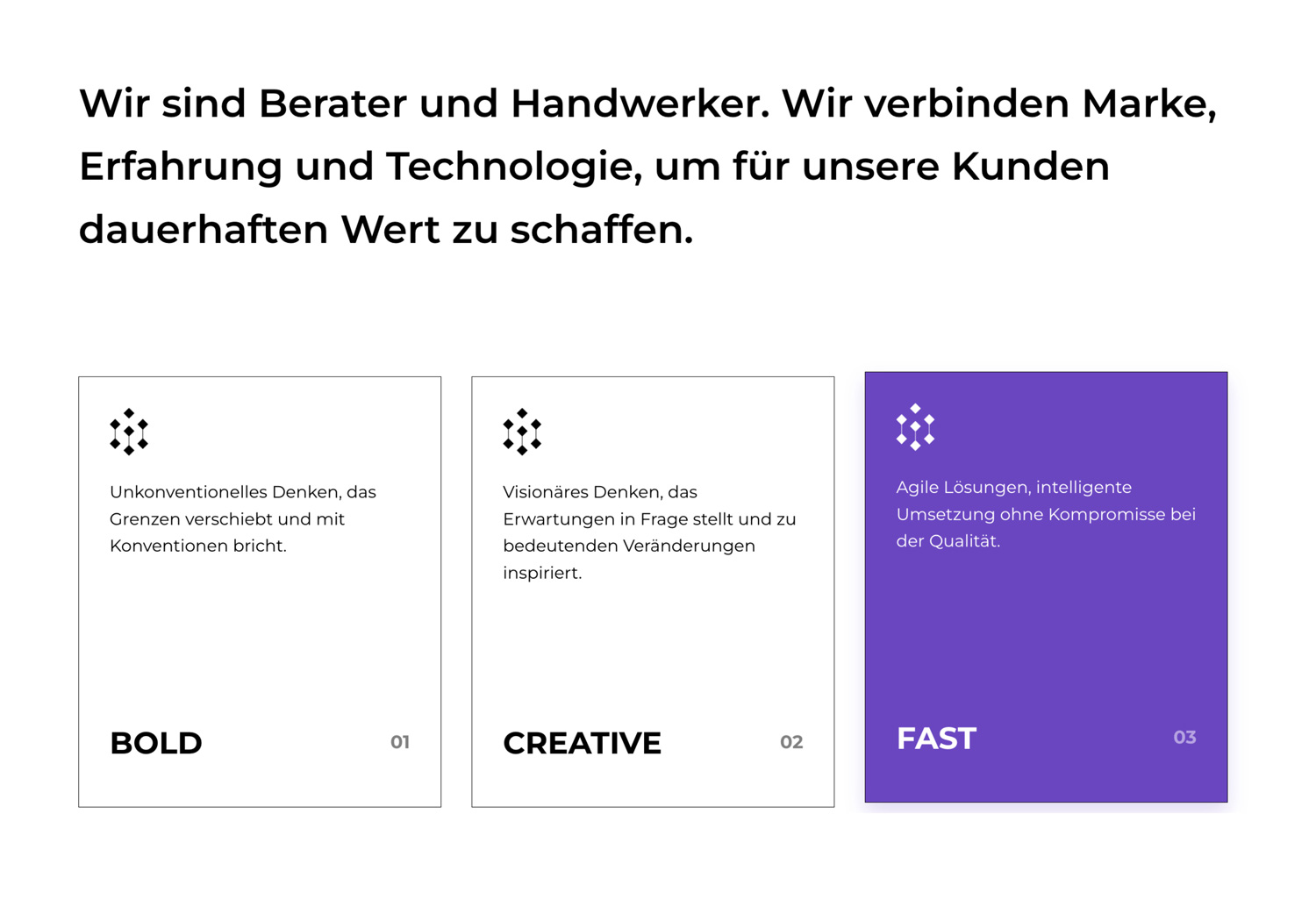
Every service in a sentence, not a page. Monun covers everything from social media to CRM systems. Each service is stated briefly and clearly, so the range reads as breadth rather than clutter.
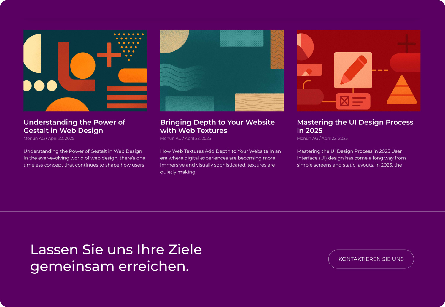
Calm replaces noise. The old site competed for attention everywhere at once. The new one stays calm by default, so the few elements that matter, the work and the way to get in touch, stand out without having to shout.
Attention was planned before launch. I decided in advance where a visitor's attention should land on each key page, and placed the most important elements there. After launch, that plan was put to the test.
Design
Art in violet, technique in black
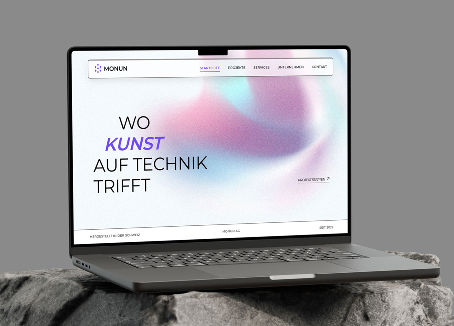
The old site's problem was volume, so the new visual language is built on subtraction: a white ground, black type, and a single violet taken from the Monun mark. Colour lives in one place, a soft grain gradient behind the hero, and everywhere else the page stays neutral. The energy that used to be spread across every screen now has a single home.
The headline, Wo Kunst auf Technik trifft (where art meets technique), carries the agency's positioning in its typography as much as in its words. Technik is set upright, uppercase and black. Kunst breaks out in bold italic violet. Art and technique are shown in contrast rather than described, and the one expressive word on the page is the word for art.
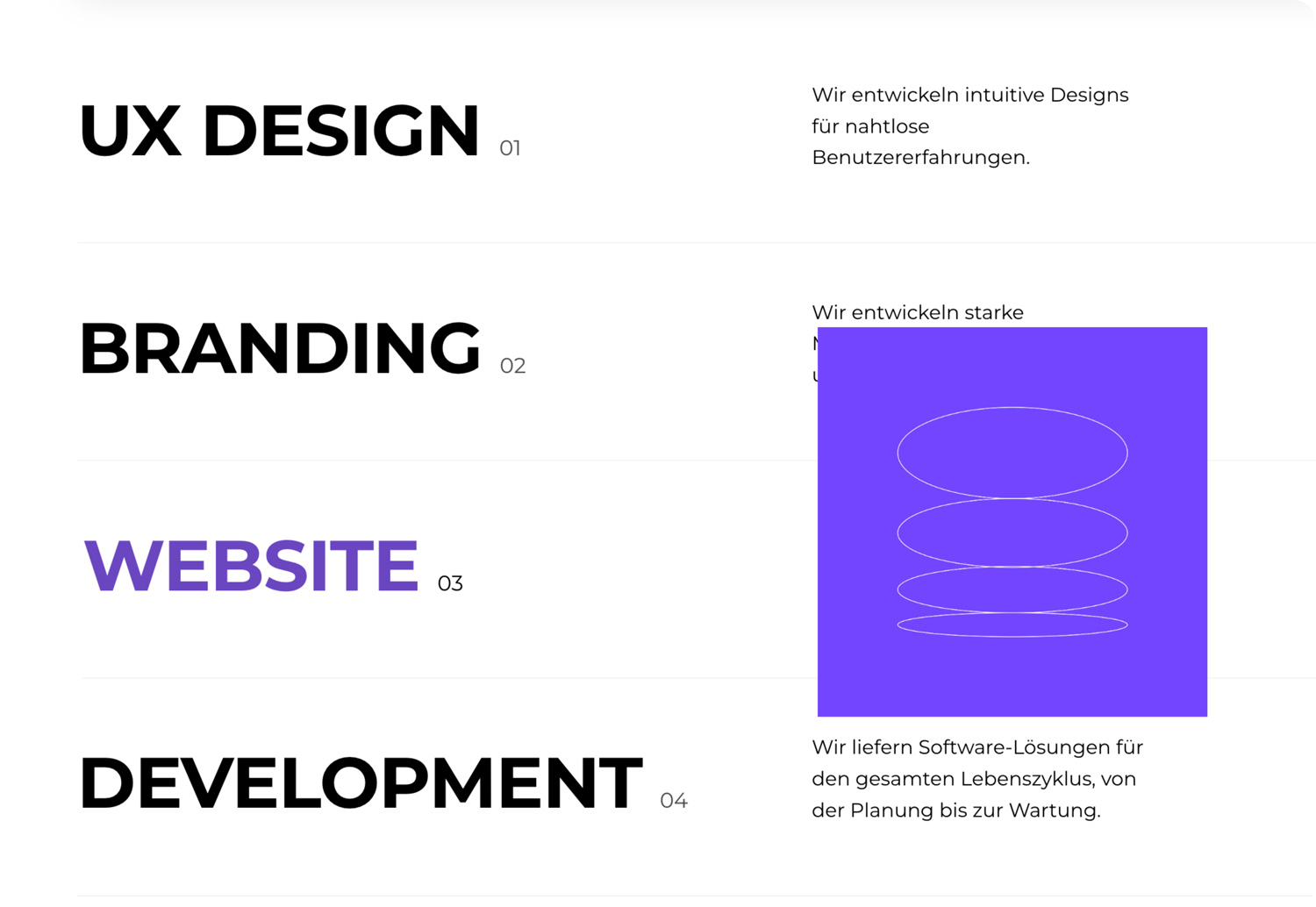
Violet has one other job: marking state. The active page in the navigation, the selected project filter, a service under the cursor. Hover over a service and its name turns violet, its arrow fills, and a violet tile opens beside it, a small reward for curiosity that makes a plain list feel alive without adding anything to read.
Services are set as a numbered index in heavy uppercase, one sentence each, divided by hairlines, so the whole offer can be scanned in seconds. Projects run in a staggered two-column grid with filters by discipline (UX design, branding, website, software, marketing), so a client interested in branding sees branding rather than everything at once. The navigation sits in a panel that floats above the page, drawn with a hairline border instead of a filled bar, so it stays present without adding weight.
Development
WordPress for content, React for interaction
The site runs on a custom WordPress theme, with the interactive parts of the interface built as React components and all styling written in Tailwind CSS. The split is deliberate: WordPress holds the content the agency updates most, its projects and services, while React handles the moments that respond to the visitor.
The project filters are the clearest example. Every project is tagged by discipline when it is published, and the filters read those tags, so a new branding project appears under Branding the moment it goes live, with nothing to configure. The service list follows the same pattern on a smaller scale: its hover behaviour is one component, reused for every service.
Tailwind kept iteration fast while the new visual direction was still being refined. Styles are written where they are used, so trying a different layout or spacing on a component takes moments rather than a trip through a separate stylesheet.
The site runs in more than one language, switched from a selector in the footer bar, so the same structure serves every language version.
Click and scroll tracking was set up at launch. It adds nothing a visitor sees, but it is what made it possible to test the design against real behaviour rather than opinion.
Outcome
Predictions confirmed by the heatmaps
After launch, the manager passed on feedback from clients: some found the new site much easier to navigate than the old one.
The heatmap data backed that up in a more specific way. The hotspots, the places visitors actually click and focus, landed where I had planned them before launch. For a redesign built on the idea that attention can be designed, that is the result that matters most: the site behaves the way it was designed to.